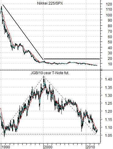
Like a moth to a flame we keep getting drawn back to the chart included below. When we look at it (and the various comparisons that we will show over the next two pages) we wonder whether it provides one of the best explanations for what has happened over the past two decades. Then, of course, we ponder how it might be of use to help discern the direction of the markets over the next five or ten years.
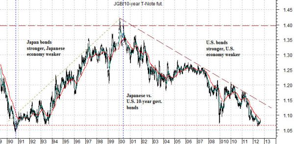
The chart shows the ratio of 10-year Japanese bond futures divided by 10-year U.S. bond futures (JGB futures divided by 10-year T-Note futures).
The ratio bottomed in 1990, rose for ten years into 2000, and then declined back to somewhere close to the original starting point in 2012.
So… what does this mean? From 1990 into 2000 the ratio moved higher. This went with ‘weakness’ in Japan. It went with Japanese bond prices rising faster than U.S. bond prices as a reflection of economic stagnation and pressure in Japan’s economy and pressure for Japanese asset prices.
From 2000 into 2012 the ratio moved lower as U.S. bond prices moved higher relative to Japanese bond prices. The ratio could have declined either on falling Japanese bond prices (Japan shifting back towards inflation) or rising U.S. bond prices (U.S. being drawn inexorably into deflation).
What is passing strange is the way the markets have been ensconced in a ‘Long Wave’- type trend towards downward pressure on producer prices even as commodity prices have soared. One doesn’t intuitively equate 500% gains in commodity prices with disinflation and/or deflation.
Perhaps the simplest explanation is that the miracles of financial engineering created investment assets out of raw materials which, in turn, led to expanding valuations in response to falling interest rates.
In any event… the chart shows economic weakness in Japan for a decade followed by downward pressure on U.S. cyclical asset prices for the next 10 to 12 years so that the ratio between Japanese and U.S. 10-year bond futures has returned to its original starting point.
Equity/Bond Markets
Let’s attempt to put the first page chart into some form of perspective.
Below is a comparison between the JGB/TNote ratio and the ratio between Japanese and U.S. equity markets (Nikkei 225 Index divided by the S&P 500 Index).
So… what do we see when we look at this chart? We see the Nikkei collapsing relative to the SPX between 1990 and 2000 in response to Japanese bond prices being stronger than U.S. bond prices.
The argument is that the country with the strongest bond market has the greatest downward pressure on growth and cyclical asset prices. Which, we trust, makes sense.
If we had shown the Nikkei/SPX ratio scaled in semi-log it might have created a somewhat different picture but our intent was to make the general case that, by and large, the Nikkei has remained roughly flat against the SPX since 2000. It hasn’t, of course, but after the massive pressures witnessed between 1990 and 2000 even a 50% decline in the ratio from around 15 times down to 8 times is almost ‘flat’.
If we do, in fact, have a point it might be that we are still mired in a deflationary trend which, in turn, creates some interesting action within the markets.
The back drop has been declining interest rates. Declining interest rates raise asset valuations. Valuations- not prices. Prices may decline if the sector represents one of the reasons why yields are falling (i.e. U.S. home prices post-2007) or they may rise if that sector in particular is not under duress (Apple comes to mind as an example).
Falling interest rates from 1990- 2000 sent U.S. stock prices soaring until the markets- as tends to happen- turned somewhat parabolic. Yields were falling ‘because Japan’ but lower yields were not required in the U.S. Chairman Greenspan called this the ‘productivity miracle’ because he did not truly understand that Japan’s largest export had become ‘deflation’.
Once U.S. asset prices peaked in 2000 falling yields began to push the next asset class- essentially anything related to China and commodities- higher. The S&P 500 Index flat-lined while commodity prices soared.
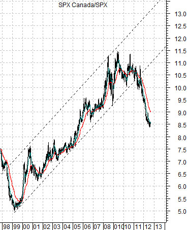
All of which makes the chart at bottom chart all the more intriguing.
The chart shows the ratio between Canada’s S&P/TSX Composite Index to the S&P 500 Index. This is the trend for Cdn equities- which benefit from stronger commodity prices- to U.S. equity prices.
The S&P 500 Index rose against the Nikkei from 1990 to 2000.
The S&P/TSX Comp. rose against the S&P 500 Index from 2000 to 2010.
The S&P/TSX Comp. rose against the Nikkei from 1990 to 2011. We show a shorter-term view on page 5 today.
Our point? It might be that if we are still in a deflationary trend… which sector or theme is most likely to spend the next decade under pressure? Our thought is that it is related to Canada and the commodity cyclicals and that it can be seen through the falling ratio on the chart below.