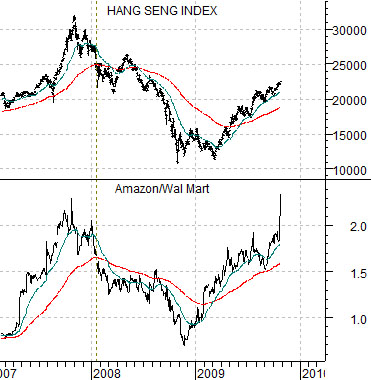
Below we show a comparison between Hong Kong’s Hang Seng Index and the ratio between the share prices of Amazon (AMZN) and Wal Mart (WMT).
The argument is that the AMZN/WMT ratio trends with the Hang Seng Index and Shanghai Composite Index. In other words… the stronger AMZN is relative to WMT the better the trend for the Asian equity markets.
At the end of last week the share price of AMZN gapped higher confirming the rising trend for Asian share prices. If there is a caveat to the story it would be that share price ‘gaps’ for AMZN in both October of 2008 and July of this year have marked key turning points for the Asian markets. A negative trend began to develop at the end of October last year following the release of AMZN’s third quarter earnings while the recent peak for the Shanghai Comp. in early August was reached a week or so after the release of Amazon’s earnings in late July.
The point? If AMZN continues to push higher then the Asian trend is alive and well. If, similar to October of 2008 and July of 2009, AMZN fails lower this week then we can make a tenuous case for downside pressure on the Asian markets.
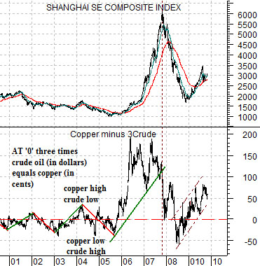
Below right is a comparison between the Shanghai Composite Index and the spread or difference between copper futures (in cents) and crude oil futures (in dollars times three).
The argument is that the price of copper tends to swing up and down relative to three times crude oil. In other words there are times when copper is ‘high’ relative to crude oil and other times when it is ‘low’ but in general it moves back and forth through the ‘0’ line on the chart.
Asian growth tends to go with ‘strong’ copper prices so a rising trend for the Shanghai Comp. is associated with a rising spread line. Notice that over the past few months as the Shanghai Comp. has struggled the spread has rolled over somewhat in response to rising crude oil futures prices. Aside from a short-term sell off for AMZN we are watching for any indication of a return to weakness in ocean dry bulk shipping rates (chart on page 4) as well as a return to a declining trend for the spread between copper and crude oil futures.
Equity/Bond Markets
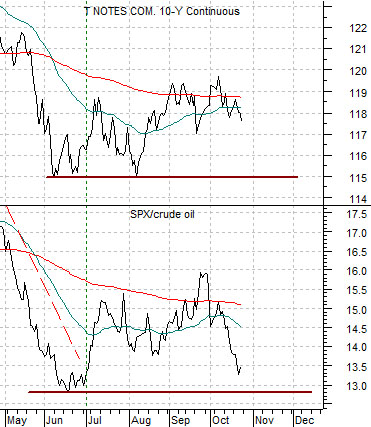
Below is a comparison between the U.S. 10-year T-Note futures and the ratio between the S&P 500 Index (SPX) and crude oil futures.
The argument is that the bond market trades with the SPX/crude oil ratio. In other words the stronger oil prices are relative to the stock market the greater the upward pressure on yields and downward pressure on long-term Treasury prices.
The chart shows a ‘good news/bad news’ perspective. The bad news is that the break above 75 by crude oil futures over the past two weeks in response to close to a 10 million barrel decline in U.S. energy inventories is pulling the SPX/crude oil ratio lower and putting downward pressure on bond prices. The gold news is that the ratio is still above the June lows and once it makes a bottom bonds tend to resolve higher.
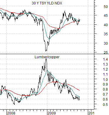
Below is a comparison between 30-year Treasury yields and the ratio between lumber and copper futures.
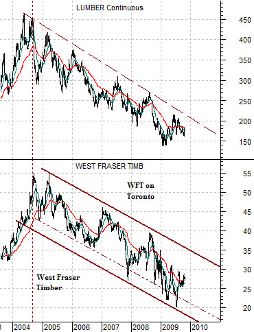
Below we compare the share price of Canada’s West Fraser (WFT on Toronto) with lumber futures.
This is one of the relationships that continues to bother us. The trend for lumber prices turned lower back in 2004 as heating oil futures prices broke up through the highs set back at the start of the 1980’s. In 2004 lumber prices turned lower along with West Fraser, a year later the U.S. home builders began to weaken, and by 2007 the sub-prime real estate-related crisis hit the financial sector. The point is that lumber prices led to the down side while copper and crude oil prices remained stronger into 2008. Our expectation was that a recovery would begin with strength in the sectors that had been mired in multi-year bearish trends but the reality has been that the last sectors down were the first sectors to recover. Weakness in lumber relative to copper went with rising long-term Treasury yields into 2008 and has gone with rising Treasury yields through much of the 2009. The point? Recessions are supposed to mark key trend changes but to date it still appears as if the pre-crisis trend- the trend that likely created the crisis in the first place- is still intact.
