The Fed began to tighten credit conditions in mid-2004. We grant that a number of sectors turned lower that year as short-term yields started to rise but the bulk of the cyclical themes held positive until late 2005 or into the spring of 2006.
The point is that short-term interest rates rise in response to strong cyclical growth and usually take a good 18 to 24 months to choke off economic momentum.
We mention this because while China took the first tentative steps towards credit tightening in January of 2010 it only began to raise interest rates last October.
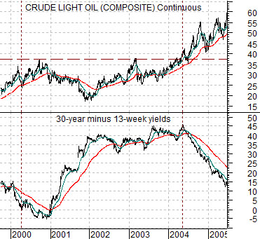
Below is a chart comparison between crude oil futures and the spread or difference between 30-year and 3-month Treasury yields from 1999 into 2005.
Our argument has been that interest rates were forced higher in 2004 in response to crude oil futures prices rising to new all time highs. If one had abandoned long positions in cyclical assets during the second half of 2004 the next three years would have been somewhat miserable.
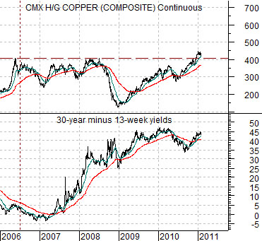
Below is a chart of copper futures and the spread between 30-year and 3-month Treasury yields from the current time frame.
The chart shows that copper futures rose to new all time highs during the final quarter of last year. In a sense the argument here is that copper is one of the markets that appears to be applying upward pressure on Chinese interest rates in a manner similar to way that energy price strength pushed U.S. rates upwards in 2004.
In general… history has shown… that the time to turn truly bearish is not at the start of a trend towards rising short-term interest rates but rather at the end of it. Usually the final rate hike goes with a flat or inverted yield curve similar to the U.S. in 2000 and 2007. That is obviously not the case today as the yield spread holds at close to its recent peak.
Obviously the trend is going to be bumpy but from a macro perspective we are still looking for something closer to the autumn of 2012 before recent rate hikes start to dig in to the recovering cyclical trend.
Equity/Bond Markets
On the one hand… the S&P 500 Index could easily decline down to around 1250. On the other hand… those relationships that we have been using that have tended to go with or even lead the SPX are still positive. Or, perhaps, if not exactly positive then not clearly negative.
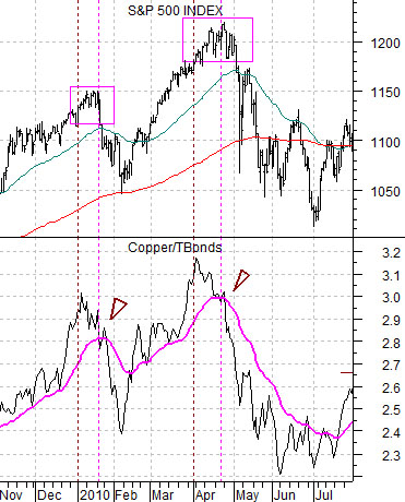
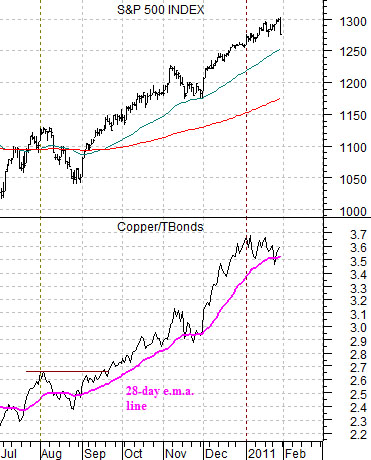
Below is a chart of the S&P 500 Index and the ratio between copper futures and the U.S. 30-year T-Bond futures.
The copper/TBond ratio has ‘led’ the SPX through the recovery. The ratio has tended to peak just ahead of the SPX and, as recently as last June, has bottomed several weeks before the broad equity market.
Our argument has been that if the copper/TBond ratio falls back to and then below the moving average line on the chart then the SPX will tend to decline. The chart below right shows that the ratio made a quick foray below the moving average line last November and again this month followed almost immediately by downward pressure on the equity markets.
The point, however, is that while a decline by the ratio through the moving average line tends to be a ‘sell’ signal it is also fairly obvious that a rise up through the moving average line serves as a ‘buy’ signal. With copper prices failing to buckle last Friday in the face of dollars strength and equity markets weakness the ratio punched back above the moving average line.
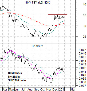
Below is a comparison between 10-year Treasury yields and the ratio between the Bank Index (BKX) and S&P 500 Index (SPX).
As mentioned (fairly often) 10-year yields are still stuck between about 3.3% and 3.5%. Notice that yields turned higher last October around the time that China first increased interest rates. If China is early in the process of tightening credit then we are still in the early stages of upward pressure for long-term U.S. yields which means… perhaps… that the relative strength recovery for the banks is still in the very early stages as well.