The broad consensus, we understand, is that the dollar is going to decline and interest rates are going to rise. Since the markets tend to reflect the views of the many the weak dollar/weak bond market theme has dominated the recent trend.
We tend to focus more on trend changes instead of the trend itself for two reasons. First, because there really isn’t any challenge associated with identifying the obvious and second, because every now and then the consensus gets it wrong.
If the commonly held belief is that the dollar will fall while interest rates rise then risk is associated with either a stronger dollar or weaker interest rates. Fair enough.
The current trend is focusing on the cyclical themes because that is what works best when interest rates are rising. The trend is skewed towards foreign markets and commodity prices because these tend to do well when the dollar is weaker. To be long commodity cyclical or BRIC-related assets is therefore the same as being short the dollar and the bond market.
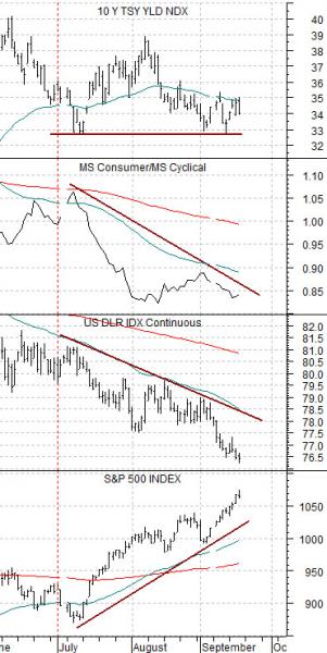
The problem or, perhaps, potential problem is that long-term Treasury yields are not rising. The saving grace is that they are also not falling. 10-year Treasury yields hit 4% in June and touched just below 3.3% in July and September so as long as yields remain within these two extremes we can not argue with the ‘cyclical’ theme.
The chart at right shows, by the way, that the consumer/cyclical ratio tends to rise as yields decline. The ratio was stronger through much of June following the peak for yields and has been no worse than flat since early August after 10-year yields rose back up to just below 3.9%.
Our point today has nothing to do with whether the S&P 500 Index will rise or fall if the dollar or bond market is weaker or stronger because it can and has responded positively and negatively to any combination of dollar and bond price strength or weakness. Our point instead is that investors have scurried back to the pre-bear market themes of foreign and commodity markets growth and while this makes perfect sense as long as the bond market and dollar are trending lower… it wouldn’t take much at present to swing the trend from cyclical to consumer (i.e. falling yields) or from foreign to domestic (stronger dollar).
Equity/Bond Markets
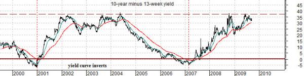
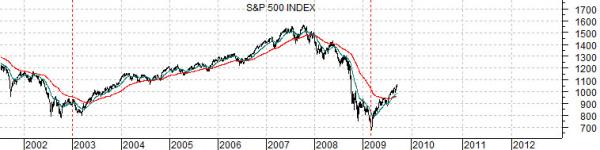
We will do something a bit more upbeat today. Below are charts of the S&P 500 Index (SPX) and the yield spread or difference between 10-year and 3-month Treasury yields.
The yield spread between 10-year Treasuries and TBills is generally viewed as one of- if not the- best indicators of the slope of the yield curve.
The charts have been offset or shifted in time by two years. We have set up the broad U.S. stock market (SPX) below the yield spread with a lag of exactly two years. This means that we are comparing what happened in the bond market at one point in time with what transpired in the equity markets two years later.
The argument begins with the observation that an inverted or negative yield spread is the monetary equivalent to pulling the parking brake up while driving a speeding car. When the yield spread moves below the ‘0’ line it has inverted which simply means that long-term yields have fallen below short-term yields.
The yield curve typically inverts after a long period of expansion as central banks raise the cost of borrowing to slow economic activity. Any combination of rising short-term yields and falling long-term yields can push the yield spread below the ‘0’ line. Over the past few decades every recession has followed an inverted yield curve although every yield curve inversion has not led to a recession. Suffice it to say that once the yield spread pushes below the ‘0’ line something negative is likely going to happen. Fair enough.
On the flip side a very high or wide yield spread is supposed to accelerate economic activity. In recent years anything close to 35 (3.5%) has represented flat-out monetary stimulus.
We argued, by the way, a month or two ago when 10-year yields were pushing back to towards 3.9% that we expected bond prices to rise.
Why? Because as long as TBill yields held very close to 0% and the yield spread continued to have an upper extreme below 4% it was difficult to imagine or justify 10-year yields north of 4%.
Returning to the chart comparison we should work through our various points as quickly as possible.
The yield spread went negative in 2000 at the peak for the Nasdaq as well as copper and crude oil prices. The inverted yield curve hammered economic growth lower which led to an equity bear market.
Two years after the inversion the equity market turned positive once again.
The yield spread trended near the highs between 2002 and 2004 with a range between 20 (2%) and 38 (3.8%). The spread began to decline in 2004 once heating oil and crude oil futures broke to new highs.
With the benefit of hind sight we know that both the dominant trend and the eventual source of economic stress was related to energy prices during the previous cycle. We know this because the yield spread began to trend lower at the exact point in time when heating oil futures pushed to new highs in 2004.
Our next thought is that if the S&P 500 Index is lagging the yield spread by roughly two years then the early 2009 bottom makes some sense because it lines up rather nicely with the low point for the yield spread in early 2007.
We can also make the argument that, all things being equal (which they never are but we can always hope), the next point in time when one should start to get seriously bearish about the equity markets is after the yield spread makes its next inversion. Unless something completely unexpected comes to pass at minimum that will be quarters if not years into the future.