We first encountered the term ‘constructive’ with respect to an analyst’s view of a stock price about 25 years ago. At the time our initial response was… huh? If the analyst was positive then that is how it should have been written. If the view was neutral or negative then, for the sake of clarity, the applicable term should have been used. What in the world did ‘constructive’ really mean? We surmised that it reflected a ‘weak positive’ view but, then again, we might have been mistaken.
We mention this as preamble to our point today. A couple of days ago we wrote that we ‘really weren’t that negative’ on the equity markets. We suspect that our choice of words makes the term ‘constructive’ seem crystal-clear by comparison.
Our problem is and was that while we were clearly in a declining equity markets trend we could dig up a number of perspectives that suggested that prices were closer to a bottom than most might have suspected. Being ‘close to a bottom’ is not exactly the same thing as shifting into a rising trend and… there is always the issue of trends running in one direction through to the end of a quarter. In the midst of a negative trend early in the month of June… is not exactly the ideal point in time to start tossing out bullish comments.
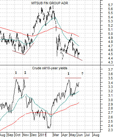
We have dragged forward a chart that we ran in yesterday’s issue to help explain what we mean by the observation that we aren’t all that negative.
The chart compares the share price of Japanese bank Mitsubishi UFJ (MTU) which we tend to use to represent the ‘laggard cyclicals’ and the ratio between crude oil futures prices and 10-year Treasury yields.
Between early October and the first few days of November last year strength in crude oil combined with a weaker trend for yields pushed the ratio up to just under 3.5. Twice. The small ‘double top’ marked the low point for MTU and as the ratio turned lower in November the markets swung rather briskly back into the financials.
The current situation is somewhat similar to last October. A rising trend for oil prices combined with a falling trend for yields has pushed the ratio back up very close to 3.5. In fact as we moved into the middle of this week the ratio was doing a fairly good job of making a second push back up to the highs to create yet another ‘double top’.
Our point, we suppose, is that if you view the markets through ‘the news’ then we can well understand why it makes sense to head for the exits. If you view the markets strictly through trend lines drawn on basic charts then a case can be made for a ‘sell in May and get out of Dodge’ approach. However… if, as we are prone to do, you view the trend for the equity markets through the combination of pressures from some of the other markets (in this case energy prices and yields) then the sense is that we could be very close to a bottom.
For all that has changed in the Eurozone and Middle East since last autumn the reality is that the markets staged a mid-quarter pivot last November and may be set to do something quite similar this month. With the crude oil/10-year yields ratio still being pushed upwards we really can’t be positive quite yet even as our inclination towards a bearish point of view fades. Perhaps we should simply have written that we are constructive on the equity markets and left it at that.
Equity/Bond Markets
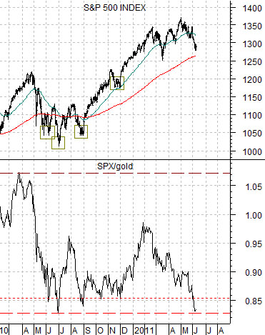
Carrying on with our initial point today we have included a chart comparison between the S&P 500 Index (SPX) and the ratio between the SPX and gold futures prices.
In a sense… the markets have simply been elevating asset prices on a sector-by-sector basis.
To explain… at the end of June last year with 10-year yields just below 3.0% the price of gold ranged between 1200 and 1250 with the SPX somewhere below 1050. Close to a year later yields are once again just below 3.0% (last seen at 2.998%), gold is flirting with 1550, and many feel that the equity markets are at risk with the SPX declining below 1300.
The point is that in terms of the price of gold the SPX is as low today as it was at the end of the second quarter last year. We pointed out earlier this week that the four ‘best entry points to the long side’ for the SPX since the first quarter of 2010 were reached when the ratio between the SPX and gold declined to or below .85.
The argument is that for as much as things have changed in the last year… in many respects nothing has changed. U.S. employment data has been weaker, Middle Eastern concerns may have added 20% or so to the price of crude oil, and Greece is, as usual, teetering on the edge of insolvency. Yet 10-year Treasury yields close to 3% are no higher or lower than they were in June of 2010, corporate earnings have expanded, dividend payouts have been raised, and the prices of copper, gold, and crude oil are proportionately higher. One can always find a reason to be bearish- especially after the kind of run that we went through over the past twelve months- but, as mentioned on today’s first page, we are still quite constructive with respect to the equity markets at current levels.
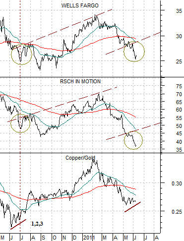
Below we have pulled forward a chart comparison that showed on the fifth page of yesterday’s issue. Today seems like a somewhat appropriate time to recycle a few charts.
Keeping in mind that at the end of June last year the SPX/gold ratio made a bottom close to .83 (i.e. the SPX was trading around 83% of the price of gold futures) and early this month the ratio is once again back to similar levels… we wanted to show what happened in early July to a couple of key stocks- Wells Fargo (WFC) and Research In Motion (RIMM).
The ratio between copper and gold hit bottom in early June of 2010. It bounced once, twice, and then three times and as the new quarter commenced the share price of WFC rallied back up to the 200-day e.m.a. line while RIMM snapped up to its 50-day e.m.a. line.
Our thought was that the copper/gold ratio may have bottomed somewhat earlier this year and after bouncing a couple of times into the current month we could be on the verge of the kind of rally that might carry WFC back up towards 29- 30 with RIMM adjusting higher towards 45- 47.
There is always a chance that, similar to last year, the initial rally might fail but, then again, from the perspective of the crude oil/10-year Treasury yields ratio shown on page 1 today… we could be closer to the kind of bottom that has ‘legs’ than even we expect.