Tuesdays are tricksy. Markets have a tendency to move counter-trend on Tuesdays creating the impression of a trend change or reversal. In general we try not to get overly excited about anything that happens on a Tuesday although we are quite sure that eventually we will pay for this particular piece of skepticism.
Anyway… we wanted to go back over the relationship between copper and crude oil prices today because, in a sense, it provides the answer to many of the questions that one should probably be asking these days.
First is a chart of the spread or difference between copper futures and crude oil futures (copper in cents minus 3 times the price of crude oil in dollars) and the spread between the share prices of Target and Wal Mart (TGT minus WMT).
We have probably made this overly complex but the idea in essence is that ‘copper stronger than crude oil’ (i.e. spread line rising) means ‘risk on’ and ‘growth on’.
The chart starts in 2002 and runs through the end of last year. We are not showing the current year because the dominant theme for energy prices has shifted from West Texas Intermediate (WTI) over to gasoline futures and Brent crude oil futures. Our argument, by the way, is that the trends for gasoline and Brent are virtually identical (page 3).
So… a rising spread between copper and crude oil goes with ‘growth’ and ‘growth’ has tended to go with Target outperforming Wal Mart. The argument over the past number of years has been that the trend shift away from growth that eventually led to the banking system collapse in 2008 started with the decline below ‘100’ for the spread. Whether ‘100’ is important is somewhat moot but it does lead us into the next chart.
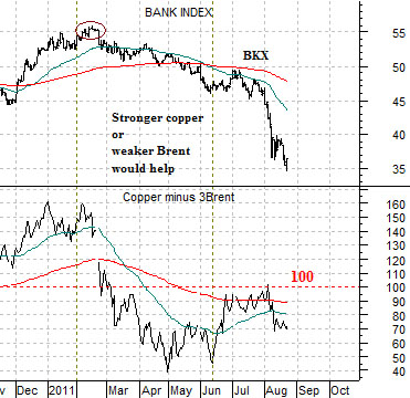
Below we show copper minus 3 times Brent crude oil futures and the Bank Index (BKX). A falling spread line denotes weaker growth and this tends to weigh on the cyclical bank shares. On the other hand notice that the spread has actually been rising since the end of April. Our view- expressed on occasion in past issues- has been that it may take a move above ‘100’ for the copper minus 3Brent spread to turn the trend back to ‘risk on’ and ‘growth on’. So far the spread seems to be having a particularly difficult time getting back on the north side of the ‘100’ line.

Equity/Bond Markets
Our focus today is the spread or difference between energy prices and copper prices. The argument is that when copper prices are stronger than crude oil prices the cyclical trend tends to be positive.
The inclusion of a ‘line’ for the spread around ‘100’ is somewhat arbitrary but to explain let’s use some hypothetical numbers based on copper futures and Brent crude oil futures.
If, for example, copper is 4.00 (400) and Brent crude oil is 100 (times 3 equals 300) then the spread is ‘100’. Copper higher than 4.00 or Brent crude below 100 would potentially lead to a positive outcome.
The issue is that energy prices are not ‘weak enough’ while copper prices are not ‘strong enough’. In other words we could get to a bullish resolution either through weaker energy prices or stronger copper prices.
Copper tends to trend with Asian growth. Rising copper prices reflect the kind of trend that centers around economic expansion in China.
Crude oil prices tend to weigh on economic growth. Rising gasoline prices, for example, act as a negative for consumer spending as a larger share of after tax income is diverted to paying for fuel and energy costs.
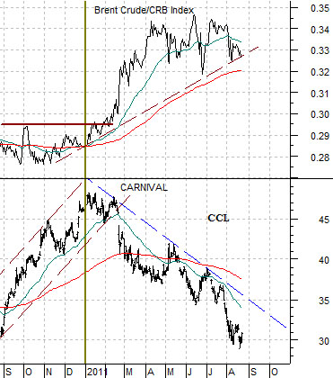
Next is a comparison between the ratio of Brent crude oil and the CRB Index (Brent crude oil prices relative to general commodity prices) and the share price of cruise ship operator Carnival (CCL). We will use CCL to represent the cyclical energy ‘users’ theme.
The chart suggests that the rising trend for Brent crude oil- related, we believe, to the problems in Libya- has gone directly with the falling trend for Carnival. The argument would be that a decline in Brent crude oil and gasoline futures prices would lead to a recovery in the energy ‘users’ sector. To date the trend for the Brent crude/CRB Index ratio is still higher.
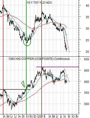
Below we feature a comparison between 10-year Treasury yields and copper futures.
The basic argument here is that any time the price of copper stops rising… long-term yields start to fall. Copper peaked in April of 2010 and again in February of this year. In both instances as soon as copper stopped making new highs the trend for 10-year Treasury yields began to collapse.
The chart also shows that the correction for yields in 2010 began with the peak for copper prices and ended as copper pushed to new highs around the end of September. If we were ‘caught’ by the recent markets action it was largely because of this chart. Notice that copper traded up to 4.50 at the end of July and was within striking distance of new highs (which would turn yields back to the upside).
The correction for copper back from 4.50 to under 4.00 has gone with a huge decline in 10-year yields from 3% to 2%. One way that we could get to the other side of the current state of crisis would be through a swing back above 4.60 by copper over the next few weeks.
In summary… stronger copper prices would help while weaker Brent crude oil prices would also work as a positive.