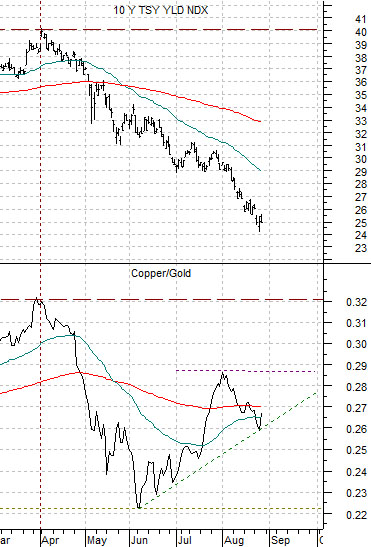
We are starting off today with a fairly simple chart comparison. At right is a chart of U.S. 10-year Treasury yields and the ratio between copper futures and gold futures.
In general the ratio between copper and gold trends with yields.
Our view is that in the current cycle copper represents Chinese and/or emerging markets growth while gold represents the state of economic growth in the developed markets. A rising copper/gold ratio represents the sort of China-centric growth theme that has dominated the markets over the past number of years and, all things being equal, should lead to rising interest rates.
Of course all things aren’t equal all of the time.
The decline in U.S. 10-year Treasury yields that began in April represents renewed fears regarding a ‘double-dip’. Within the U.S. equity markets the economically sensitive ‘cyclicals’ underperformed the broad averages with home building-related sectors leading the decline followed by consumer-related, industrial-related, and China-related.
The point is that falling yields set the stage for the selling of economically-sensitive assets with the focus of much of the pressure on the U.S. housing market. As both present and anticipated future yields decline the incentive to hold dollars and euros softens which leads to a flow of money into gold as an alternative store of value.
U.S. weakness leads to falling yields and rising gold prices. China growth goes with rising copper prices and ultimately higher yields. The ratio between copper and gold tends to represent the overall trend for long-term yields. Fair enough.
Our point? Over the past few months money has rushed into bonds in response to slowing U.S. growth led in large part by softening U.S. housing market. The trend fails to take into account the other end of the spectrum- Asian growth- which has apparently been strengthening as copper prices have risen. If we get to the point where the copper/gold ratio rises above the peak made in July or, perhaps, all the way back up through the top set at the end of March… our expectation is that the trend for yields will pivot from its current focus on the weakness link (U.S. housing) back to the strongest link (Asian and emerging markets) as yields swing higher.
Equity/Bond Market
The chart below compares the S&P 500 Index with the ratio between copper futures and the U.S. 30-year T-Bond futures.
Each market cycle seems to have a different commodity versus bonds relationship. The current situation appears to be locked in to the copper/TBonds ratio.
The way things seem to be evolving the U.S. equity markets are going to be lifted by the Asian/emerging markets theme. We can make the case (and will in a moment) that the pivot is rapidly approaching. The bottom line in terms of the chart at right is that while copper prices were somewhat higher yesterday the bond market remained firm. If we finally get to the point where bond prices start to weaken even as copper prices continue higher the SPX could swing back to the recent highs in a hurry.
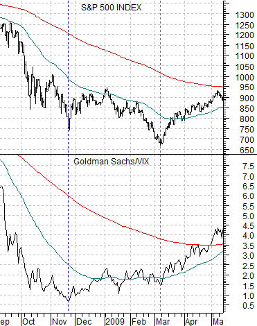
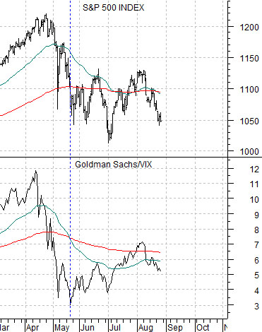
We are going to examine the CBOE Volatility Index (VIX) in a bit more detail on the following page but for now we are going to return to a chart that we showed on many occasions back in late 2008. Below and below right are comparisons between the S&P 500 Index and the ratio between Goldman Sachs (GS) and the VIX.
The argument in 2008 was that the GS/VIX ratio trended with the SPX and should bottom with or ahead of the U.S. equity market. The chart below shows that the ratio made a low in November of 2008 while the SPX finally reached bottom the following March.
The current situation (below right) is quite similar. In fact the recent drive lower by the SPX through August looks a bit like the final decline in this index from February into March of 2009.