The markets continue to fixate over the U.S. debt limit saga and ongoing concerns with respect to Greece. Until these issues fade away or investors discover some new theme to chase we expect that the markets are going to remain somewhat choppy and defensive. As usual when the focus shifts to near-term crises we push our perspective out towards longer-term macro views.
March 11, 2011 compared to September 11, 2001. Just something we were pondering this week.
The major trend changed early in the last decade following the September 11, 2001 terrorist attacks. More than ten years later we can look back and note that this event marked the start of a trend that pulled money away from developed markets towards emerging economies, favored the energy producers over consumers, and led into a very long and painful stretch for the airlines.
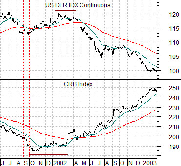
Below is a chart of the U.S. Dollar Index (DXY) futures and the CRB Index futures from mid-2001 into the start of 2003. The low point for commodity prices was reached in October of 2001 with the dollar rising to a final peak early in 2002.
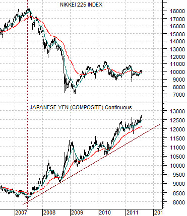
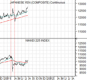
Next we show a comparison between the Japanese yen futures and the Nikkei 225 Index. This chart starts at the end of 2010.
We have lined up 9-11 with the March 11, 2011 Japanese quake, tsunami, and nuclear meltdown.
One of recurring arguments is that the broad themes from the 1970’s forward have favored commodities, Japan, tech, and then back to commodities. While ‘Japan’ may represent a broader consumer cyclical theme the idea was that the recovery in the Nikkei in 2011 might appear somewhat similar to the start of the bull market for the CRB Index back in 2001.
With this in mind we were wondering whether Japan’s crisis this year might ultimately serve as the pivot point for the current decade’s trend in the same general manner as 9-11. If so… then it might make sense to argue that a new trend will begin to gain traction once the yen begins to weaken in a manner similar to the dollar back at the start of 2002.
Equity/Bond Markets
Below is a chart comparison between the Nikkei 225 Index and the Japanese yen futures. Essentially we have taken the first page chart and extended the time frame back into 2006.
The markets are always capable of doing the unexpected but the message that we get from this chart is that a rising yen is a negative for the Nikkei. In other words the yen has trended higher as the Nikkei has trended lower since 2007. Our intuitive leap is that the Nikkei might represent the next major bullish theme but the trend will not start to gather momentum until the yen turns back to the down side.
On the one hand we have the Nikkei (representing the broader consumer cyclical theme) and yen moving in opposite directions. On the other hand the same battle is being waged between the major banks and gold prices. Given that the yen and gold made new highs yesterday… the point is that we are still somewhat ahead of the next potential trend change.
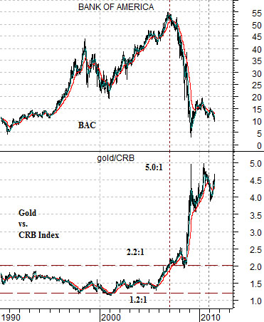
Below is a comparison between Bank of America (BAC) and the ratio between gold and the CRB Index.
The gold/CRB Index ratio ranged from around 1.2:1 up to 2.2:1 from the early 1980’s into 2007. The collapse of the banks in 2007 went with a powerful rally in the gold/CRB Index ratio that peaked around 5:1.
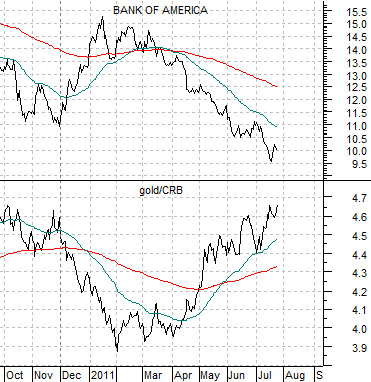
Lastly we feature the same comparison over a shorter time period.
Our argument is that this is a very tight relationship. Strength in banks goes with weakness in gold while weakness in the banks leads to strength in gold.
At present the trend for gold on both an absolute and relative basis appears higher which is helping to add pressure to the share price of BAC.