We have thrown a bunch of variables into the pot with regard to how far and how long the current equity markets correction/consolidation will run. Over the next couple of pages we will attempt to run through them once again.
One of the arguments is that the S&P 500 Index will remain under pressure until crude oil prices find the next meaningful bottom. By ‘meaningful bottom’ we are referring to a price level that will hold for at least a few months.
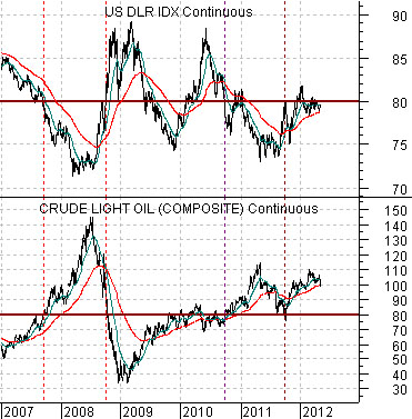
This raises the question of exactly how low is ‘low’ for crude oil. One answer would be ‘around 80′ while another points to something closer to ’65’.
Below is a comparison between the U.S. Dollar Index (DXY) futures and crude oil futures.
The idea here is that when the U.S. dollar is below 80 the price of crude oil tends to be above 80. And vice versa. The rallies above 80 for oil prices from 2007 into 2008 as well from 2010 into 2011 occurred as the dollar sank beneath the 80 level. With the U.S. Dollar Index hovering close to the 80 level the relationship would come back into balance if oil prices declined back to 80.
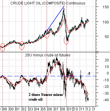
Next is a comparison between crude oil futures and the spread between two times the share price of Suncor (SU) and crude oil.
The chart suggests that bottoms for crude oil prices since 1999 have been made when the spread has risen up to around -5.
Suncor is currently trading a bit north of 30 so if we double the share price we would get something in the vicinity of 60. In order for the spread to rise back up to -5 (assuming a flat share price of SU) crude oil futures prices would have to fall to around 65.
The point is that crude oil prices could bottom out around 80 assuming a flat dollar and a bullish response from the equity markets (i.e. Suncor’s share price rising from 30 to 37). Another alternative would be a decline down to 65 assuming a flat share price response from SU and ongoing strength in the U.S. Dollar Index.
Equity/Bond Markets
The above point is that the equity markets could remain under pressure this month until oil prices find a defendable bottom. There are, however, a couple of other factors that might influence the markets in the meantime.
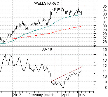
Below is a chart of Wells Fargo (WFC) and the point spread between the 30-year and 10-year Treasury futures.
The 30- 10 is simply one way to view the trend for bond prices. The stock market is correcting as bond prices are rising so we would expect to see cyclical pressures until the 30- 10 spread turns back to the down side.
The key, however, may well be the share price of Wells Fargo. We view WFC as a ‘leader’ and note that the stock market began its consolidation as WFC’s share price stalled just below the 35 level.
Now… consider the chart of WFC. If the share price had been declining in significant price chunks then it would make sense to view the current situation as a major equity markets correction. But that hasn’t happened as of yet. WFC has simply flat-lined between 33 and 34 while finding short-term support on the rising 50-day e.m.a. line.
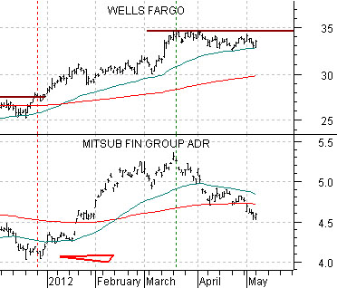
At middle is a comparison between WFC and the share price of Mitsubishi UFJ (MTU). We are using WFC to represent the financial ‘leaders’ and MTU to represent the ‘laggers’. With this in mind it makes some sense to argue that unless the ‘leaders’ are actually leading by making new price highs the path of least resistance for the ‘laggers’ is lower. Which, of course, has been the case since mid-March.
The argument is that if WFC breaks nicely above 35 then the broad U.S. large cap stock market should turn back to the upside.
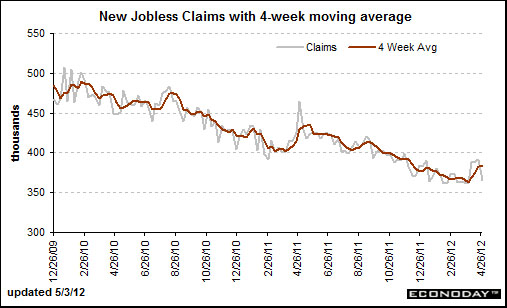
Below is a chart from Econoday.com of the U.S. weekly jobless claims numbers which are reported each Thursday.
Our view is that the trend for weekly jobless claims may well be the most important ‘driver’ of the cyclical trend in the current cycle. Claims peaked in March of 2009 at the same time that the stock market bottomed.
In 2010 and 2011 the cyclical trend remained positive through the first quarter of the year. From there cyclical asset prices turned bearish until a bottom was made in the autumn.
The chart suggests that claims made a bottom in March or April of the past two years and then didn’t make significant new lows until some time closer to September.
The potential for a bullish surprise may come from the weekly jobless claims numbers. The sticking point is around 350,000 so last week’s decline back to 365,000 was encouraging. If 2012 follows a different path than 2010 and 2011 it may well be as a result of a return to a downward trend below 350,000 for the weekly U.S. jobless claims numbers.