We are going to start off with an assumption. We will assume that the long-term U.S. interest rates peaked at the end of this year’s first quarter and are now trending lower. Our premise might be tested tomorrow following the release of the monthly U.S. employment data but we will worry about that next week.
There was a time- pre-1998- when the bond and equity markets trended in the same direction. Falling interest rates are always a positive for equities, of course, but the reason rates are declining is typically a negative. Post-1994 in Japan and post-1998 in the U.S. the trend for equities has mirrored that of long-term yields.
If yields peaked at the start of April and are now resolving lower then the base trend for the equity markets should be lower as well. That is the bad news.
The good news is that there is typically a ‘lag’ between the high point for yields and the cycle top for the equity markets.
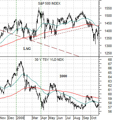
Below we show the S&P 500 Index and 30-year Treasury yields from the end of 1999 through October of 2000.
Yields reached a high at the start of the first quarter of 2000 and as yields declined the stock market corrected lower. Our sense, by the way, is that this may be very similar to the current situation as bonds and equities decline in tandem.
The SPX rallied sharply into the end of March and then held near the highs through August.
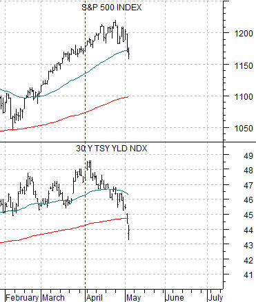
Below is a comparative view of the SPX and 30-year yields from the end of 2008 into 2009. This is the same argument from the opposite perspective. The trend turned positive for equities when yields hit a low at the end of the fourth quarter of 2008 but… the stock market continued to decline for another two months before turning upwards in March.
The current situation is shown at the top of the next page. The argument is that if yields are lower then equities are lower as well even though we could still see an impressive amount of strength in the S&P 500 Index into June. For now the index is likely looking for a moving average to serve as support. If the 1170 area fails to hold then the next stop could be closer to 1100.

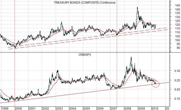
Equity/Bond Markets
The rather large chart at the bottom of the page is probably quite important even if we have a hard time getting our minds around its point.
The chart compares the U.S. 30-year T-Bond futures with the ratio between commodities and equities from the end of 1998 to the present day.
The chart suggests that from 1999 into 2010 bond prices have been trending with the ratio of commodities to equities. This is actually the opposite of what one would expect but… that is what the chart argues.
At bond price lows the commodity/equity ratio has also bottomed. This was particularly true in early 2000 and mid-2007. Note that early 2000 marked the start of the collapse for the Nasdaq while mid-2007 was point in time when the banks began to implode.
The odd thing about the chart is that peaks in the CRB/SPX ratio have occurred at very important points in time but have resulted in a very different outcomes. The ratio peaked in late 2002 and early 2003 at the low point for the equity market and then rose to a peak once again in mid-2008 as the collapse in commodity prices cratered the stock market.
One of the best arguments in favor of a bottom for bond prices comes from the position of the CRB Index/SPX ratio relative to its rising support line. With the ratio at support the ongoing trend is starting to lift bond prices.
IF the CRB Index/SPX ratio holds the rising trend line (and it may not if the longer-term trend is changing) then- perversely- the only way the equity markets can rise is if the commodity markets rise as well.