Over the past few weeks we have fixated somewhat on the bond market. Our view, by the way, is that the yield curve should start to flatten out, that the spread between long-term Treasury yields and shorter-term yields is as wide as it is going to get.
The problem is that the yield spread can tighten in one of two ways. Either short-term yields rise or long-term yields decline. Either emerging markets growth pulls the developed economies into a steep recovery necessitating a series of central bank rate hikes or the sluggish recovery and yawning output gap exhibited by OECD countries reigns in the momentum of emerging markets growth.
Our ‘lean’ is towards curve flattening and the outcome that we favor is lower long-term yields. The ‘stop’ on this view would be a clear recovery in U.S. distillate (i.e. diesel fuel) usage. Thus the importance of the weekly energy inventory reports.
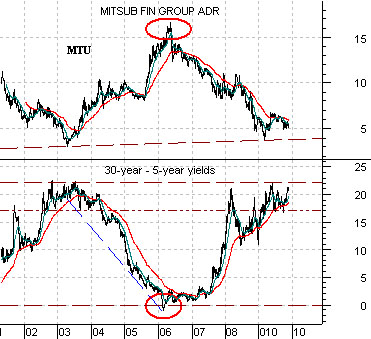
Below we show a comparison of the spread between 30-year and 5-year U.S. Treasury yields and the share price of Japanese bank Mitsubishi UFJ (MTU). The argument is that when the yield spread is high or wide- as it is at present- the share price of MTU will be at a bottom- which it likely is at present. When the yield spread tightens in towards ‘0’ MTU should be at some sort of price peak. The last time the yield spread was as wide as it is at present was back in 2003 and it approached the ‘0’ level during 2006.
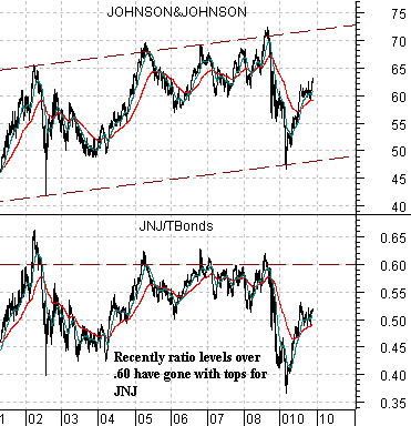
Below we return to a chart comparison that we have used on at least a half a dozen occasions over the past few years. The chart shows the share price of Johnson and Johnson (JNJ) and the ratio between JNJ and the U.S. 30-year T-Bond futures.
The argument here is that within what has essentially been a ‘dead flat’ trend the share price of JNJ rises to a peak every year or two. Through the ‘weak dollar/strong commodity’ trend that developed back in 2002 the peak for JNJ has consistently been reached when the JNJ/TBond ratio rises above .60.
The point is that with the TBond futures on the high side of 120 the upside target for JNJ remains somewhat north of 70. If the yield curve flattens through lower long-term yields and higher bond prices then the upward push by JNJ towards 70 makes some sense.
Why have gold prices been so strong? The easy answer is the weaker U.S. dollar. Another answer- one that we have shown on a number of occasions- is that the major U.S. banks have been under pressure. A third answer is just a bit more complex.
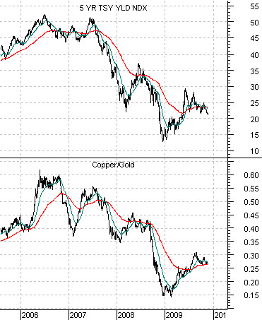
Below is a comparison between 5-year U.S. Treasury yields and the ratio between copper and gold futures prices. The argument is that when yields are declining the copper/gold ratio will fall. In other words when interest rates are working lower gold prices will outperform copper prices.
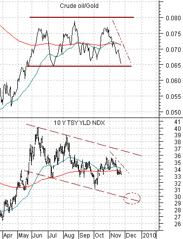
Below is a comparison between 10-year Treasury yields and the ratio between crude oil futures and gold futures.
This chart makes the case that gold prices will rise relative to crude oil prices when long-term yields are declining.
If we put both of these charts together we get a fairly simple answer for why gold prices have been so strong. The reason is that copper and crude oil prices have been rising at the same time that yields have generally been under pressure. What is pushing gold prices upwards is the combination of falling interest rates and a lack of weakness in base metal and energy prices. As long as yields are grinding lower the only way that gold prices will slow their ascent is if copper and crude oil prices lead to the down side.
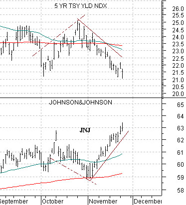
Below is a comparative view of 5-year U.S. Treasury yields and the share price of Johnson and Johnson (JNJ).
This is a fairly simple chart-based message. Around the start of this month the trend for yields turned lower. When the trend turned lower the share price of JNJ started to rise. As long as yields keep moving to the down side the trend for JNJ should be positive and if this continues on for long enough then eventually the JNJ/TBonds ratio will rise above .60.