Today’s chart presentation is based on something that we read but could barely remember and couldn’t find once again once we realized that it actually might work nicely as a chart-based argument. To explain… some time during Wednesday morning we were scanning various financial pages and came across an article detailing the horrendous losses at Hitachi or NEC or some other consumer tech company. The article, we recall, included the observation that the financial mea culpa for this sector was similar to that of the telecom companies back in 2002.
We were intrigued by the comparison because it suggested not only that the consumer tech companies were approaching the bottom of the cycle but also, given the lag between a cycle peak and cycle bottom, that downward pressure must have started some time back.
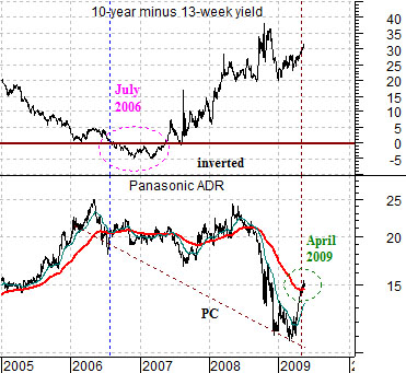
As we mulled the idea that ‘consumer tech’ today might be similar to ‘telecom’ back in 2002 we decided to build a chart comparison based on the share prices of Panasonic (which reports quarterly earnings tomorrow) (PC) and Cisco (CSCO).
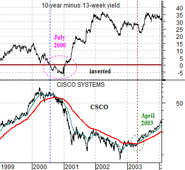
The next question was… how to show ‘pressure’? Our thought was that it would be reasonable to use the shape of the yield curve or, as our charts depict, the size of the yield spread between 10-year and 3-month Treasuries.
When the 10-year minus 13-week (3-month) yield spread declines below the ‘0’ line it means that long-term yields are lower than short-term yields which means, of course, that the yield spread has inverted. This is the monetary equivalent of slamming your foot on the brakes of your car.
We lined the charts up based on the point in time in 2000 and again in 2006 that the yield curve inverted. Interestingly enough both cases occurred right at the end of July. This meant that the early 2000 peak for Cisco lined up with the early 2006 top for Panasonic.
The point, we suppose, is that Cisco finally pushed back above its 200-day e.m.a. line around the end of April in 2003 while PC did almost exactly the same thing at the end of April this year. If history were to repeat exactly (which, of course, it never does) the positive trend for the consumer cyclicals would remain intact through into the start of next year’s first quarter.
Equity/Bond Markets
As one might surmise… we keep track of far more charts and relationships than we could possibly show on a daily basis. Quite often our views are structured based on perspectives that have never graced our pages so we thought we would show something new today.
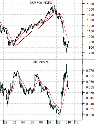
The idea is that at times we get something absolutely right but miss on the logical extension that we draw from the argument. To explain… at right we start off with a chart of the S&P 500 Index (SPX) and the ratio between the share price of biotech giant Amgen (AMGN) and the SPX.
For those gracious enough to recall we spent much of last year arguing in favor of the ‘biotech’ theme. We focused primarily on Amgen, Genentech, and the biotech etf (BBH). The BBH is actually a ‘HOLDR’ which means that when Roche purchased DNA the owners of the BBH were returned capital equivalent to the shares of DNA held by the BBH. This simply means that the BBH was 175 one day and about 89 the next which effectively ruins all of the chart-based relationships that we had set up.
Returning to the chart at right we can see that the AMGN/SPX ratio has touched up to or above .07 on three occasions this decade. When we were focusing on biotech the ratio was well below .04 which means that through the stock market’s collapse in 2008 the relative value of AMGN compared to the broad market more than doubled.
The conclusion that we drew from this chart was that the SPX has a tendency to be at or near a bottom- as was the case in early 2003- when the ratio approaches .07. In fact… when the ratio reached this level in both 2003 and 2005 it served to help propel the stock market higher for the next couple of years.
Our point is that based on this one relationship we felt somewhat comfortable with the idea that the S&P 500 Index was working into a bottom towards the end of 2008 even if things became a bit dramatic into March. Our problem has been that we put this chart together with another chart to create something of a ‘if this, then that’ argument.
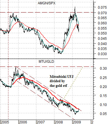
At bottom right we show the AMGN/SPX ratio and the ratio between Japanese bank Mitsubishi UFJ (MTU) and the gold etf (GLD).
The logical leap was that, give or take a month or three, the peak for the AMGN/SPX ratio in 2005 occurred at the peak for the financials/gold ratio. In other words if the AMGN/SPX ratio was going to swing back up to the previous peak then the financials/gold ratio should be ready to do much the same thing.
We were consistently positive on the biotechs last year and we have been equally consistent with our negative view on gold prices. The twist is that we aren’t so much negative on gold as positive on almost any relationship that has gold as a denominator. In other words we could argue that the most positive outcome for MTU- in terms of this ratio- would be flat gold prices. Why? Because if the gold etf (last seen around 90) were to hold at current levels while the ratio rose from around .07 back up to .30 the share price of MTU would have to push back into the high 20’s.
In any event… MTU reports earnings on Monday and in a perfect world it requires rising 10-year Japanese yields to really push it upwards. Yields are last seen at 1.45% which is some distance below the 2.0% level that we have marked as a true trend changer.