The further we get away- in terms of time- from the last equity bear market the more confident investors become. Still… when the markets have collapsed in recent memory it is natural to feel some level of anxiety each time prices start to sell off.
While the equity markets will typically go through any number of small corrections within a rising trend the issue is whether one is nimble enough to get out at the first indication of weakness and then back in again at lower levels. For the ‘buy and hold’ types who enrich their lives by NOT watching each and every trade… the key lies in trying to figure out when a small correction is due to become a much larger correction.
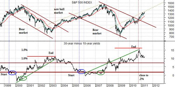
One way to parse the nature of the trend is through the relationship between the S&P 500 Index and the yield spread. For our analysis today we are using the yield difference between 30-year and 10-year Treasuries to represent the yield spread.
The argument is that a negative or ‘bear’ trend begins once the yield spread declines down to close to ‘0’. We use a level of around .2% to represent ‘close to ‘0’’. In both 1999 and 2005 the yield spread fell to the point where 30-year yields were barely above those of 10-year yields.
This event marks the ‘bottom’ of the downward sloping trading channel that will define the next bear market and may, in fact, be quarters of years ahead of the actual cycle peak.
The top of the channel is formed when the yield spread starts to move higher. This tends to occur when growth has slowed to the point where downward pressure is beginning to be exerted on short-term yields.
The argument is that even though the S&P 500 Index turned upwards in March of 2009 it didn’t break through the top of the channel to mark the end of the bear market until the yield spread peaked in the autumn of last year. From here the SPX will likely make repeated corrections over time back to or even below its 200-day e.m.a. line while maintaining a bullish trend. At minimum… the trend should remain positive until the yield spread finally sinks back close to 0%. If history is kind enough to repeat then this would represent a form of investment ‘last call’ affording traders the opportunity to knock back as many gains as possible before the yield spread begins to swing back to the upside.
Equity/Bond Markets
When we look at the markets we tend to focus on what is up as well as what is down. A stronger copper price trend, for example, will tend to go with platinum prices moving upwards faster than gold prices. When gold is stronger than copper yields should be declining and if yields are weaker… which sector is providing much of the pressure?
Are energy prices rising and, if so, is the trend driven by gasoline prices? Within the equity markets is there a major sector that is still declining while another is rising? Does that fit in the currency trends and does it make sense with respect to what is going on in the commodity markets? Beyond that is there anything that really makes no sense? Are yields falling even when everyone knows that growth and inflation are rising? Is it widely accepted that the dollar has to be weaker even though the relationships argue that it is starting to look better? Are the equities of the oil producers confirming the trend of energy prices? Are the consumer stocks weaker or stronger than the cyclical sectors and does that jibe with what the bond market is doing?
In any event… we are constantly digging for the kind of inconsistencies and divergences that might indicate that a trend is changing. Most times- given the tendency of trends to last far longer than you might possibly expect- these divergences appear only to disappear but every now and then… you get an early warning of an important change.
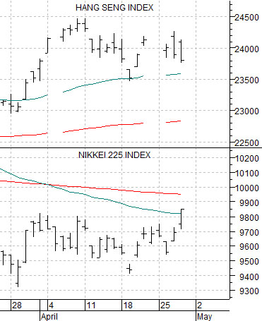
For some inexplicable reason we thought that this topic deserved a protracted preamble so suffice it to write that our intention was to provide some sort of explanation for the chart at top right.
The chart compares the Hang Seng Index from Hong Kong with the Nikkei 225 Index from Japan.
On the one hand Japan and Hong Kong are both situated in ‘Asia’. On the other hand… they tend to represent quite different trends. That is why there are quite of number of Asian ex-Japan indices.
Perhaps the best way to explain why we are showing a short-term view of the Hang Seng Index versus the Nikkei 225 Index is to skip to the chart at bottom right.
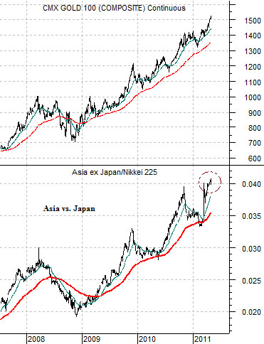
The chart compares the ratio of the Asia ex-Japan Index (Dow Jones Asian Pacific ex-Japan) to the Nikkei 225 Index with the trend for gold futures.
The argument is that the trends are almost identical. Any trend that continues to favor Asia ex-Japan over Japan should go with rising gold prices.
Over the past few trading sessions the Nikkei has been a bit better while the Hang Seng has been marginally weaker. While a ‘few trading sessions’ are hardly statistically significant this is the kind of minor divergence that we tend to pay attention to. The argument is that if gold prices are ever going to decline the trend change should go with some kind of internal shift within the Asian equity markets that would lead to a return to relative strength by the Nikkei.