The financial press and Washington politicians seem somewhat torn these days. Goldman Sachs- the company that profited on both the way up and the way down from the housing bubble- makes for a convenient target for blame but there are still those who would argue that this is all the fault of Alan Greenspan. The same empty suits who complain that the Fed is not doing enough when times are slow are more than happy to point fingers, pound tables, and conjure up stern visages when the cameras swing their way. Such is life.
If anyone asked us who is really to blame we might agree that Goldman profited from the trend while Greenspan accentuated it but a case can be made that the origins of the debacle date back to the Clinton administration.
New York Times Sept. 30, 1999- ‘In a move that could help increase home ownership rates among minorities and low-income consumers, the Fannie Mae Corporation is easing the credit requirements on loans that it will purchase from banks and other lenders… Fannie Mae, the nation’s biggest underwriter of home mortgages, has been under increasing pressure from the Clinton Administration to expand mortgage loans among low and moderate income people and felt pressure from stock holders to maintain its phenomenal growth in profits… In addition, banks, thrift institutions and mortgage companies have been pressing Fannie Mae to help them make more loans to so-called sub-prime borrowers.’
Anyway… markets move in cycles and when the cycles are long enough they become trends and when the trends last long enough they become irrefutable reality. Until, of course, the trend runs into the even more irrefutable reality that it is merely a part of a cycle.
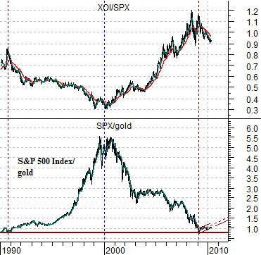
At top right we show a comparison between the ratio of the S&P 500 Index (SPX) and gold futures and the ratio between the Amex Oil Index (XOI) and the S&P 500 Index (SPX).
From 1990 into 2000 the trend favored equities over gold and most everything relative to the oil stocks. From 2000 into roughly 2009 the trend reversed with gold and the oil stocks outperforming the broad market.
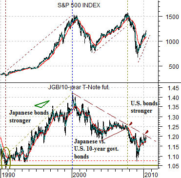
Below right is a comparison between the S&P 500 Index and the ratio between Japanese and U.S. 10-year bond futures (JGB/TNotes).
From 1990 into 2000 the trend favored Japanese bonds over U.S. bonds while the S&P 500 Index trended higher. From 2000 into 2009 the trend reversed as U.S. bonds rose relative to Japanese bonds.
Equity/Bond Markets
Our view is that the markets theme that included the stock market rising relative to gold, the oil stocks underperforming, and the Japanese bond market rising on a relative basis from 1990 to 2000 was a trend hidden within the confines of a cycle. By this we mean that it was most certainly a trend- anything that runs in virtually a straight line for ten years has to be a trend- but it was also part of a cycle that spent the next ten years working back in the other direction.
So what? If you think of this just in terms of the SPX/gold ratio you can see that the markets were literally ‘taking turns’. First large cap U.S. stocks moved higher and then gold prices caught up. The problem is that investors are quite fond of extrapolating a trend so arguments that gold is headed to 2000, 5000, or 10,000 make as much sense as predictions back in the late 1990’s that the SPX was going to 2000, 5000, or 10,000.
Once again… if you look at the SPX/gold ratio you can see that it started back in 1990 below 1:1 and ended in recent months back below 1:1. Two different trends within a single cycle.
Anyway… we have digressed to the point where we have almost lost our way today.
There are two ways to view the markets. You can ride the ageing trend or position for the next trend.
Why did the price of gold rose 5-fold? Because it was catching up with the S&P 500 Index. Why were oil prices so strong over the last decade? Because the oil stocks had lagged the market over the previous decade. If the ‘next trend’ is dominated by those sectors that have been left behind then the best sectors to own might well be those that have been left for dead for ten or twenty years which, we suppose, explains our interest in the Japanese stock market.
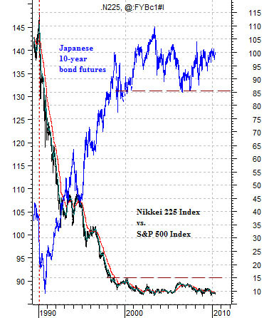
At top right is an overlaid chart of the ratio between the Nikkei 225 Index and S&P 500 Index (in black) and the Japanese 10-year bond futures (in blue).
The argument in favor of the Nikkei begins and ends with the premise that one of these days (years, decades, etc.) the Japanese bond market is going to start to decline. The closer the JGBs get to 90 the more interesting the argument becomes because this will suggest that Japan is at long last exiting from deflation. In terms of the chart a decline in the JGBs towards 90 should go with an expansion of the Nikkei/SPX ratio back up towards 15:1.
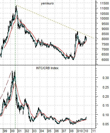
Below right we feature a comparison between the cross rate between the Japanese yen and the euro and the ratio between Intel (INTC) and the CRB Index.
The argument is that the trend that dominated the markets over the past decade has come to an end. Why? Because the commodity-based trend was predicated on dollar and yen weakness relative to the euro. With the euro now weak and getting weaker one would expect to see ongoing relative strength- perhaps for years to come- from the tech stocks compared to raw materials prices.