In our usual roundabout way we are going to attempt to explain why we continue to hold to a positive view on the cyclical trend. By ‘cyclical trend’ we are referring to a general theme of economic expansion that tends to lift prices in economically sensitive sectors.
Our journey begins back in the 1980’s. The argument is that the cyclical trend interacts with the bond market on two different time frames. Since this is not the easiest of topics to get a handle on we are going to type more slowly than usual.
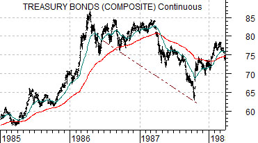
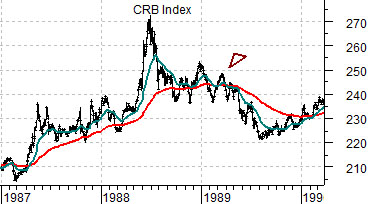
Below is a comparison between the U.S. 30-year T-Bond futures and the CRB Index. The TBonds are shown from the start of 1985 into 1988 while commodity prices- as represented by the CRB Index- are shown with a two year lag from the start of 1987 into 1999.
The ongoing argument is that the cyclical trend lags the bond market by roughly two years. Rising bond prices through 1985, for example, helped to create the positive trend that dominated the markets through 1987.
The bond market rose to a peak in 1986 following the collapse in crude oil futures prices that started towards the end of 1985. The lagged impact on the cyclical trend catapulted the commodity markets up to a top in 1988.
Now… this is where it gets a bit harder to follow.
Strength in the bond market through 1985 and into 1986 drove the cyclical theme higher through 1987. Strength in cyclical asset prices- especially in the equity markets- during 1987 led to a sharp decline in bond prices that year. In other words the bond market in 1985 reached forward two years later to drive asset prices higher and the rising trend for asset prices in 1987 caused bond prices to collapse.
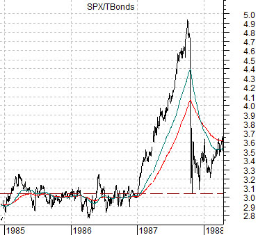
The combination of rapidly rising equity prices and equally rapidly falling bond prices in 1987 caused the ratio between the S&P 500 Index and TBond futures to soar upwards until… the stock market ‘crashed’. We can see how this played out using the SPX/TBond ratio shown at bottom right. The point, however, is that the equity markets represented collateral damage within the context of the interplay between bond prices and the cyclical theme. The stock market may have ‘crashed’ in 1987 but the CRB Index continued to rise well into 1988 before finally swinging negative during the first half of 1989. With this in mind we will push on to the present situation.
Equity/Bond Markets
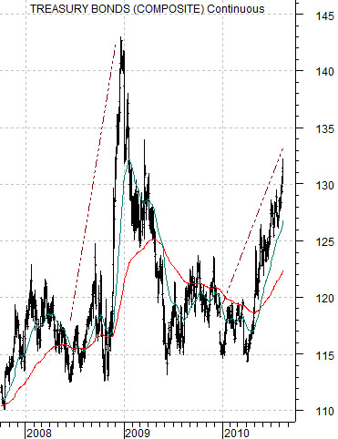
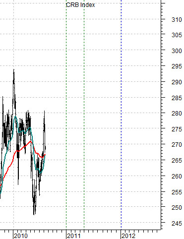
Below we show the U.S. 30-year T-Bond futures while below right is a chart of the CRB Index. The charts have been lagged or offset by two years as we equate the trend for the CRB Index with what was happening to long-term Treasury prices two years earlier.
Let’s see if we can’t make our basic point as clearly as possible. Bond prices interact with the cyclical theme on two different time frames.
Rising bond prices today, for example, reflect negative cyclical growth but tend to create a positive cyclical trend roughly two years later. Falling bond prices tend to reflect strong cyclical growth even as the decline in bond prices creates a head wind for the cyclical trend two years into the future.
So… we are holding to a positive view on the cyclical trend TODAY because the bond market was very strong during the second half of 2008. The chart shows that the 30-year T-Bond futures were quite choppy in terms of prices during the third quarter of 2008 before spiking to a peak through the final quarter.
Our view is that if the CRB Index represents at least one of the markets or themes that represents the ‘cyclical trend’ then we should lead towards a positive view through the end of this year or, perhaps, into the spring of 2011. Much of next year may prove to be challenging before the rising trend for bond prices in 2010 starts to impact the growth themes out in 2012.
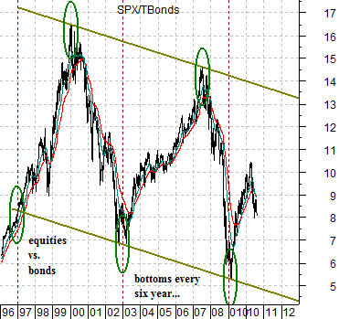
Above we showed how the ratio between equities (SPX) and bonds (U.S. 30-year T-Bond futures) spiked higher in 1987 and then collapsed as the stock market ‘crashed’ under the pressure from falling bond prices. Below we show a longer-term view of this ratio.
The idea is that from around 1997 up to the present time frame the SPX/TBond ratio has pushed back and forth within a fairly well defined channel with bottoms reached every 6 years. If the pattern persists the ratio should resolve back up towards 13:1 or so into 2012. At this juncture the ratio may break through the channel top marking the end of the correction for large-cap U.S. stocks or… decline back to the channel bottom into 2015.