To cut to the chase the markets are essentially in a trend that is pushing bond prices higher in response to weakness in crude oil. In this kind of trend gold prices rise relative to crude oil which was definitely a feature of trading at the end of last week.
The issue that we have been struggling with has to do with the assumption that the S&P 500 Index will decline as commodity prices move lower and bond prices ramp higher. Obviously we only have to look back to 2008 to see how this can happen but… we don’t believe that this kind of outcome is a given.
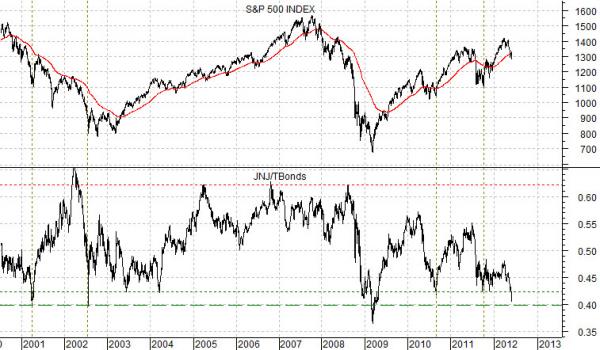
Below is a chart comparison between the S&P 500 Index and the ratio between Johnson and Johnson (JNJ) and the U.S. 30-year T-Bond futures.
The JNJ/TBond ratio reflects the relative strength of the defensive or non-commodity stocks compared to bond prices. The premise is that this ratio will tend to be ‘low’ at bottoms for the S&P 500 Index.
The point is that cyclical weakness is lifting bond prices and while the equity markets are under pressure the higher bond prices rise the more attractive the defensive stocks become.
The chart covers the time frame from 2000 to the present day. It shows that over the past 12 or so years the JNJ/TBond ratio has tended to bottom out around or above .40. The only exception to this was through a short period of time in March of 2009.
The argument is that as long as energy prices are weaker and bond prices are rising the downward pressure on cyclical asset prices should start to create offsetting bullish pressure on the defensive growth sectors. With the JNJ/TBond ratio now very close to the lowest levels in more than a decade a case can definitely be made that the S&P 500 Index is closer to a bottom than a top.
Equity/Bond Markets
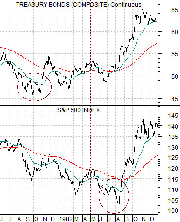
We are going to do a spin on the Decade Theme today. At right is a chart from 1981- 82 of the U.S. 30-year T-Bond futures and S&P 500 Index.
The TBonds bottomed in the autumn of 1981 while the SPX made its final decline from May into August of 1982. The bond market ‘led’ the stock market higher.
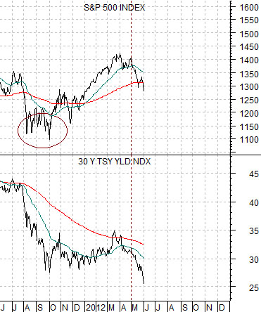
Below we feature a chart of the S&P 500 Index and 30-year Treasury yields from 2011 into 2012.
In 1981- 82 the bond market bottomed ahead of the stock market. We have set up the charts to make the case that this time around the stock market could be leading long-term interest rates. The SPX bottomed in the autumn of 2011- similar to the low point for bond prices in the autumn of 1981- and we are currently mired in a downward trend for yields that looks somewhat like the SPX in the second quarter of 1982.
The point? In 1982 bond price strength helped swing the stock market higher. This time around equity markets strength may be required to turn long-term yields back to the upside.
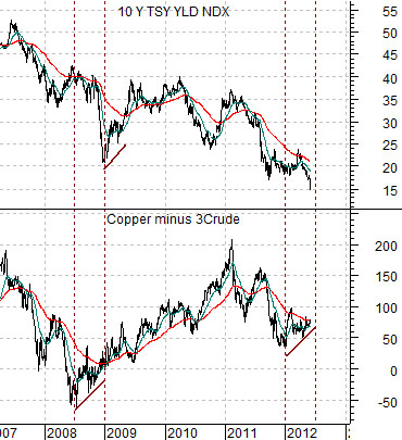
Below is a comparison between 10-year U.S. Treasury yields and the price difference between copper (in cents) and crude oil (in dollars time 3).
So… how far along are we within the current correction? The argument here is that we could be through the bulk of it by the end of the quarter.
In 2008 the spread between copper and crude oil turned higher through the second half of the year leading yields by six months. The price of copper has been rising relative to crude since the start of 2012 and is now back to the moving average lines in a manner quite similar to the final month of 2008.