The cyclical trend was somewhat stronger in trading yesterday in anticipation of something positive following the conclusion of today Federal Open Market Committee meeting. Bond and gold prices were a bit weaker along with the U.S. dollar while the banks, materials stocks, and commodity prices moved higher.
Will this time be different?
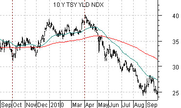
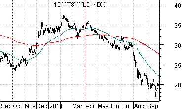
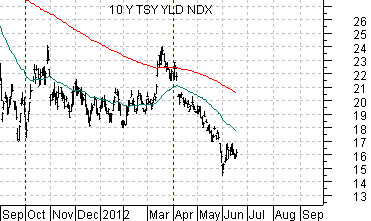
Just below are three charts of 10-year U.S. Treasury yields. The chart at top right runs from 2009 into 2010, the next chart from 2010 into 2011, while the bottom chart starts in the autumn of 2011 and runs to the present time frame.
We are attempting to show the trend for long-term Treasury yields through 2010 and 2011 so that we can explain why we have been leaning towards some kind of cyclical bottom later this summer.
Prior to 2008 the markets were following a fairly consistent trend that included energy price strength from January through June along with rising interest rates and then cyclical weakness and falling yields over the last six months of the year. As we will show on the following page this trend led to a variety of outcomes for the S&P 500 Index.
In recent years the trend appears to have shifted somewhat with cyclical bottoms into September and peaks around the end of March. The pattern of six months up and six months down hasn’t changed however.
From the autumn of 2009 through March of 2010 yields rose. From there yields turned lower until a bottom was reached in September.
From September of 2010 through the first quarter of 2010 yields once again pushed upwards only to turn lower through the second and third quarters.
With a flat to rising trend for yields from September of 2011 into March of this year our expectation has been that yields would remain ‘heavy’ for another few months. If this time is going to be different… then watch for weakness in gold prices, some kind of rally for crude oil, and a surprisingly strong push upwards for the major banking stocks.
Equity/Bond Markets
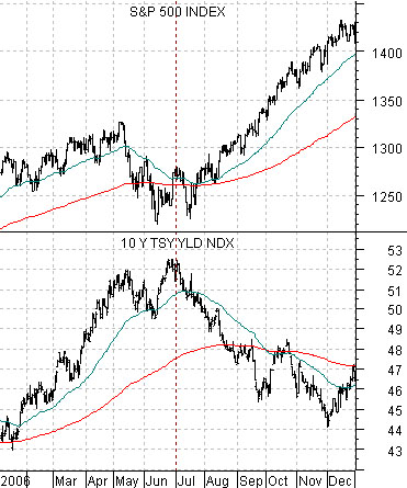
Below is a comparison between 10-year Treasury yields and the S&P 500 Index from 2006.
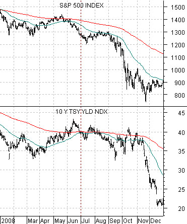
Next we feature the same comparison from 2008.
The stock market has buckled with yields on a fairly consistent basis but we only have to go back to 2006 to see that this is not always the case. In that year the pivot lower for yields sent the stock market soaring as pressures from rising copper prices began to abate.
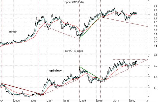
We have included a chart that shows that one of the features of mid-2006 was a relative strength ‘roll’ from base metals to agriculture prices. As the ratio between copper and the CRB Index peaked the ratio between corn and the CRB Index began to ramp upwards.
Of course… in 2008 the decline in long-term yields through the second half of the year went with absolute carnage in the equity and commodity markets. The point is that it is very difficult to ‘black box’ the markets. In one cycle stock prices will rise in response to a lessening of upward pressure on interest rates while in another cycle falling yields will point to economic deterioration and tumbling asset prices.
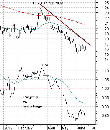
Below is a comparison between 10-year yields and the ratio between Citigroup (C) and Wells Fargo (WFC).
The argument is that the ratio between the lagging banks (C) and the leading banks (WFC) is fairly tightly tied to long-term yields. A sustained upward thrust for interest rates should go with a period of rather marked outperformance by some of the major financials.