U.S. short-term interest rates began to rise in mid-2004 while similar European yields did not turn upwards until the fourth quarter of 2005. U.S. interest rates started to fall in 2007 while short-term European yields did not turn lower until late 2008. The point is that Europe’s decline into crisis and eventual recovery is lagging that of the U.S.
The argument has been that the trend over the past decade has included the flow of money away from developed markets towards those of the Asian, Latin, and emerging markets. If there is a shoe yet to drop then the lag between U.S. and Eurozone yields suggests that it is more likely to come from an extension or expansion of crisis in Europe rather than a double-dip in the U.S.
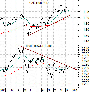
The chart below compares the sum of the Canadian and Australian dollar (CAD plus AUD) futures and the ratio between crude oil and the CRB Index.
The general view has been that rising energy demand from the emerging economies will eventually be met with demand recovery in the developed markets with crude oil futures prices rising back into triple-digits.
The chart shows that crude oil prices have been weakening relative to general commodity prices for much of the past three quarters. Typically the crude oil/CRB Index ratio trends with the commodity currencies so the chart shows a 9-month divergence that has yet to be resolved.
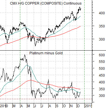
Another view is featured further below as we compare copper futures with the spread between platinum and gold futures prices. In the kind of strong economic recovery that favors copper prices one would expect to see a similar chart pattern for the platinum minus gold price spread.
Our point has been that divergences often tend to run for about nine months. Once we dig into the first quarter of 2011 it should be time for the trends shown through these charts to resolve towards strength (rising crude oil and platinum) or weakness (declining commodity currencies and copper). Our sense is that the outcome may have much to do with the pace of the recovery in both the U.S. and Eurozone.
Equity/Bond Markets
Dec. 18 (Bloomberg) — The extra yield Treasury investors demand to hold 10-year notes over 2-year securities touched the widest since February on speculation an extension of tax cuts will spur growth and increase deficits.
The benchmark 10-year yield rose this week to the highest level in seven months as retail sales advanced in November more than economists forecast and the Federal Reserve said the recovery is continuing.
We are quite fond of something that we term the ‘Decade Trend’. The argument is that there have been certain similarities between the various years of the past few decades with asset price peaks made in the ‘0’ year (1980, 1990, 2000), bottoms reached in the ‘2’ year, crisis and crashes occurring in the ‘7’ and ‘8’ years, and frantic recoveries in the ‘9’ year.
But… what about the ‘1’ year? With 2011 just around the corner we thought that we would show two prior examples.
The ‘1’ year is a difficult year to read. Our work suggests that the ‘next trend’ begins in the ‘1’ year even though it tends to show up in earnest some time early in the ‘2’ year.
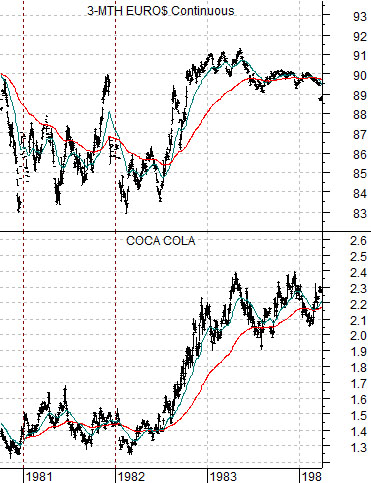
The chart just below compares the share price of Coca Cola (KO) and 3-month eurodollar futures from 1980 into early 1984. We are using Coke to represent the post-commodity trend that favored financial asset prices and the consumer growth stocks through the 1980’s.
With the benefit of hindsight we can argue that the rising trend for Coke began around the end of 1980 even thought the stock price held near the lows into early 1982. The key for the recovery was interest rates which reached 17% (a price of 83 for 3-month eurodollars) in late 1980 and again in the first quarter of 1982.
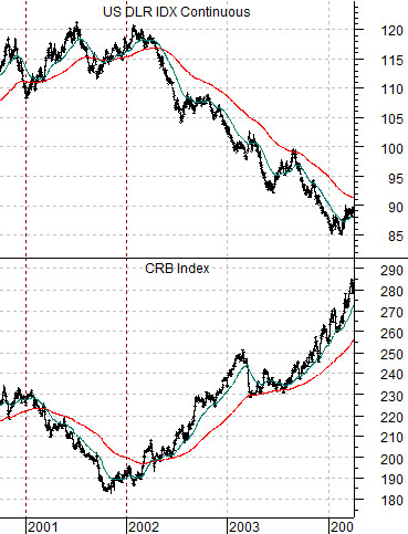
Next is a comparison between the CRB Index (commodity prices) and the U.S. Dollar Index (DXY) futures from 2000 into early 2004. Once again we are examining the way the ‘new trend’ organized itself through the ‘1’ year (2001).
While rising commodity prices dominated the trend through the 2000’s the reality was that prices did not start to move higher until the dollar finally began to weaken at the start of 2002. The ‘1’ year- similar to 1981- was actually more of a consolidation or counter-trend time frame.
In no particular order our points are as follows:
Asset prices tend to peak at the start of a new decade.
While the focus may be on the equity market the two examples shown on this page argue that some other market (interest rates in 1981 and the dollar in 2001) drove the trend.
The ‘1’ year has tended to be somewhat negative with the markets gaining momentum in the ‘2’ year.
If we had to guess we would argue that the trend through much of coming decade will feature strength in the U.S. dollar and weakness in long-term bond prices which, of course, describes the most negative set of intermarkets for gold prices.