Well… it seems like a reasonable time for some dollar strength.
The markets have been trading off of the relative outperformance of energy prices for so long that it is almost inconceivable to many that this kind of trend could actually end. The Amex Oil Index (XOI), for example, was more than a 1000 points lower than the S&P 500 Index back in 2000 and over 200 points above the SPX in 2008. Yesterday the XOI closed about 50 points lower than the SPX. We have included a chart of this on page 4.
In any event we have included a chart of the U.S. Dollar Index (DXY) futures, gasoline futures, and Brent crude oil futures below.
The point here is that the peak for gasoline and Brent crude oil prices was made at the end of April at the same point in time that the U.S. Dollar Index reached a low. The chart suggests that there is a fairly strong inverse relationship between the dollar and the two strongest components of the energy sector.
We have argued that the dollar is essentially ‘flat’ at present and used the action in silver and gold futures prices as the foundation of our view. The fact that silver prices have not made new highs since the end of April suggests that the dollar is no longer falling while the extension of the rally for gold prices suggests that the dollar has not yet begun to rise.
Returning to the chart at right our view is that both Brent crude and gasoline futures prices are very close to the top edge of the downward sloping trading channels that began to form once the dollar made a low around 73 at the end of April. Each time the dollar starts to show even the slightest bit of weakness the markets bid energy prices higher and , in terms of the trend, we note that the dollar is still below its 200-day e.m.a. line while Brent and gasoline futures are above their moving average lines.
What we get out of all of this is that the current trend is somewhat uncertain. If the markets are going to cut short the recent rally in energy prices then this is about the time when the DXY futures start to get serious about moving up to and then through resistance in the low 76’s.

Equity/Bond Markets
The bond market makes a bullish case for equities. Really.
We showed a version of this argument in yesterday’s issue but thought that we would run it in terms of the S&P 500 Index instead of copper futures today.
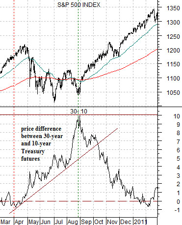
Below is a comparison between the S&P 500 Index (SPX) and the price spread or difference between the 30-year U.S. T-Bond futures and the 10-year T-Note futures from March of 2010 through February of this year.
The 30-10 spread reflects the trend for the difference between the price of a 30-year bond and that of a 10-year bond. The spread will tend to rise or widen when bond prices in general are tracking higher and decline or contract when bond prices are moving lower.
We use the 30-10 spread to get a sense of the overall trend for the bond market. The spread was as low as -15 (i.e. the 30-year price was 15 points lower than the 10-year price) back in 1985 and only managed to get above the ‘0’ line on a consistent basis in 2004. The spread peaked around +14 at the very peak for the bond market in December of 2008.
The argument is that for now the spread seems to be range trading between just under 0 up to around +10.
The equity market has tended to decline when the spread swings up from below 0 through +1 or +2. The bearish trend for stocks continues until the spread reaches a peak and turns lower. The chart at top right shows that while the absolute lows for the SPX were reached at the start of July in 2010 the bullish recovery trend did not begin until the 30-10 spread reached a peak of +10.
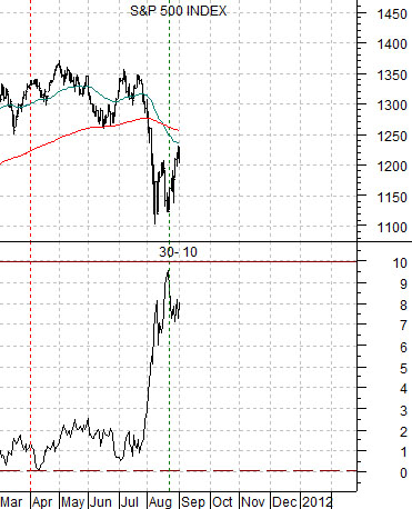
Below we show the same chart comparison starting in March of this year. In essence we are comparing the S&P 500 Index against the bond price spread from March of 2010 forward and March of 2011 forward.
The current chart shows that for a second year in a row the bond price spread has pushed up very close to +10 in late August and that this has gone with a bottom and subsequent recovery for the equity markets.
Another somewhat interesting detail is that the 30-10 spread peaked in August of 2010 and August of 2011 very close to the point in time when the 50-day e.m.a. line crossed down through the 200-day e.m.a. line. Many technicians refer to this event as the ‘death cross’ although we tend to view it as something that happens just before the markets bottom or swing into a bear market rally.
In trading yesterday the 30-year T-Bonds rose 1 12/32 while the 10-year T-Notes gained 18.5/32. This pushed the spread out to just beyond +8.
A bullish outcome would involve a gradual narrowing of the spread as bond prices move lower with the SPX following a similar rising path to the final four months of last year. The risk would be that the bond market finds some reason to surge in price back to or through +10 as the SPX makes yet another test of the recent lows.