We are not sure how the markets will respond to the weekend vote on U.S. health care reform but, either way, it promises to make this week just a bit more interesting than usual.
The entrenched dollar bears remain in apparent denial with regard to dollar strength over the past few months. We suspect that many miss the very key point that the dollar always tends to rise when the U.S. budget deficit expands. Why? Because the huge sums required to finance the deficit creates a flow of capital into dollars.
In any event there will always be those who believe that the dollar is heading towards the scrap heap and that one should load up on gold, ammunition, and canned goods. We take the other side of the trade as we argue that the U.S. began to tighten credit conditions well ahead of the Euro-zone and switched to aggressive easing more than a year before most of its trading partners. First in, first out.
While we could argue that the dollar will continue to rise even as others make the case that this is a bear market rally a more logical approach might be to show what the markets should look like if, as, or when the dollar pushes higher.
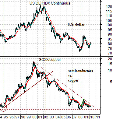
Below we show a chart comparison between the U.S. Dollar Index (DXY) futures (the dollar relative to the euro, yen, sterling, Swiss franc, Swedish krona, and Canadian dollar) and the ratio between the Philadelphia Semiconductor Index (SOX) and copper futures.
A stronger dollar should go with better strength for ‘tech’ compared to base metals prices. If there is one detail within the markets that serves to temper our enthusiasm for the greenback it might well be this one. The SOX has yet to show the kind of strength or, conversely, copper prices have yet to weaken to the point where we can argue that the dollar has clearly turned higher.
Next we return to our chart comparison between the DXY futures and the ratio between biotech Amgen (AMGN) and the Baltic Dry Index (BFI). The ongoing argument has been that a better dollar will go with an improving trend for biotech relative to bulk freight ocean shipping rates. The denominators for both comparisons- copper and the Baltic Dry Index- tend to represent Asian or BRIC-type strength while the numerators- semiconductors and biotech- tend to swing with better developed markets strength.
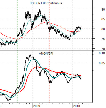
Equity/Bond Markets
We are basically going to be going over a few charts that we have shown on these pages on many occasions in the past. The idea is that we are trying to show what the markets would ‘look like’ if the dollar continued to trend higher.
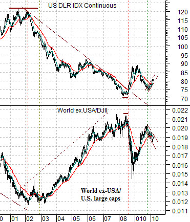
Below is a comparison between the U.S. Dollar Index futures and the ratio between the Morgan Stanley World ex-USA Index and the Dow Jones Industrial Index.
The argument is that a weaker dollar went with relative strength outside of the U.S. large caps. In other words capital flowed away from the U.S. and towards all of the emerging, Latin, Asian, and commodity-producing countries following the start of the recovery post-Nasdaq peak.
The reason this chart ‘fits’ with the semiconductors vs. copper chart on page 1 has, we suspect, much to do with excess capacity. In terms of the internet (telecom) such massive amounts of excess bandwidth were created through the end of 1990’s that the pace of expansion slowed. The market’s response? Find new ways to eat up the band width. The result? YouTube, Facebook, WebTV, e-commerce, file sharing, itunes, smart phones, etc.
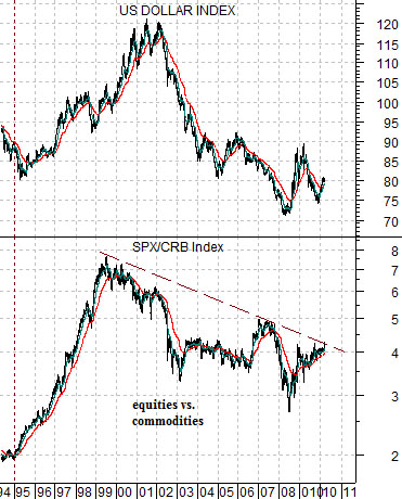
Below we compare the DXY with the ratio between equities (S&P 500 Index) and commodities (CRB Index).
The simple point is that a weak dollar goes with better strength for commodity prices while a stronger dollar favors large cap U.S. equities. While we can not argue that the equity/commodity ratio has clearly broken through resistance… we can at least point out that the trend line that has helped define the trend over the past decade is getting seriously tested this month.
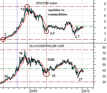
Below we take the SPX/CRB Index ratio and apply to an individual stock. As we have noted in the past the stock price of pharma company GlaxoSmithKline (GSK) has tended to trade so closely over the years with this ratio that we have become tempted to use it literally. If the ratio continues to rise towards 5:1 then the argument would be that the entire large cap pharma sector is in a positive trend as GSK works back up towards 50.