Let’s cut to the chase. A stronger U.S. dollar on rising U.S. short-term interest rates is bullish. A stronger U.S. dollar on falling European short-term interest rates is bearish.
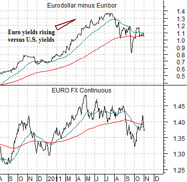
Below is a comparison between the euro futures (the euro versus the dollar) and the price spread between 3-month eurodollar and 3-month euribor futures.
The price spread is rather straight forward. The spread rises as European yields rise against U.S. yields. It falls when European yields decline compared to U.S. yields.
Whether it makes sense or not the markets continue to trade currencies off of yield spreads. As European yields moved higher against U.S. yields the euro rose relative to the dollar. Through the third quarter of this year the Greek debacle put pressure on European yields which narrowed the spread resulting in a weaker euro.
Investors take it as a given these days that dollar strength is a negative because of the impact that a rising dollar has on raw materials prices. We argue, however, that dollar strength is not the issue because what is more important is ‘why’ the dollar is rising. If it is rising due to capital fleeing risk… it is a negative. If it is rising because U.S. growth is improving then it is likely a positive.
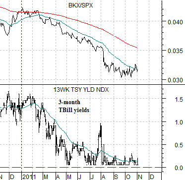
Next we show once again the comparison between 3-month TBill yields and the ratio between the Bank Index (BKX) and the S&P 500 Index (SPX).
The chart shows that the banks have been losing ground relative to the broad U.S. large cap market at the same time that TBill yields have been sucking back towards 0%. Our view is that this is not a coincidence.
At some point in time the BKX/SPX ratio is going to swing back to the upside. When it does it will start to put a small amount of upward pressure on U.S. yields that will build over time into larger pressure until the Fed is forced to raise the funds rate. From this perspective the argument would be that a stronger dollar has the potential to create a bullish outcome if, and only if, the driver comes from real strength in banking share prices.
Equity/Bond Markets
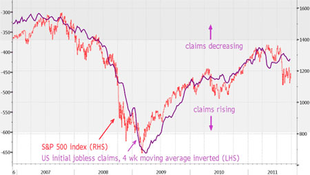
Only on VERY rare occasions do we include charts that we haven’t created. Today will be one of those exceptions.
Every Thursday we get a bit wound up about the weekly U.S. jobless claims report. Last week, for example, we commented that a number below 400,000 could be enough to swing the cyclical trend back into gear. The number reported was a kiss-your-sister 402,000.
We found a chart on moneyweek.com that may have originated with Bloomberg. The chart was run at the end of September so it is about a month out of date but it shows the S&P 500 Index overlaid with an inverted chart of weekly U.S. jobless claims. The argument is that a lower number for weekly claims (i.e. stronger employment) has been closely associated with the trend for the equity markets.
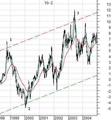
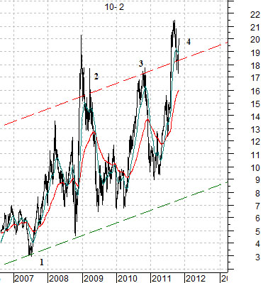
Let’s return to our quest for perspective. Below are two charts of the price spread or difference between 10-year and 2-year Treasury futures.
The 10-2 spread is another way to follow the trend for the bond market. The spread rises when bond prices rise as 10-year prices move upwards faster than 2-year prices. Conversely the spread declines when bond prices trend lower.
The cyclical trend is, more or less, the inverse of the trend for bond prices. Put another way… when the cyclical trend is weak and investors are shunning risk we would expect to see the 10- 2 spread at some kind of peak. When the cyclical trend is at its strongest point with investors certain that growth will continue forever… the 10- 2 spread will tend to be at its channel bottom.
On the chart below we have numbered three points in time. The first is late 1998 which marked the end of the Asian crisis. The second is the first quarter of 2000 which went with the bubble peak for the Nasdaq Composite Index. The third is from the middle of 2003. This was the point in time when the laggard banks and Japanese consumer cyclicals finally began to rise in price.
Below we show the same chart from 2006 to the present day. The first time frame to note is mid-2007. The spread was at the channel bottom and this was the peak for bank share price strength. The spread pushed through the channel top into the end of 2008 which was the low point for the cyclical trend following the subprime crisis. In late 2010 the spread made another top at the bottom for the stock market. At the end of the third quarter the spread spiked up through the channel top once again.
The point To us this looks for more like a bottom for the cyclical trend than a pause in an ongoing bearish trend. In a sense the situation is so negative that it has now shifted over to positive.