Our focus of late has been on trying to identify the start of the next cyclical upswing. The term ‘cyclical upswing’ refers to a broad-based rally for both yields and asset prices leveraged to economic activity. It should not be confused with something like a ‘bull market’ because, in a sense, it represents both a bullish and bearish outcome.
A pivot point associated with rising asset prices and yields would mark the beginning of a bull market for certain sectors and the start of a bear market in others. Any rise in yields represents a decline in bond prices and as bond prices move lower there is downward pressure on valuations. In other words a cyclical pivot may or may not push the S&P 500 Index higher- although we would argue that the initial reaction will be positive- as much as it leads to a rather drastic change in leadership and relative strength.
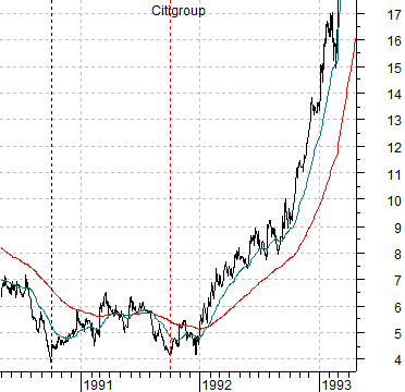
In any event… let’s start off today’s intermarket journey with the chart at top right of Citigroup (C) from 1990- 93.
The recover for the U.S. markets began in the autumn of 1990. The lag between the start of the recovery and the cyclical upswing that snapped the share price of Citigroup higher ran from the fourth quarter of 1990 into the final quarter of 1991. This was the length of time that the markets deemed necessary to get past the damage from weaker real estate prices on the banking system.
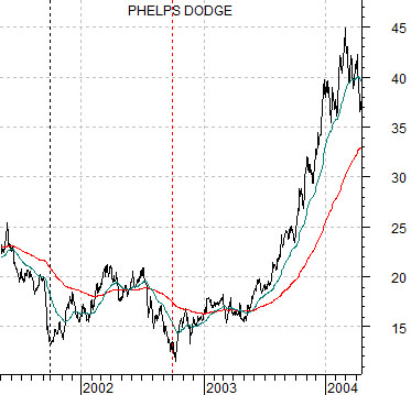
Below is a chart of Phelps Dodge (a copper producer since bought out by FreePort McMoRan) from 2001- 04.
The recovery for commodity prices began in the autumn of 2001. Essentially it commenced following the September 11th terrorist attacks and the subsequent outflow of money from the dollar.
The recovery for commodity prices started in late 2001 while the cyclical upswing did not take place until yields bottomed in the middle of 2003. The lag between the start of the recovery and the cyclical pivot extended over about 7 quarters.
The point? The deeper the recession the longer the lag. Yet once the recovery has started it is likely only a matter of time before a cyclical upswing associated with rising yields takes place. With this in mind the question might be… what would be worse- owning Citigroup and Phelps Dodge ‘early’ or missing the start of the rally and then sitting on the sidelines hoping for a pull back that never comes?
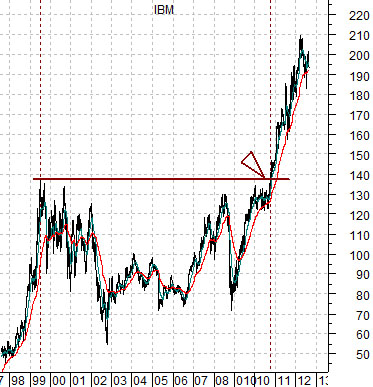
Below is a chart of IBM. In terms of the start of the recovery a case can be made for anything from the end of 2008 when yields made a bottom out to the second half of 2010 as IBM’s share price finally broke up through the trading range that extended back into 1999.
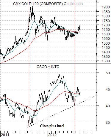
Below is a comparison between gold futures and the combination of the share prices of Cisco (CSCO) and Intel (INTC).
The argument was that gold, the yen, and bond prices were the offsets to a recovery. In other words as long as gold prices were making new highs it made some sense to conclude that we were going through less of a recovery than a post-crisis price bounce. The peak for gold prices was reached in August of 2010 which coincided with the start of a rising trend for tech heavyweights such as Cisco and Intel.
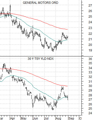
Below is a view of General Motors (GM) and 30-year Treasury yields.
The basic point is that the markets are (ever so) slowly working out from the start of the recovery to the eventual cyclical upswing. Strong stocks like IBM have been pushing upwards since the end of 2008. Somewhat weaker themes represented by Intel and Cisco began to rise just over a year ago. Pressures from Europe and China continue to draw investor’s focus away from the fact that it is possible- if General Motor’s share price continues to rise- that the actual pivot over to a cyclical upswing began over a month ago. If we see GM’s share price going 22, 23, 25 this month as 30-year yields push back above 3.0% then one only has to take a quick look at the page 1 charts of Citigroup and Phelps Dodge to get a sense of how important this shift may end up being.