Last week China surprised the markets by raising bank reserve requirements for the second time. We have argued, however, that the only monetary tightening that one really has to worry about is the last one so the issue is not whether China will continue to attempt to slow its economy- because it will- but rather where thing currently stand within the process.
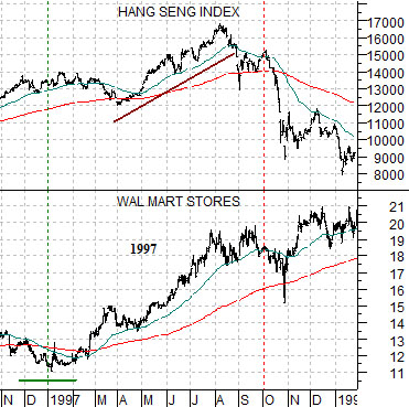
Below we show a chart comparison between the share price of Wal Mart (WMT) and Hong Kong’s Hang Seng Index from late 1996 through into January of 1998.
We have argued that WMT’s share price tends to turn higher around the time that Asian growth begins to turn negative. Within the umbrella of the term ‘Asian growth’ we include everything from the equity markets of China and Hong Kong to copper and crude oil prices along with commodity currencies like the Canadian and Australian dollars. We show a more complete comparison on page 6 today.
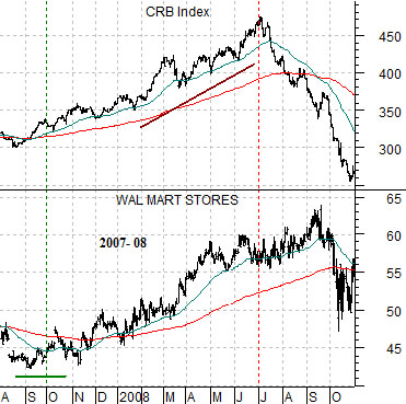
Next we have included a comparison between the CRB Index and the share price of WMT from the late summer of 2007 through into October of 2008.
Using the page 6 charts as a point of reference the idea is that while WMT tends to bottom and turn higher as the Asian theme swings negative based on the last two instances in 1997- 98 and 2007- 08 there was a lagged response by one or markets within the theme. In other words WMT began to rise around the start of 1997 even as the Hang Seng Index remained stronger for another nine months. When the share price of WMT started to strengthen in the fourth quarter of 2007 the CRB Index continued to push upwards for nine months until finally breaking lower at the end of the second quarter in 2008..
The point? Based solely on the share price of WMT (which currently is above its 200-day e.m.a. line but has yet to really show any kind of upward acceleration) it still appears to us as if one or more sectors within the ‘Asian theme’ can remain stronger for another quarter or two. In other words in past cycles there is typically a period of time when risk averse capital is moving towards WMT even as momentum-based money is still chasing the Asian/commodity theme.
Equity/Bond Markets
In 2008 the U.S. dollar bottomed and turned higher. In response the markets collapsed. In a sense the markets are working through a similar trend this year… with a difference. We hope.
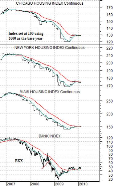
Below is a comparative view of the individual Case-Shiller home price index futures from Chicago, New York, and Miami along with the Bank Index (BKX).
The Case-Shiller housing indices were set with an initial level of 100 in January of 2000 so a reading of, say, 130 today represents a 30% increase in average home prices through the past decade.
The charts show that home prices in Chicago are around 30% above the levels of 2000 while New York has shown gains of 75% compared to an increase of around 50% for Miami.
The Bank Index is trending very closely with the home price futures indices. The argument is that if U.S. real estate prices fall off yet another cliff then the banks are at risk. Fair enough.
The Case-Shiller data is released towards the end of the month based on real estate prices two months previous. In other words next week we will receive updated numbers from last December.
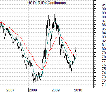
Below is a chart of the U.S. Dollar Index (DXY) futures covering the same time period as the housing index futures and Bank Index chart.
Our point is that in 2008 U.S. home prices were still in free fall and to the extent that the major banks have been trending with real estate prices the trend for the banks was rather clearly lower.
The dollar can rise as capital flees other markets- as was the case in 2008- or it can rise simply because U.S. assets appear to have greater upside potential. Obviously in 2008 in the midst of a serious decline in home prices a rising dollar represented the leading edge of a flow of money away from risk. In this instance dollar strength was associated with collapsing asset prices.
The argument that we are rather furiously circling is that there is a considerable difference between 2008 and 2010 and one only has to look at the housing index futures charts to get a sense of what it is. In 2008 real estate prices were trending lower while in early 2010 the trend is somewhere between flat and positive.
Over the past couple of months we have heard of a number of instances where Canadians (of our acquaintance) have purchased rather high-end homes in the depressed Phoenix, Arizona market. Our thought is that this represents the kind of marginal buying of U.S. dollars and assets that has the potential to create a bullish outcome instead of a second wave of crisis.
Our other thought is that we will get a better sense of the trend for banks and, by extension, the price of gold (the banks and gold have been trending inversely of late) next week when the December home price figures are released. If real estate prices continue to improve then the markets will tend to feel a bit warmer and fuzzier about the banks as we push on into the month of March.