Over the years we have often returned to something that we call the ‘decade theme’. The idea is that the markets keep working through a sequence of events that ends up with a cyclical bubble through the end of the decade. Only a few short months ago the idea of an asset bubble in any market seemed somewhat improbable but as the days and weeks roll by we keep wondering whether, in Occam’s Razor-like fashion, the simplest explanation for what is going on will prove to be the most accurate.
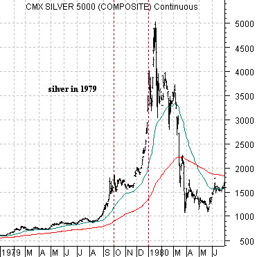
Below we show a chart of silver futures from January of 1979 through June of 1980. Obviously silver prices went parabolic during 1979 with the bulk of the rise compressed into the final three months of the year.
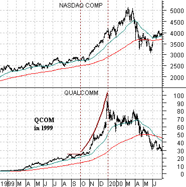
Below we compare Qualcomm (QCOM) and the Nasdaq Comp. from January of 1999 through June of 2000. While the Nasdaq did not peak until March of 2000 most of the frantic gains were made through the final quarter of 1999. QCOM, for example, quadrupled in price through this three month time period.
Is gold this decade’s bubble? Is the best explanation for the relentless upward grind for gold prices simply the near proximity of the end of the quarter, year, and decade? With gold prices accelerating from the recent 50-point per month pace the argument that we wished to make today through the charts of silver from 1999 and QCOM from 2009 is… we have no idea how high gold prices might reach over the next few weeks and no inclination to stand in front of this market. We have other windmills to tilt at and other trends to argue with. If history is any guide then three or six months from now gold will be below current levels but between now and then… almost anything could happen.
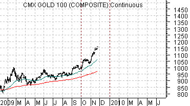
Our point above was not that gold prices have to rise from current levels; instead we were merely trying to make the case that strange things tend to occur at the end of decades. From our perspective gold should continue to outperform both copper and crude oil into 2010 so in order for gold prices to move higher both of these commodities have to remain reasonably firm.
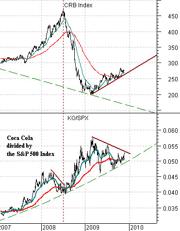
Below we return to the comparison between the CRB Index and the ratio of Coca Cola (KO) to the S&P 500 Index (SPX). The argument is that as long as the KO/SPX ratio is rising… commodity prices are in a negative trend. Even if the CRB Index pushes upwards the trend is still lower which explains why this index fell from over 450 to around 200 from mid-2008 into the spring of this year. The decision point for the trend tends to take place when the moving average lines for the KO/SPX ratio converge- as they did in mid-2008 and again a month or two ago.
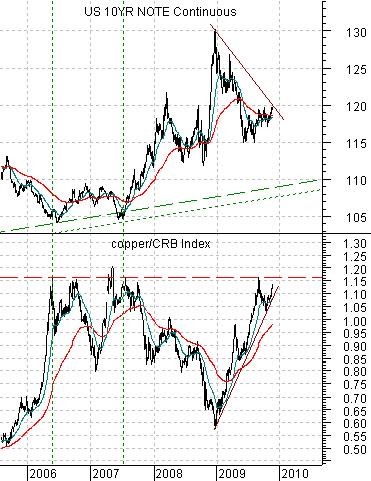
Below is a comparison between the ratio of copper futures prices to the CRB Index and U.S. 10-year T-Note futures.
The chart suggests that when copper prices rise to around 115% of the value of the CRB Index (copper is about 312 compared to 275 for the CRB Index at last glance)… bond prices are at or close to a bottom. Obviously the comparison would be a bit more compelling if the T-Note futures were trading closer to 110 instead of 120 but the point is that an upward bias is developing for long-term Treasury prices.
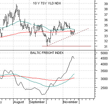
Below we show 10-year Treasury YIELDS along with the Baltic Dry (Freight) Index.
One of our recurring arguments has been that yields tend to track with dry bulk ocean freight rates. We have also suggested that at the turns freight rates seem to lead by a week or so. All of which was intended to show that we are unlikely to see a sustained decline in longer-term Treasury yields as long as the Baltic Dry Index was rising each and every day. After a couple of days of weakness, however, the potential for a decline down through 3.3% for 10-year yields appears to be building.
