Aug. 31 (Bloomberg) — Treasuries rallied, extending the biggest monthly gain for the 10-year note since the end of 2008, and commodities slid as the Federal Reserve said some policy makers saw greater risks to the economic recovery. U.S. stocks rose, trimming the largest August slump in nine years.
How much is enough? How far does the bond market have to rise before this rally comes to an end? In general trends tend to run from quarter to quarter so the most logical point to look for something different would be early in October. However… we only have to look as far back as 2003 and 2004 to find two occasions when bond prices failed through the final month of a quarter.
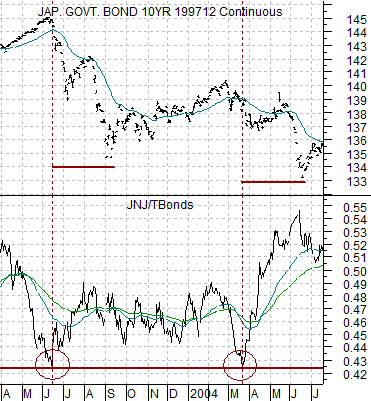
Below is a chart of the Japanese 10-year (JGB) bond futures and the ratio between the share price of Johnson and Johnson (JNJ) and the U.S. 30-year T-Bond futures from 2003- 2004.
The argument is that if Treasury yields fall far enough high dividend paying stocks such as JNJ become attractive as an income alternative. In both 2003 and 2004 the ratio between the share price of JNJ and the TBond futures fell to just over .42 (JNJ’s share price was 42% of the value of the TBond futures) just after the Japanese 10-year bond futures reached a cycle peak.
Once the JNJ/TBond ratio turned higher as money started to shift away from bonds and back towards equities the JGBs declined for very close to 3 months. In the 2003 the JGBs fell from June into September while in 2004 the decline ran from March into June.
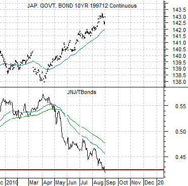
Below we show the same chart comparison for the current time period.
As of the end of trading yesterday the JNJ/TBond ratio had moved down to around .42. Similar to 2003 the JGBs recently made a price peak although the jury is still out on whether this is going to mark a significant cycle top.
Our view is that if the bond market doesn’t manage to push higher through the end of September then we should look for a reasonably significant price correction that will carry through the end of November this year.
Equities/Bond Markets
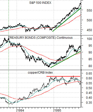
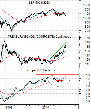
Just below are two charts of the copper/CRB Index ratio, the U.S. 30-year T-Bond futures, and the S&P 500 Index. The top chart is from 1993- 1995 while the lower chart runs from the end of 2008 to the present time frame.
We mentioned in passing in yesterday’s issue that a rising bond market and a ‘high’ copper/CRB Index ratio helped to create one of the strongest bull markets in recent history. At the end of 1994 the copper/CRB Index reached a peak before flat-lining through much of 1995. With copper prices ‘high’ the addition of rising bond prices helped drive the stock market sharply higher.
The situation is quite similar this year as the peak for the copper/CRB Index ratio at the end of March led to a rising bond market. The major difference, of course, has been that the stock market has drifted lower in response. Curious.
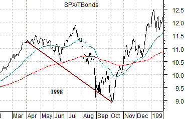
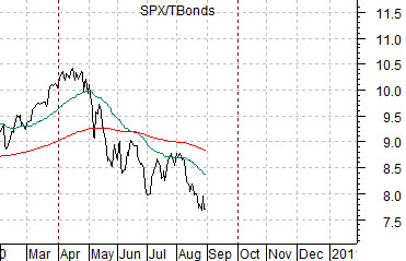
Equities have been weaker as the bond market has been stronger. With this in mind we turn to two ratios between equities (SPX) and bonds (TBonds futures). The charts below show the SPX/TBond ratios from 1998 through the Asian crisis and 2010.
All things considered the biggest dilemma that we have at present is whether the weak equities/strong bonds trend is going to run all the way through this month. In 1998 the correction began around the end of March and concluded early in October. There was a fairly sharp bounce through much of September but the real recovery did not begin in earnest until the start of the fourth quarter. The current situation suggests that it is possible that we still have another month of pressure ahead of us.