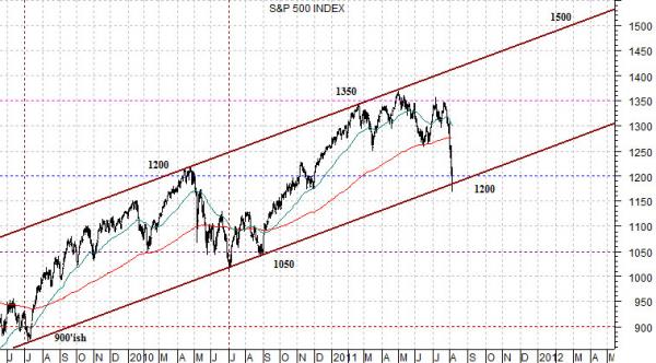
With S&P’s downgrade of U.S. debt following the close of trading last week any bullish or even neutral perspective is going to be put to the test today. However, since our intention was to start with the chart below we have decided to just let it ride.
The chart shows the S&P 500 Index from mid-2009 to the present day.
The argument is that the index is still in a rising trend with bottoms and tops being made about 150 points higher than the year previous. If this trend continues then the index should find support between 1170 and 1200 with the next high due around the spring of 2012 close to 1500.
The SPX bottomed just below 900 back in mid-2009 and then topped out around 300 points higher in the spring of 2010. From there the index declined back to roughly 1050 in the summer of 2010 before a rally developed that carried the index up to 1350 a few months back.
The sequence includes a bottom around 900 in mid-2009, a top 300 points higher the following spring near 1200, a correction back to 1050 and then another 300 point rally up to 1350.
This trend creates a channel where support is found during the summer around 150 points higher than the year previous with resistance occurring in the spring.
If the index holds the channel then we should be at or near support this week with the next cycle top due some time next spring at or near 1500. This would carry the index all the way back to the highs set in both 2000 and 2007.
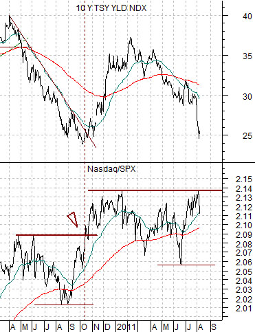
Equity/Bond Markets
At right is a chart of 10-year Treasury yields and the ratio between the Nasdaq Composite Index and the S&P 500 Index.
The argument is that the Nasdaq is more economically sensitive or cyclical than the SPX so when the ratio is strong and rising it reflects the kind of trend that goes with upward pressure on long-term yields.
This is a strange chart because what it may be ‘saying’ is diametrically opposed to what we all know is actually happening.
The idea here is that when the ratio breaks to new highs 10-year yields should turn higher. Obviously the ratio has not yet reached new highs but, then again, it is not that far away either. We hate the place the fate of the markets on one stocks but… the market’s reaction to Cisco’s earnings this week might be enough to take the Nasdaq/SPX ratio to new highs.
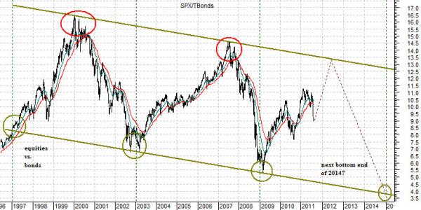
Below is a chart of the S&P 500 Index divided by the price of the U.S. 30-year T-Bond futures.
Let’s put our cards on the table. Our expectation is that the SPX will resolve up to around 1500 next year while the U.S. 30-year T-Bond futures decline back to around 115- 120 from around 132 today. We expect equities to be higher and bond prices to be lower.
The chart shows that the SPX/TBond ratio has been making bottoms in 6-year intervals with the next ratio low due around the end of 2014. The highs in 2000 and 2007 were concurrent with inverted yield curves which is clearly NOT the situation at present. The longer the ratio takes to reach the channel top the less time is available for it to decline back to the channel bottom which, in a sense, explains why the equity markets collapsed and bond market soared in 2008. A more balanced cycle would see the ratio rise to around 13:1 into next year (SPX 1500 and TBonds 115 would be about right).