The best argument that we can make with respect to Japanese equities is that eventually the market gets around to just about everything. Out of favor sectors in one cycle become relative strength leaders in the next cycle while one-decision growth stocks languish into value plays.
Our chief concern with respect to the Nikkei lies with the ‘Decade Theme’. The argument is that the cyclical trend tends to peak in the ‘0’ year (i.e. 2010) leading into a correction into the ‘2’ year (2012) before swinging back to positive. Our short-term view has been that the cyclical trend will remain stronger into year end so- at least in terms of ‘time’- things are getting a bit tight.
We thought that we would start off today with a bullish perspective on the Nikkei along with a quick view of what we mean when we write that the markets ‘get around to just about everything’.
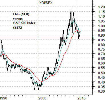
Below is a chart of the ratio between the Amex Oil Index and the S&P 500 Index from 1990 to the present day.
Through the decade of the 1990’s the oils were well and thoroughly out of favor as money pushed into financials, consumer growth stocks, and tech names. Over a 10-year time span the XOI/SPX ratio declined and declined and then declined some more. Lo and behold… as we started a new decade… the names that everyone loved and owned started to weaken leading an upswing in the XOI/SPX ratio. A few years later, of course, the oils became the ‘must have’ sector and now after close to a decade of relative strength most have forgotten the antipathy with which the market held the energy stocks through the 1990’s.
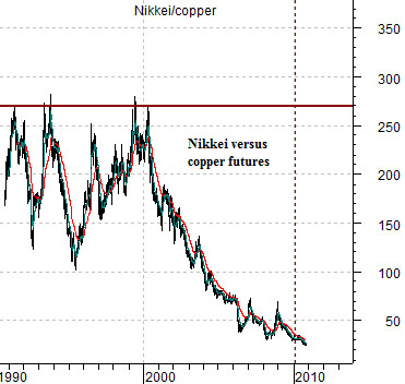
The next chart shows the ratio between the Nikkei 225 Index and copper futures. Similar to the XOI/SPX ratio during the 1990’s this ratio has spent the last ten years moving inexorably lower. Copper has replaced Cisco, GE, and Microsoft as the darling of the markets while Japanese stocks move to ever lower levels of valuation.
If history were to repeat the next ten years may belong to Japan. The caveat once again is that a weaker cyclical trend may pull copper prices lower first with the Nikkei kicking into gear in 2012.
Equity/Bond Markets
On the other hand… things actually look quite good at present.
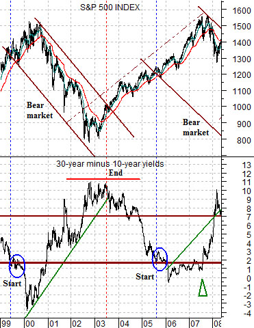
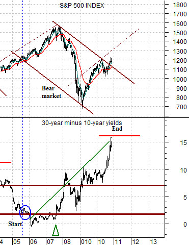
We showed a longer-term view of the comparison between the S&P 500 Index and the spread between 30-year and 10-year Treasury yields in yesterday’s issue. Today we are going to cut the chart in half so that we can concentrate on the individual cycles.
The argument is that an equity bear market goes roughly with a rising yield spread. In other words as growth expands the yield spread gradually tightens in until it flattens or inverts at which time the economy begins to cool leading to a declining stock market. The decline continue until the yield curve expands out to its highest point which leads into a positive or bullish stock market trend. Fair enough.
The twist is that the trading channel that defines a bear market has a certain amount of ‘width’. This width is created by the S&P 500 Index rising even as the trend turns negative.
By way of explanation we will start with the chart at top right. The idea here is that the base trend for the SPX turned negative in 1999 when the spread between 30-year and 10-year yields tightened in to around .2%. The actual peak for the SPX was not reached, however, until the yield spread declined to its cycle bottom and then crossed back up through the .2% line. This set the parameters for the downward sloping channel with the lower edge beginning in 1999 and the upper edge commencing in late 2000.
The chart suggests that once the yield spread finally turned lower in mid-2003 the SPX was set to break through the top of the channel. This marked the end of the negative trend even though the index had been climbing upwards within the channel since late 2002.
Shifting to the chart below right we can see that the yield spread declined to .2% back in 2005. This marked the start of a negative trend with sectors like Japan and stocks such as Mitsubishi UFJ turning lower.
The chart shows that the SPX continued to rise for another two years as the channel’s ‘width’ was created. The yield spread declined below .2% during 2006 which capped the rally for copper futures prices and then swung back up through .2% around the middle of 2007.
As drawn the bear market trend for the SPX was quite ‘wide’. This was largely the result of the relentless momentum in the commodities sector. By 2007 home prices began to weaken which, in turn, put pressure on the banks. Interest rates started to decline even as grain and energy prices moved higher.
From this perspective the recent push to a peak by the yield spread may well have set the break out for the SPX through its channel top. The problem here is that the only way that we will know for sure that we have drawn the channel correctly for the SPX is if the yield spread starts to decline. If it does then we have just recently entered into a bullish trend that would be expected to last until growth expands to the point where the yield spread is once again forced back down to .2%. Given that the spread does not move THAT quickly the argument would be that similar to 2003 we are entering into the early stages of a positive trend that could easily last for quite a number of years. Note that the key event in 2003 marking the trend change was a peak in the Japanese bond market and strength in the Japanese equity market. That feels quite a bit like what we have been experiencing over the past few weeks.