The problem that we have with being negative here is that it appears to us as if the cyclical trend could explode to the upside at almost any time. Of course, our view of ‘any time’ is measured in weeks or months instead of hours and days.
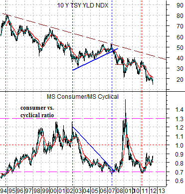
First is a chart of 10-year U.S. Treasury yields and the ratio between the Morgan Stanley Consumer Index and Cyclical Index.
The consumer/cyclical ratio tends to rise when yields are moving lower and in ‘broad brush’ terms it seems to swing back and forth through 1:1 with extremes found around 1.3:1 and .7:1.
At present the markets are working in favor of the consumer and defensive themes as yields move to the down side so a case could be made that the ratio still has further to go before a meaningful bottom for yields will have been reached.
If there is upward pressure building for the consumer sector then we may see a positive reaction on Thursday to the long awaited Supreme Court ruling with respect to ‘ObamaCare’. We have absolutely no idea which outcome the markets would view as positive but with the consumer/cyclical ratio still well below 1:1 it would appear that there is still a certain amount of upward price adjustment left for the consumer-oriented large cap stocks.
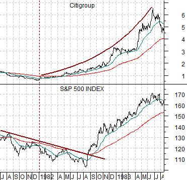
Next is a chart from 1981- 83 of Citigroup (C) and the S&P 500 Index (SPX).
This actually has little to do with the current markets situation but is instead illustrative of a point that we continue to struggle with.
The Decade Theme argues that the markets keep doing the same things over and over again each decade but in somewhat unexpected ways. For example gold prices soared with interest rates during the 1970’s and then rose last decade with falling yields.
The recovery for the SPX began in late 1981 as bond prices bottomed and Citigroup started to rise. The broad market remained under pressure, however, into August of 1982 before ‘exploding to the upside’. On page 3 today we show an imaginative example of how 2012 may end up looking like 1982.
Equity/Bond Markets
Let’s start off with a bit of a macro explanation.
Our view is that there are three major ‘drivers’ for economic growth- consumer spending, corporate or capital spending, and government spending.
The argument is that decade-long themes are created by either an excess of consumer or capital spending. When one loses momentum and slows interest rates decline until the other picks up the slack.
In the ‘between’ periods government spending has to expand as an offset. While effective this can only be maintained for short periods of time until budget deficits expand to uncomfortable levels.
When North America is driven by consumer spending the ‘driver’ in Asian will be capital spending. And vice versa.
In general… capital spending seems to lead to a stronger stock market.
When the Nasdaq (representing capital spending) peaked in 2000 the U.S. went into a recession which pushed interest rates lower. Fiscal spending increased to help temper the decline in corporate spending but eventually lower interest rates led to mortgage refinancing which, in turn, helped expand consumer spending. As the cycle progressed home prices started to rise which increased home equity and spending.
The previous decade was driven by U.S. consumer spending and Asian capital spending. The Asian trend (by ‘Asian’ we actually mean Asian/Latin/emerging/BRIC etc.) included massive investment in construction and infrastructure which pushed raw materials prices higher.
The subprime crisis in 2008 marked the end of the U.S. consumer spending trend although a case could be made that it occurred a couple of years ahead of schedule. From there government spending was forced to expand as a means to bridge the chasm between the reduction in consumer spending and the eventual pick up in U.S. capital spending.
At present China is struggling to shift from capital spending to consumer spending while the U.S. is in the early stages of a capital spending recovery.
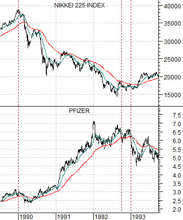
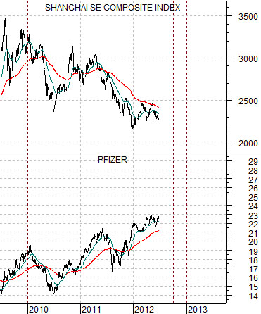
In any event… with the trends shifting from decade to decade the last time the U.S. went ‘capital spending’ was back in 1990. At top right is a comparison between Japan’s Nikkei 225 Index and drug maker Pfizer (PFE) from 1989 into 1993 while below right we have added a chart of China’s Shanghai SE Composite Index and Pfizer from 2009 to the present time period.
The point- if, indeed, there actually is one- would be that the large cap consumer and pharma names are trending higher into 2012 in the same general way that they rose into 1992. Cyclical weakness post- 1990 came from Japan while in the current decade the pressures seem to be related to China’s efforts to shift the focus of growth away from building entire cities that no one lives in over to consumer spending.