Quite frankly… we look at a lot of charts. In fact we spend a lot of time looking at a lot of charts. We spend even more time fiddling with charts, comparing charts, turning charts upside down, making ratios and combinations from various markets, and shifting time frames.
When we view an individual chart our focus is not on whether it is going up or down but rather when the trend changes took place. If a stock turned lower… what else was going on to create the pressure? If a stock turned higher… was there a seasonal tendency, a reaction to something in the forex or commodity markets, or some kind of connection to yields? That sort of thing. Was it rising because the broad market was rising and, if so, was it underperforming or outperforming?
From time to time we come across a chart that we suspect might be important even though we aren’t quite sure why. Today’s Chart Presentation is just such an example.
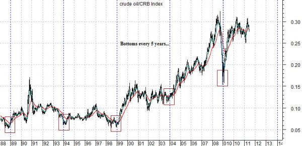
Below is a rather large chart of the ratio between crude oil and the CRB Index. In other words we are following the relative strength relationship between energy prices and general commodity prices.
The argument is that when crude oil is stronger than the CRB Index there are probably worse sectors to be long than the oil producers. Fair enough.
The intriguing detail here is that the ratio has made a bottom and turned higher in 5-year intervals… five times. In other words if one had bought the oils around the end of 1988 and held them for a couple of years they would have been long the sector as Iraq rolled into Kuwait in 1990. A similar purchase at the end of 1998 would have absolute nailed the bottom for oil prices with a 2-year rally through into late 2000.
At the end of 2003 (the time frame that we will return to on the next page) the ratio swung higher once again. Interestingly enough.. the cycle suggested that the next bottom would be made at the end of 2008 which might explain, we suppose, why the markets managed to cram a few years worth of weakness into the final six months of that year.
The point? We are a couple of years from the last bottom so, all things being equal, this is probably a good time to move away from the oils. The next bottom is due at the end of 2013 and we suspect that at that time it will be almost impossible to convince anyone to like the oil stocks.
Equity/Bond Markets
NEW YORK (AP) – Carnival Corp.’s net income dropped 18 percent in the second quarter but managed to beat Wall Street’s view as the cruise operator dealt with escalating fuel costs, unrest in the Middle East and North Africa and the aftermath of Japan’s earthquake and nuclear disaster.
Aside from the fact that Carnival seems to have been hit by a lot of bad news in the past six months… we included the news story above because it related to energy costs. Carnival is a good example of a cyclical company with negative exposure to rising energy prices. We generally refer to this sector as energy ‘users’.
Above we showed that the crude oil/CRB Index ratio has bottomed and turned higher in 5-year intervals. The most important trend change point was the end of 2003 because it rather seriously skewed the list of winners and losers within the equity markets.
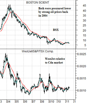
Just below is a chart comparison between Boston Scientific (BSX) and the ratio between Canadian airline WestJet (WJA on Toronto) and the Cdn stock market (S&P/TSX Comp.)
At the end of 2003 the share price of BSX was close to a peak while the ratio between WJA and the TSX was exactly at a peak. The shift from weaker to stronger energy prices split the equity markets as rising fuel costs hurt the energy ‘users’ while at the same time placing upward pressure on U.S. interest rates. In a sense the markets began the process of tightening credit at the start of 2004 in response to the shift in energy price strength.
Our sense is that now that we are half way through the 5-year cycle that some time between now and the end of 2013… the energy users and rate sensitive non-commodity stocks will do a bit of catching up. We can not argue that the BSX will ever rise back to 45 but we certainly wouldn’t be surprised to see the WestJet/TSX ratio about double current levels 24 to 30 months from now.
Our points are as follows:
1) In general the time to be long energy and/or commodities is through the first two to three years of the cycle after the ratio bottoms. The notable exception was post-2004. Copper prices peaked in 2006 (as well as 1996) even as oil prices continued to rise.
2) If you look at the markets somewhat backwards then instead of arguing that BSX (chart at right) will turn higher when energy prices start to weaken it probably makes more sense to suggest that energy prices will start to weaken when we start to see actual price strength in the offsetting sectors. In other words… if oil prices decline but the autos and airlines remain dormant… watch out for a return to stronger energy prices.
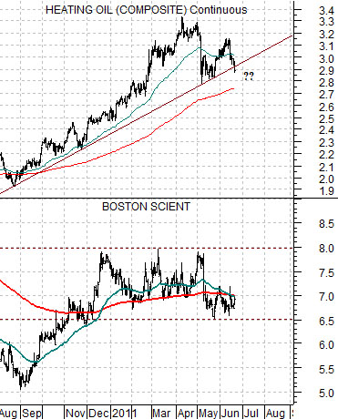
3) The chart at right compares BSX with heating oil futures. We argued a month or two back that BSX could spike up through 8.00 when the energy trend turns negative. As of earlier this week heating oil futures were simply powering up the rising trend line so even though prices we well off the recent highs… the trend was still positive. Did something change yesterday? Was that ‘it’? We remain skeptical as long as BSX is doing little more than holding right on its moving average lines.