There often isn’t much in the way of rhyme or reason involved in our decisions to focus on one market or another. On a daily basis we tend to write about those issues or markets that we are thinking about. If we are mired in a fixation then we will hammer away at an issue until we are fairly comfortable that our point has been clearly made. Then- quite often- we will run through all of the various arguments all over again.
The topic that is foremost in our thoughts today centers around the ratio between the Amex Oil Index (XOI) and the S&P 500 Index (SPX). We introduced a new twist to the thesis in yesterday’s edition but to set the stage we are going to return to the original argument, work through an extension of the theme on page 2, and then jump to the conclusion on page 3. Hopefully.
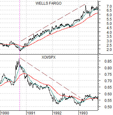
Below we start with the share price of Wells Fargo (WFC) and the XOI/SPX ratio from 1990 into 1993.
The idea is that at the worst point for the equity bear market in the autumn of 1990 the ratio between the oil stocks (XOI) and the broad market (SPX) was at a peak. This was caused in part by oil price strength leading into the Gulf War and financial asset price weakness.
From the autumn of 1990 through into 1993- a time span of more than 2 years- the XOI/SPX ratio declined as money slowly moved away from the oils. The share price of WFC rose steadily through this time period.
Below we have included the same chart comparison for the current time period.
The argument back in late 2008 and into 2009 was that the recovery should go with a falling XOI/SPX ratio. While we might have chosen to show a Canadian bank instead of WFC the point is still basically the same- as long as the XOI/SPX ratio is resolving to the down side the economic recovery and the equity bull market should remain intact.
The chart shows that from March of 2009 through to the present day the ratio is still grinding lower. The Canadian banks broke to new recovery highs a few weeks back followed by the U.S. Bank Index (BKX). Wells Fargo has yet to trade above the peak levels reached last October but the distance has closed considerably over the past few weeks.


Equity/Bond Markets
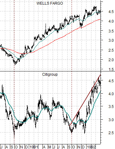
Below we compare the share price of Wells Fargo (WFC) with that of Citigroup (C) from 1990 into 1992.
This particular comparison is an off-shoot of the argument that we made on page 1. The start of a positive trend for WFC in the autumn of 1990 was marked by the relative strength peak for the oil stocks. The XOI/SPX ratio continued to decline all the way through into 1993 but over the initial 12 months- from October of 1990 into October of 1991- the damaged, nicked, and laggard financials failed to participate.
During the final quarter of 1991 the share price of Citigroup finally came to life. Note that if one had bought C in October of 1990 and held it through into the middle of 1993 the gains would have surpassed that of owning WFC through the same time period even though WFC outperformed C through the first 12 to 15 months by a considerable margin.
Next we feature the same comparison starting in December of 2008.
We have mentioned on occasion that there are (at least) three laggard banks that we are watching- Citigroup, Mitsubishi UFJ (MTU), and Japan’s Mizuho Financial (MFG). Whether we are comparing apples to oranges or apples to zebras is a question for another day.
IF history were to repeat THEN about one year after the recovery began (marked by the peak in the XOI/SPX ratio) the laggard banks should start to swing upwards. A few weeks into the process we are encouraged by early price strength for Citigroup.
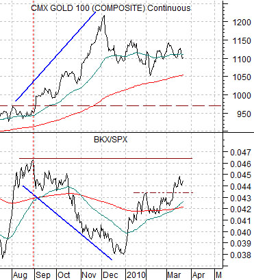
Below we show gold futures and the ratio between the Bank Index (BKX) and the S&P 500 Index (SPX). As the month of March winds to a close we wonder whether there is still enough time left for one or more markets associated with asset price bubbles to ‘bust’. Time will tell. The point, however, was that the stronger the banks became the greater the pressure on gold prices.


