We can’t think of a better day to introduce our new topic. If we are going to prove ourselves foolish once again why not do so on April Fools Day. So… without further do… let’s begin.
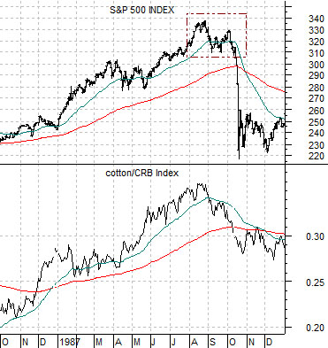
The idea came to us a few days back when we argued that recent price weakness for cotton may be indicating that the cotton/CRB Index ratio was at or close to a cycle peak. We noted at the time that a peak for cotton relative to general commodity prices had marked ‘the lows’ for the dollar on three very important occasions in the past- 1987, 1992, and 1995.
The argument was that if the cotton/CRB Index ratio was finally at a top then the dollar was at a bottom. Fair enough… with a rather ominous caveat.
Of the three prior instances noted above the only one that included a significant lag between the peak for the ratio and the bottom for the dollar was 1987. The cotton/CRB Index ratio topped in August of that year while the dollar did not find bottom until four months later in December.
We are well aware of what else happened in August of 1987. This was the month when the U.S. equity markets rose to a peak before working through a ‘top’ culminating in a ‘crash’ in early October. In other words by arguing that we could be at a top for the cotton/CRB Index we were, in fact, suggesting that the markets were going through the same general trend that preceded one of the most nasty and vicious stock market debacles in relatively recent memory.
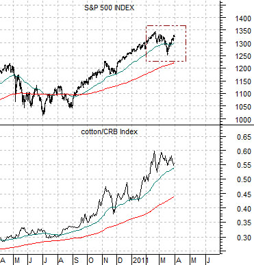
Below is a chart of the S&P 500 Index and cotton/CRB Index ratio from 1987. Below right we show the same comparison for the current time frame.
To keep things in perspective we should note that it is far from clear at this juncture that the cotton/CRB Index ratio has actually reached some kind of peak. While the ratio has weakened slightly since mid-February the reality is that it is still holding well above the rising 50-day e.m.a. line. In 1987 the ratio broke far enough below this moving average line that it actually began to decline during the month of September.
Our point, we suppose, is that while we can make a tentative case for some kind of markets ‘event’ it likely isn’t anything to be concerned about… quite yet. We will continue with this theme through the rest of today’s issue.
Equity/Bond Markets
Basing an argument in favor of a stock market crash on the action of one random ratio based on a commodity- cotton- that few tend to follow is more than a bit shaky. Our point, however, was not that the cotton/CRB Index created the 1987 stock market crash but merely that it was one of the few peaks for the ratio in the last few decades and that in prior instances a top for the ratio had been made in the general vicinity- give or take a few months- of a major dollar bottom.
We can actually put together a rather compelling case for a stock market event but, as usual, it will take a bit of imagination.
Our basic view regarding the 1987 stock market ‘crash’ was that it was less of a crash and more of a very quick adjustment of relative prices between stocks and bonds. It was based on a commodity cyclical- heavy trend feeding off of a weaker dollar that included exceptional relative strength in the oils, golds, and mines (seem familiar?) in the face of falling bond prices.
Taking a step backwards the 1987 stock market crash was likely a function of the collapse in oil prices through the end of 1985 and into 1986. In other words weak oil prices created a chain reaction that ran through the markets during 1986 and 1987 culminating in the ‘crash’.
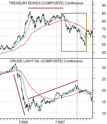
Below is a chart of crude oil futures and the U.S. 30-year T-Bond futures. This is a reasonable place to begin.
In late 1985 crude oil prices collapsed. The offset to this was a huge rise in long-term bond prices. Falling energy prices led to falling interest rates.
From the spring of 1986 into 1987 the trends reversed as oil prices tracked higher even as pressure built on long-term bond prices. Bonds held near the highs into early 1987 and then began to tumble.
So… the trend into 1987 included both a weak dollar and an ever increasingly weak bond market. Once again… does this seem somewhat familiar?
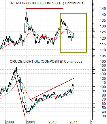
Next we have included the same comparison for the current time frame. We should note that we are using a much longer period of time for this chart.
Let’s start with the foundation of the argument. The collapse of oil prices in 2008 and subsequent upward and rising tend appears visually similar to the recovery for oil prices from 1986 into 1987.
Similar to 1985- 86 the bond market drove higher when oil prices collapsed during the second half of 2008. Similar once again… the rally by long-term bond prices into the middle of 2010 creates the visual image of a ‘flat trend’ for bond prices that is not too dissimilar to the bond market between the springs of 1986 and 1987.
Finally… as oil prices continue to rise we can see that the bond market is starting to decline in a manner not much different that 1987. We have, in effect, a collapse for oil prices that sends bond prices higher, a recovery for oil prices along with a flat bond market, and an extension of the recovery for oil prices that is going with a sharp decline in bond prices. While the process is taking longer this time around the sequence itself is almost identical.