The markets continue to bat back and forth between negative pressures emanating from Europe and the occasional weekly bit of positive news from U.S. jobless claims. It remains to be seen whether stronger Treasury prices and weaker equities will reverse once we get a look at today’s jobless claims report.
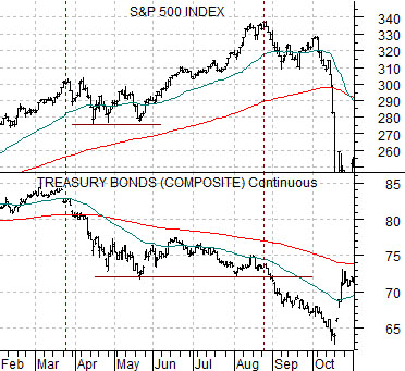
We have argued from time to time that gold prices trend with the Swiss franc. As we pondered the relationship we were reminded of the way the equity and bond markets appeared to diverge back in 1987. To start things off today we will focus on these two comparisons.
Below is a chart of the U.S. 30-year T-Bond futures and the S&P 500 Index from 1987. At the time the equity and bond markets were trending together so the initial break lower in the bond market from March into May caused the SPX to ‘chop’ lower.
As the TBonds flattened out following the May price lows the SPX extended its rally. The peak was finally reached in August. The key here is that when the TBonds were finally ready to break to new lows the stock market stopped pushing upwards and began to decline.
When the dust finally settled the equity market ‘crashed’ to a low just after the bond market shifted from a bearish to a bullish trend.
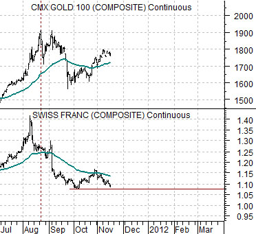
Let’s compare this with the relationship between gold futures and the Swiss franc futures. The chart is featured below right.
When the franc made a bottom in early October the price of gold was close to 1600. Once the franc began to rise up from around 1.08 versus the dollar the price of gold pushed back up towards 1800.
The argument is that gold trends with the franc but similar to the equity market in 1987 the trend for gold may remain positive until the franc is ready to break back below 1.08. This could take days, weeks, or even months but our sense is that if gold is ever going to go through a more meaningful price correction it will be confirmed by the kind of U.S. dollar strength that pulls the Swiss franc futures below the 1.08 level.
Equity/Bond Markets
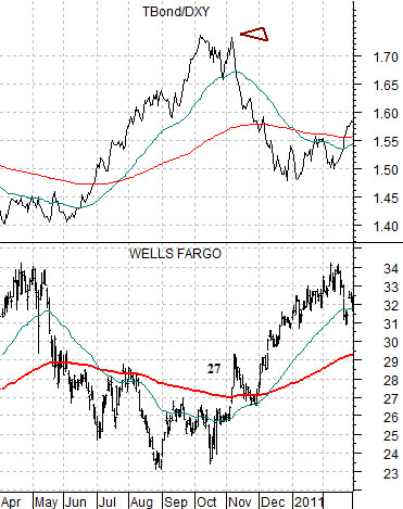
The markets rarely repeat exactly but that doesn’t stop us from fixating on the potential for a similar outcome. Today’s fixation has to do with Wells Fargo (WFC) and a price of 27.
Next is a chart of WFC and the ratio between the U.S. 30-year T-Bond futures and U.S. Dollar Index (DXY) from 2010.
The TBond/DXY ratio is another way to follow the trend for gold. It rises when the bond market is stronger in price and the dollar is trending lower. It declines when the bond market is weaker in price while the dollar is higher.
From April through October last year the share price of Wells Fargo trended lower. Concurrent with this was a rising trend for the TBond/DXY ratio (as well as gold).
We have argued that there is an inverse relationship between the banking sector and gold prices. We have also argued that stronger banks go with falling bond prices. On occasion we have even pointed out that when the banks began to rally late last year the price of crude oil flattened out and the dollar started to rise. What we are attempting to do today is put all of these various arguments into one ‘picture’.
In early November 2010 the price of Wells Fargo jumped up through the 200-day e.m.a. line. At the time the moving average line was very close to 27. One day WFC was trading around 26 and almost out of the blue the price surged through 27 up to around 29.
When WFC crossed above its moving average line a number of things started to happen. First, the dollar started to firm. Second, the rally widened out to include the laggard banks. Third, long-term Treasury yields began to rise. Fourth, gold prices started to weaken.
The point is that in early November of 2010 the ‘trigger’ that served to slow the rise in oil prices, initiate the rally in the laggard banks, and act as pressure on gold prices was, coincidentally or not, a push by WFC above its 200-day moving average line.
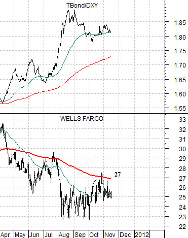
Below we have included the same comparison for 2011.
The chart shows that from April into November the trend for WFC has been lower with an offsetting rising trend for the TBond/DXY ratio. Clearly the price of crude oil is still trending upwards and there is still an almost cult-like belief in the trend for gold.
The chart shows that while WFC has made a few forays up to its 200-day e.m.a. line since April it has not been able to successfully push through it. The detail that we find intriguing has to do with the fact that the moving average line is now cutting through around 27 putting it in a similar position to last year.
The argument is that in 2010 the initial stage of the recovery was driven by stronger energy prices with the trend changing to a stronger dollar and better banking shares trend around the time that WFC closed above 27. While the markets rarely repeat exactly our thought was that if WFC manages to close above 27 one of these days or weeks it could mark the start of something equity markets and dollar bullish with bearish overtones for the Treasury market and gold.