In recent issues we have focused on the relationship between long-term Treasuries and the share price of Goldman Sachs. The argument has been that we are mired in a Eurozone crisis similar in many ways to the Asian crisis that roiled the markets during the late summer of 1998.
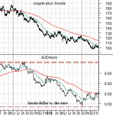
While it is always difficult to make the case that one time frame is similar to a prior time period there is a bit of method to our madness. To explain we start off with the chart at top right of the cross rate between the Australian dollar (AUD) and euro along with the sum of copper and crude oil futures prices from early 1997 into the start of 1999.
The AUD/euro cross rate trends with Asian growth. Not just Asian growth, of course, but the entire BRIC gamut ranging from China to Brazil and from Russia to India along with energy and metals prices and the commodity currencies.
In early 1997 the sum of copper and crude oil prices peaked and turned lower. Within the forex markets the trend for the AUD/euro cross rate began to decline. Month after month and quarter after quarter money moved away from the BRIC/commodity theme until a sense of crisis hit the equity markets. From July into October of 1998 bond prices surged higher as capital moved away from virtually everything associated with risk.
The chart shows that the AUD/euro cross rate hit bottom at the start of October in 1998 marking the peak for the crisis.
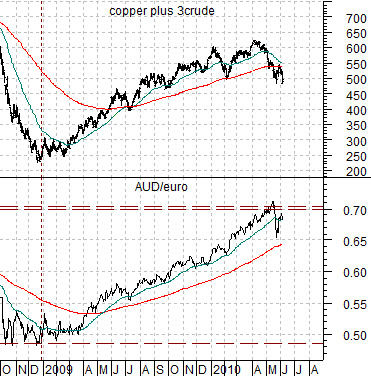
Below we compare the sum of copper and crude oil futures with the AUD/euro cross rate from the current time period. Notice that energy and metals prices have once again been trending with the AUD/euro cross rate but… in the opposite direction. Instead of money moving away from Asia- as was the case into 1998- money has been moving away from the euro.
The AUD/euro has tended to trend from just below .50 up to around .70. During 1997 and 1998 it went from the top end of the trading range to the bottom culminating in an Asian crisis while in the current instance it has trended from the bottom edge up to the top as the markets shifted towards a Eurozone crisis. Our thought, by the way, is that if the Asian crisis marked the bottom for energy and metals prices in early 1999 the ongoing Eurozone crisis might very well be setting the top for energy and metals prices for years to come.


Equity/Bond Markets
Below is a comparison between the share price of Ford (F) and the ratio between crude oil and the CRB Index.
Our above point was that weakness in the Aussie dollar relative to the euro into 1998 helped create ‘the lows’ for energy prices. The chart shows that the ratio between crude oil and general commodity prices (CRB Index) bottomed at the end of 1998 and has been rising ever since. The offset to ‘strong energy prices’ has been a very long bear market for the autos and airlines.
Our point? If the Asian crisis occurred just in front of the lows for energy prices the current Eurozone crisis may be telling us that energy prices have finally reached a relative strength peak to the benefit of the autos and airlines.
Below we show a chart of IBM. Our thought is that an end to the strong energy theme that began in 1999 might be somewhat broader than just the autos and airlines. In fact it has the potential to indicate that the extended consolidation for U.S. large cap stocks that began back in 1999 might be drawing to a close. Given IBM’s propensity to push back up to the upper edge of its trading range we would view an upside break out through 140 as a fairly serious ‘game changer’. In other words… if the offset to a strong crude oil/CRB Index ratio is a flat trend for IBM then a break to new highs for IBM should indicate that the energy-centric trend has come to end.
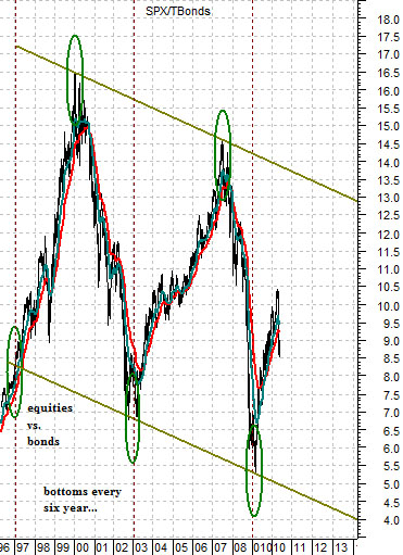
Below we show what we hope is an encouraging perspective. As U.S. large cap stocks (IBM, Wal Mart, Coke, JNJ, Intel, Cisco, Microsoft, GE, etc.) have held below the highs set between the late 1990’s and 2000 the ratio between the S&P 500 Index and U.S. 30-year T-Bond futures has swung up and down within a fairly well defined channel.
With bottoms for the ratio occurring at six-year intervals the argument is that the next low could be seen way out in 2014. The sharp correction in the SPX/TBond ratio looks a bit like the volatility experienced in 1998 as well as 2004. If the pattern repeats then over time the SPX/TBond ratio will resolve up towards 13:1. If the TBonds hold around 115- 120 then the SPX can once again make a run at 1500 over the next couple of years as 1500 divided by 115 would take the ratio up to 13:1.


