If pressed we could probably create a chart comparison to support virtually any possible outcome. We do spend an inordinately large amount of time ‘messing with charts’ as we attempt to decipher what is going up, what is going down, and why.
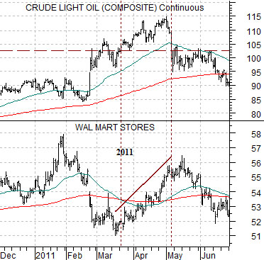
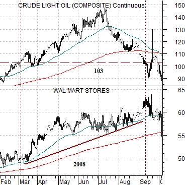
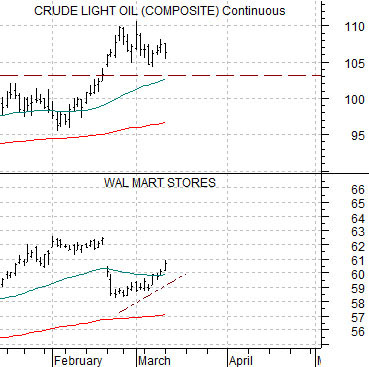
We have been asked on occasion ‘how high’ crude oil prices have to rise before there is a negative impact on economic growth. One answer might be… 103.
Wal Mart (WMT) tends to rise in price when growth begins to slow. This tends to happen either when crude oil prices start to weaken or when oil prices move above roughly 103. The chart at top right compares WMT with crude oil from 2008, below right is a period of time from 2011, and directly below is the current situation. The argument might be that WMT will tend to resolve higher in price as long as crude oil prices remain in the triple digit range.
Equity/Bond Markets
With interest rates close to 0% an argument can be made that a return in excess of, say, 5% per year is fairly decent. Decent, perhaps, but boring. Let’s look at a previous case of a relative strength ’10-bagger’.
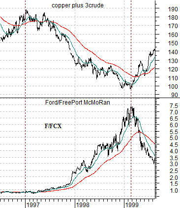
At top right is a chart comparison between the sum of copper and crude oil (copper in cents plus crude oil in dollars times 3) and the ratio between Ford (F) and FreePort McMoRan (FCX) from 1996 into 1999.
One of our arguments is that investors have become hard-wired to the assumption that stock prices can only rise when commodity prices move upwards. This has been true for so long that it has almost become a given. In general stocks rise when copper and crude oil prices move upwards and in most cases this works best when the U.S. dollar is weaker.
There have been periods of time, however, when the markets have not only risen on weaker energy and base metals prices but have actually moved upwards in a robust manner.
In any event… at the start of 1997 the trend for copper and crude oil futures prices turned lower. This was, by the way, the precursor to the Hong Kong stock market’s ‘crash’ in the autumn of 1997 and 1998’s Asian crisis.
The argument is that money began to abandon the Asian/Latin/emerging markets/energy theme around the end of 1996. As Warren Buffett once said you never know who is swimming naked until the tide goes out and in this case ‘the tide’ was the flow of capital. Once money began to move away from these themes it took anywhere from 9 to more than 18 months for the ‘cracks’ to appear.
Through the time frame from the beginning of 1997 into early 1999 the prices of copper and crude oil declined. The offset was a very powerful rise in the ratio between Ford (F)- and energy ‘user’- and FreePort McMoRan (FCX)- a base metals producer. The ratio started off around .075 in early 1997 and peaked two years later close to 7.5. In other words the share price of Ford rose 10 times relative to FCX over roughly 24 months.
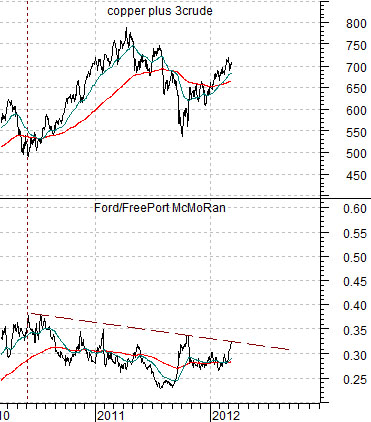
Below right is the comparison between the F/FCX ratio and the sum of copper and crude oil futures from the current time frame.
The basic argument is that the F/FCX ratio is still trending lower. Notice, by the way, that Ford’s share price was 7.5 times that of FCX in 1999 while today it is roughly one third. The chart suggests that this means that the trend for copper and crude oil is still ‘higher’.
Yet… from mid-2010 to the present day the F/FCX ratio has been working through what might turn out to be a rather nice ‘bottom’. From current levels- and using a fair bit of imagination- we can imagine a scenario where downward pressure on commodity prices from a rising U.S. dollar could shift the flow of money away from the basic materials stocks and back over to energy ‘users’ like the autos.