Obviously getting any market ‘right’ is a challenge but the one that we are really fixating on these days is the long end of the U.S. Treasury market.
One of our views is that we should never argue with the bond market. Obviously it is in our nature to be- at times- unnecessarily contrary but it has been our experience that if we accept that the bond market is ‘right’ everything else eventually falls into line. The problem today is in trying to determine whether the trend for bond prices turned higher last December or lower between June and August.
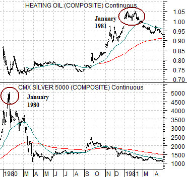
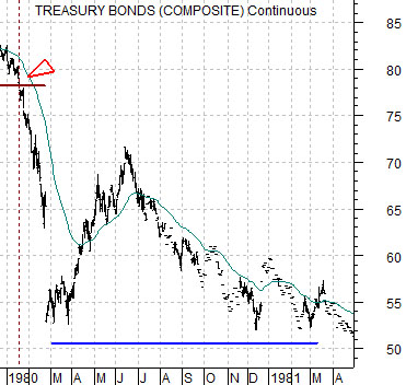
At top right is a comparison from 1980- 81. The chart compares heating oil futures with silver futures. Below right we show the U.S. 30-year T-Bond futures for the same time period.
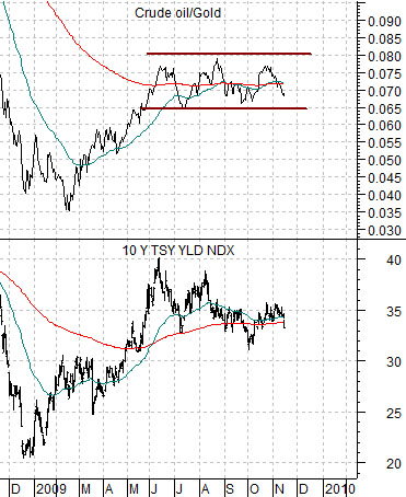
In yesterday’s issue we argued that the ratio between crude oil and gold prices goes with the trend for Treasury yields. In other words when gold prices are stronger than crude oil prices the trend for yields is lower while the trend for prices is higher. Conversely when gold prices are weaker than oil prices it tends to reflect rising yields and lower bond prices.
In any event… commodity prices peaked between 1980 and 1981 so we wanted to show how this related to the bond market. We are using silver futures in place of gold futures for this comparison.
Precious metals prices peaked at the start of 1980 concurrent with- and this is the important point- a rather massive break down in long-term Treasury prices. Energy prices, on the other hand, did not stop rising until early 1981.
The argument is that precious metals prices were stronger until the bond market vigilantes began to raise interest rates in earnest to slow cyclical growth in order to contain energy prices. Silver prices peaked as bond prices collapsed and then bond prices remained near the bottom until energy prices stopped rising.
Through 1980 one of the more dramatic relative strength shifts occurred between precious metals prices and energy prices. When gold and silver prices start to weaken relative to energy and base metals prices it tends to reflect a rising trend for interest rates and weaker bond prices.


Equity/Bond Markets
To finish off our page 1 argument we have included a chart of 10-year Treasury yields and the ratio of crude oil to gold prices. From June through to the current time period the trend for yields has been ‘flat’ while the oil/gold ratio chops back and forth through its moving average lines.
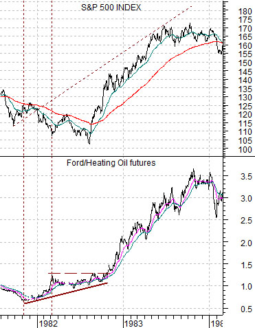
Below is a comparison between the S&P 500 Index (SPX) and the ratio between the share price of Ford (F) and heat oil futures from 1981- 84.
The equity market bottomed in August of 1982 but we will argue that the bullish trend actually began close to 9 months earlier when the Ford/heating oil ratio began to rise. The trend for equities was higher all the way through 1983.
Below we have included the same comparison for the current situation.
We argued early in the year that the Ford/heating oil had bottomed and should likely lead the equity markets higher. In other words while energy prices might rise or fall we would maintain a positive view on equities as long as this ratio was pushing to the upside.
The problem this year has been that ratio peaked at the end of April so over the past six months the markets have shifted focus from the energy users to the commodity producers.
Our thought is that if the Ford/heating oil ratio swings to new highs then the focus of the equity markets will swing away from commodities and back to some of the themes that have been lagging since May. The page 6 chart comparison anchored by the Ford/heating oil ratio provides a few examples.


