One of the benefits of being on this side of the desk is that we get to select the relationships and comparisons that end up in these pages. Most of the time- in our view- the charts are set up ‘fairly’ but every now and then we will use a bit more imagination than perhaps is necessary to support a previously held view. In other words… be warned; we are going to use a bit of artistic license to start things off today.
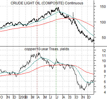
The argument begins with a chart from late 2007 through 2008. Below we compare the ratio between copper futures prices and 10-year yields with crude oil futures.
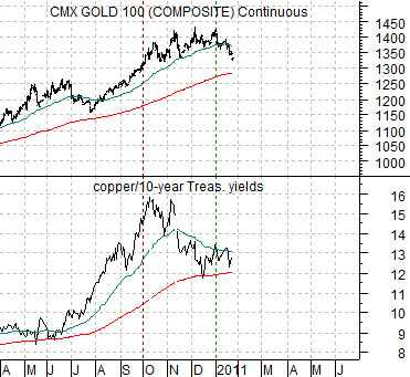
We have used the copper/yields ratio in the past in support of an assortment of arguments. Most recently we included it to show that a peak for this ratio tends to lead to weakness for the gold mining stocks. The idea was that a quarter or so after this ratio peaks and declines to its 200-day e.m.a. line the gold miners start to sell off.
In the spring of 2008 the ratio reached a peak. Three months later crude oil futures rallied to a cycle top before declining to the 200-day e.m.a. line. By September of that year both crude oil and the ratio ‘gave up’ the moving average line as the carnage spread through the raw materials sector.
The artistic license mentioned above is found in the comparison at bottom right. Instead of running crude oil against the ratio- which would like be ‘fair’- we have replaced it with gold futures. This may or may not be a logical leap but our thought is that the market that looks the most like crude oil in 2008 is… gold.
The copper/10-year yields ratio reached a top around the start of the final quarter last year. Given that we have argued that this marked the start of the rally for the laggard banks and that the offset to rising banks should be downward pressure on gold prices… it makes sense (to us) to swap crude oil for gold.
The chart argues that first support for gold should be found around the 200-day e.m.a. line (i.e. roughly 1290) and that the weaker copper gets relative to 10-year yields the greater the chance that gold will eventually fail from first support and decline through the first half of this year all the way down to around 700. 700, more or less, represents the break out point for gold in 2007 associated with the start of pressure on the banks. To us this would be a fairly logical price target if the correction started to gather real momentum.
Equity/Bond Markets
A target of 700 for gold is so extreme that we have decided to scrub the arguments that we were going to make on this page and actually make an effort to show how we came up with this number.
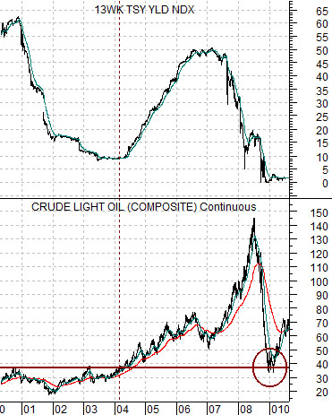
Below is a chart of crude oil futures and 3-month TBill yields from 2000 into 2010.
Our argument is and has been that crude oil futures prices breaking to new highs in 2004 initiated the rising trend for short-term U.S. interest rates. In other words the ‘break out’ point for crude oil was between 35 and 40.
When oil prices collapsed during the second half of 2008 the correction ran all the way back down to the ‘break out’ point set in 2004.
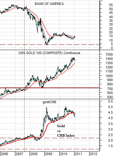
For close to two decades the ratio between gold and the CRB Index ranged from around 1.2 times up to 2.2 times. In other words for any given level of the CRB Index the price of gold would range from a bit more than the index to a bit more than twice the value of the index. Today, by the way, the CRB Index is just below 330.
The break out for the gold/CRB Index was made in 2007 as an offset to weakness in the banking sector. The chart at bottom right compares the gold/CRB Index with gold futures as well as the share price of Bank of America.
When the gold/CRB Index ‘broke out’ the price of gold was around 700. This suggests (to us) that a serious decline for gold prices could carry all the way back to the original break out level which is, of course, 700.
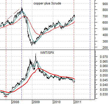
Below we show the sum of copper and crude oil and the ratio between Wal Mart (WMT) and the SPX. In 2007 the WMT/SPX ratio turned upwards a full nine months before crude oil and copper reached a peak. This time may be different but the point is that the ratio has yet to strengthen to the point where a clear rising trend is evident. If at least some components of the cyclical trend lag this ratio by a full three quarters then we still have some reason to expect a positive outcome once the current pressures subside.