In a number of ways and from a variety of perspectives the current markets trend is both unique and extreme. Since we continue to be asked about our views on gold on an all too regular basis we thought we would start things off today with a chart comparison based on gold prices.
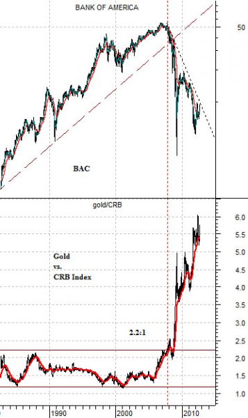
At right is a chart of Bank of America- scaled in semi-log- and the ratio between gold and the CRB Index.
Keep in mind that the gold/CRB Index ratio says less about the absolute price of gold and rather more about its performance relative to other commodity prices. With commodity prices rising through the previous decade gold prices ramped up from just over 1 times the CRB Index in early 2001 to around 6 times in June of this year.
For close to three decades the price of gold wandered back and forth between around 1.2 and 2.2 times the level of the CRB Index. With the CRB Index currently around 310 this would argue that, all things being equal, a gold price somewhere between 400 and 700 would be approximately ‘fair’.
But, as is often the case, all things are not equal. The most compelling argument that we could make is that the price of gold at current levels reflects the stresses put on the financial system post-2007 as the world moved from one state of crisis into another.
The break down through the rising support line for BAC in 2007 marked the start of the upward relative price explosion for gold.
It would be difficult to imagine a scenario that would include BAC swinging all the way back into the old rising trend any time soon but that would be the sort of intermarket event that would be necessary to pull the gold/CRB Index down into its previous trading range. In the mean time we continue to look for the cyclical recovery to find some form of traction which would lead to a sustained downward trend for long-term bond prices.
The basic point is that the better the banks the weaker the trend for gold. With gold and the bond market trading in the same direction any lasting price weakness for gold will have to include a significant price decline in the long end of the U.S. Treasury market.
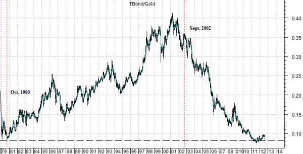
Below is a rather long-term chart of the ratio between the price of the U.S. 30-year T-Bond futures and gold futures.
The ratio bottomed in the autumn of 1980 and then returned to the same basic levels in 2011. In a sense this is likely an important detail.
Bond prices have risen for more than 30 years. Gold prices, on the other hand, lagged the bond market for the first two decades and then sprinted north to ‘catch up’ with the bullish trend. The end result is that gold prices today are almost exactly the same relative to the bond market as they were at the most extreme point following the 1970’s commodity bull market.
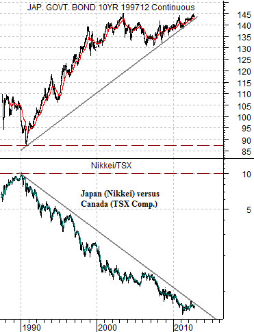
The point? Gold prices can rise if bond prices rise. If the bond market isn’t leaping higher then gold prices are, more or less, range bound. The big move that took the TBond/gold ratio down from .40 to around .08 has been completed.At right is a chart of the Japanese 10-year (JGB) bond futures and the ratio between the Nikkei 225 Index and Canada’s S&P/TSX Composite Index (TSX).
The key here is the direction of the bond market. Another intriguing detail has to do with the 20+ year trend of relative strength in the Canadian stock market that has gone as an offset to rising Japanese bond prices.
So… in the chart below the TBond/gold ratio rose from 1980 into 2001- 02 and then snapped back to its starting point through a rapid increase in the price of gold. In the chart at right we see the Nikkei/TSX ratio declining from 1990 into 2011- 12. We continue to wonder whether there is any set of circumstances that would snap this ratio back to its levels from 1990. For as farfetched as this might seem we will counter that very few would have believed in 2002 that the price of gold would rise 5-fold against the bond market over the ensuing decade.