Oct. 22 (Bloomberg) — Copper fell from the highest price in almost 13 months in New York as the dollar strengthened, eroding metals’ appeal as an alternative investment.
Oct. 23 (Bloomberg) — The dollar traded within a half-cent of a 14-month low against the euro as stocks gained on better- than-expected corporate earnings, reviving demand for riskier assets at the expense of the greenback.
Apparently just about everything in the markets these days relates to the U.S. dollar. If copper prices decline it is dollar strength at work. If equities rise… dollar weakness is to blame. The strange thing is that this actually makes sense most days.
Gold tends to trend higher when the dollar is weaker so one has to look no further than the dollar to grasp why gold prices are trading at or near record highs. The dollar is only part of the equation, however, so we thought we would quickly run through one of the other variables.
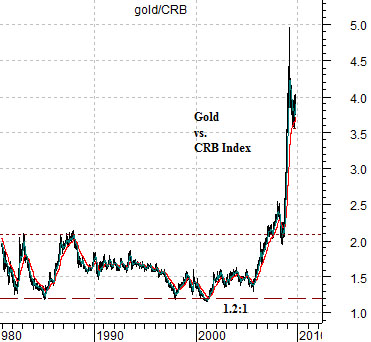
At top right is a chart of the ratio between the price of gold and the CRB Index. From the early 1980’s through to around 1997 the ratio swung back and forth from around 1.2:1 to 2.1:1. With the CRB Index closing yesterday around 282 this supports a gold price somewhere between the 300 and 600.
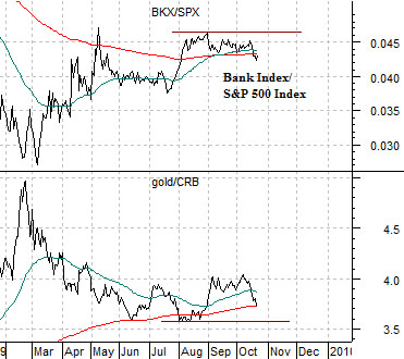
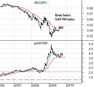
The chart below right compares the gold/CRB Index ratio with the ratio between the Bank Index (BKX) and the S&P 500 Index (SPX). While the dollar has certainly been instrumental in creating a rising trend for gold prices we have slogged through weak dollar trends in the past without getting anywhere close to triple-digits for gold prices. From our perspective just about everything north of around 600 has more to do with the recent banking system crisis than the absolute value of the U.S. currency.
The point is that with or without dollar strength the price of gold could decline simply based on a recovery in the relative value of the banking shares. If the BKX/SPX ratio resolves to the upside into 2010 we could easily see the gold/CRB Index ratio return to something in the neighborhood of 2:1.
Equity/Bond Markets
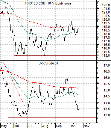
At top right we show a short-term view of today’s first page chart.
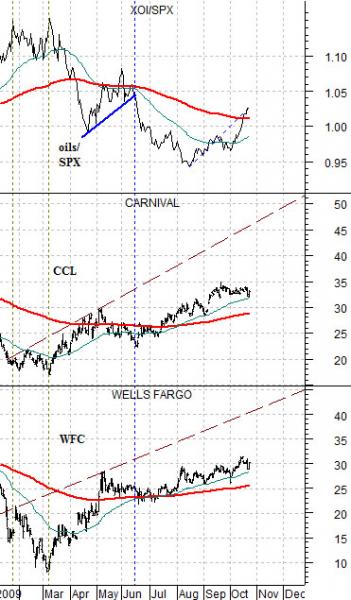
Below right is a comparison that we have shown on many occasions over the past few years. As long as we are focusing somewhat on the banks we felt that this might be worth running through once again.
The chart compares Wells Fargo (WFC), Carnival Cruise Lines (CCL), and the ratio between the Amex Oil Index (XOI) and S&P 500 Index (SPX).
The argument was that once the XOI/SPX ratio peaked… a recovery trend for both WFC and CCL would begin. To put things into perspective when the XOI/SPX ratio topped out at the bear market bottom in the autumn of 1990 it remained in a downward trend through into early 1999. In other words… our argument was much longer in term than a quarter or three.
Rallies in the XOI/SPX ratio put pressure on WFC and CCL and since WFC is one of the major U.S. banks the idea is that if, as, or when the XOI/SPX swings lower- as it did this past June- we should get back to a stronger trend for the banks and the non-energy cyclicals.
Below is a comparison between U.S. 10-year T-Note futures and the ratio between the S&P 500 Index and crude oil futures.
In June of this year the SPX/crude oil ratio bottomed along with the bond market. This also marked the top for the XOI/SPX ratio and the beginning of a better trend for WFC and CCL. There are any number of potential outcomes for the next few months but the one that we would prefer includes a return to strength for the SPX/crude oil ratio. This would help support the bond market, keep equities rising relative to commodity prices, help the banking system recover, and keep gold prices from sprinting too far above the 1000 level.
