We are not referring in the title to the returns on growth but rather on the return of the growth trend. The return of a positive cyclical trend. A change within the markets back towards a focus on economically sensitive sectors.
WASHINGTON — The Federal Reserve opened a new chapter on Thursday in its efforts to stimulate the economy, announcing simply that it plans to buy mortgage bonds, and potentially other assets, until unemployment declines substantially.
We have been arguing for months (and months) that negative pressures are emanating from the Eurozone and China while positive and, at times, offsetting pressures are coming from gains in U.S. employment. With the Fed essentially stating that it will keep its foot hard on the accelerator until employment declines ‘substantially’ the markets were inclined to take a more kindly view on cyclical asset prices.
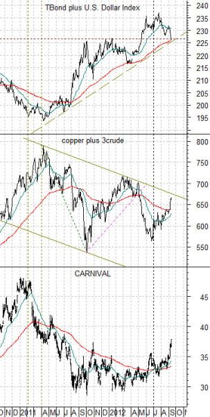
Below is a comparative chart of, from top to bottom, the sum of the price of the U.S. 30-year T-Bond futures and the U.S. Dollar Index (DXY) futures, the combination of copper and crude oil futures prices, and the share price of cruise ship operator Carnival (CCL).
We are using Carnival to represent ‘cyclical’. Normally CCL will trade in the opposite direction of crude oil prices but the chart suggests that the markets have taken a rather broad brush to the idea of ‘cyclical’ with Carnival trending in essentially the same direction as copper and crude oil.
The argument is that a rising trend for the TBonds and Dollar represents a defensive trend. Money is moving towards the safety of the bond market and the perceived safety of the U.S. dollar in response to a negative trend for cyclical asset prices.
When the sum of the TBond and Dollar turns lower the markets react by driving a variety of cyclical themes higher. This is essentially what has been happening within the markets since the end of this year’s second quarter.
The caveat, of course, is that the sum of the TBonds and Dollar has only declined to the moving average line (similar to March of this year) while the combination of copper and crude oil has yet to break out through the top of the declining channel.
Equity/Bond Markets
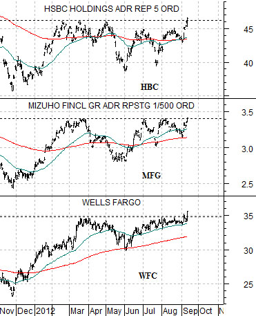
Well… leaders gotta lead. Or something like that. At right is a chart of Wells Fargo (WFC), Japanese bank Mizuho (MFG), and Hong Kong’s HSBC (HBC).
We have been fixating on Wells Fargo’s struggles with resistance in the 34- 35 zone for months. With WFC finally breaking out of the trading range we also note that HBC is nipping up to new recovery highs while MFG is testing the top edge of its range.
The idea has been that the leading banks have to break clear of resistance and when this happens the lagging banks will swing higher along with long-term yields. We show a chart of MFG, Mitsubishi UFJ, and Nomura on page 7 as a comparison between leading and lagging.
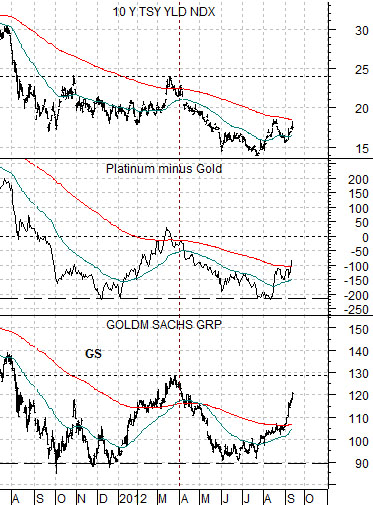
Below is a view of Goldman Sachs (GS), the spread between platinum and gold, along with 10-year U.S. Treasury yields.
All three are essentially the same chart. GS trends with yields. Platinum is stronger than gold when yields are rising. GS trades almost tick for tick with the platinum- gold spread.
Things get interesting if GS rises above 130 while platinum futures prices move above gold prices. This would bring the markets back to the same basic levels as March of this year when 10-year Treasury yields were closer to 2.4%.
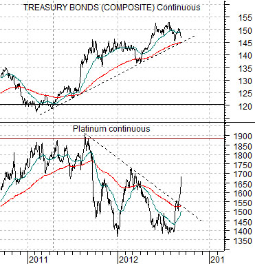
Below is a comparison between the U.S. 30-year T-Bond futures and platinum futures.
In March the TBond futures were trading around 137 while platinum futures were flirting with 1700. Given the sharp price gains that platinum has enjoyed over the past few weeks is it really that hard to believe that 137 is a difficult price target? We mention this because a price of 137 on the TBonds was last seen when 10-year yields were 2.4% so there still appears to be considerable room for yields to adjust upwards.