A markets cycle begins with falling interest rates and ends once interest rates have climbed to the next peak. Our premise today is that there are two parts to the cycle- falling yields and rising yields and that the change over takes place about half way through the cycle with respect to ‘time’.
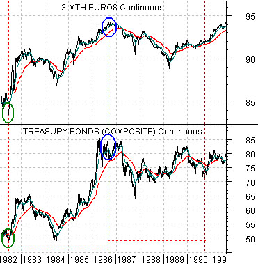
Let’s see if can’t find some way to explain our point today. Below are two charts of U.S. debt futures. The charts compare 3-month eurodollar futures with 30-year U.S. T-Bond futures. The top chart is from 1982 into 1991 while the lower chart is from 1999 through to the current time frame.
We will argue that a markets cycle began in mid-1982 as both short and long-term debt prices began to rise. In other words the cycle began as both short and long-term interest rates started to tumble.
After a period of backing up through 1984 the cycle extended all the way into 1986 at which time debt prices peaked as interest rates reached their lows. In terms of our argument the time period between 1982 and 1986 marked the first stage of the cycle.
While the stock market managed to ‘crash’ in 1987 the cycle continued through into late 1990. The stock market declined ahead of the peak for energy and metals price that year with the recession following in 1991. The point, however, is that the entire cycle from 1982 through 1990 ran for roughly 8 years made up of around 4 years of declining yields and 4 years of rising yields.
The chart below shows that debt prices bottomed in 2000 with long-term bond prices rising just ahead of short-term eurodollar prices. The ‘first half’ of the cycle ran through into the spring of 2004 when the combination of short and long-term debt prices finally began to decline. Once again the cycle ran for 4 years- 2000 into 2004- with downward pressure on yields.
If history repeated then the cycle would have been expected to come to an end some time around the start of 2008. 4 years of downward pressure on yields followed by 4 years of upward pressure. By the second half of 2007 U.S. debt prices had swung back to the upside marking the beginning of yet another markets cycle even as the existing cycle ground to a close.
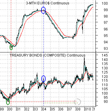
The points that we were attempting to make are as follows. A markets cycle begins with falling yields and extends to the next peak in yields. It is divided into two sections- downward pressure on yields and upward pressure on yields. In the two examples shown the sections ran for very similar lengths of time.
The next point is that the cycles began somewhat muddied as a new one began ahead of the end of the old one. In other words even as commodity prices pushed to record highs during the first half of 2008 a new markets cycle had begun marked by tumbling interest rates.
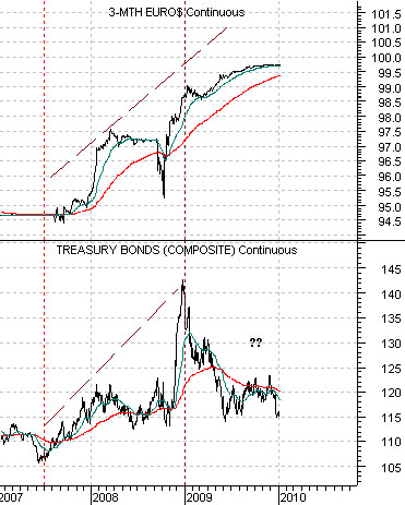
We now approach the next challenge to our examination. Below we show 3-month eurodollar futures and 30-year T-Bond futures. The charts show that the cycle began in earnest around the middle of 2007 with debt prices on the rise. Through all of 2009 the short and long ends of the bond market diverged. If we look at 3-month eurodollars we are convinced that we are still in the first section of the cycle. Using 30-year T-Bond futures it looks more as if upward pressure on yields began a full year ago.
Our view is that this has much to do with ‘China’. Downward pressure on yields comes from U.S. domestic circumstances while upward pressure comes from the broader BRIC/commodity themes. Our thought is that the decline in bond prices may simply be a repeat of 1983- 84 (chart on page 1) with higher bond prices to follow. What would work best from our perspective is a continuation of the downward pressure on yields through into 2011 (i.e. 4 years in duration) followed by the start of the second section of the cycle that would run into 2015.
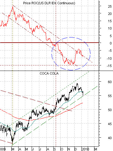
Quickly… Coke’s (KO) share price continues to trend inversely to the annual percentage Rate of Change for the U.S. Dollar Index. Dollar weakness yesterday helped KO’s share prices recover somewhat.
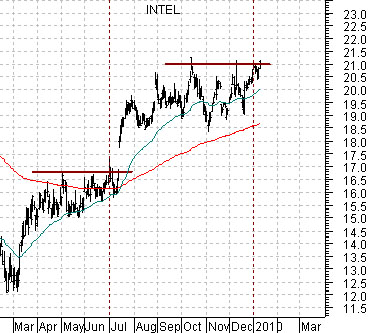
Intel (INTC) is still stuck at the high end of its recent trading range. The chart below shows that INTC struggled in the 16’s through the second quarter of 2008 and then ran into resistance close to 21 through the fourth quarter. If the positive equity market trend is still intact then this is the kind of large-cap non-commodity name that needs to extend its rally.