Let’s see. A definite lack of strength in the Asian equity markets with a tinge of real weakness in Chinese share prices. A weaker dollar supporting rising commodity prices with trend line support for currencies like the Swiss franc and Japanese yen being tested once again. The commodity currencies (Cdn and Australian dollars) are having a hard time holding above parity with the greenback suggesting that with a very small bump- a veritable nudge- the dollar could be substantially higher than today’s levels.
The question is… what might a ‘substantially higher’ dollar do to some of the more speculative commodity charts?
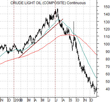
Below is a chart of crude oil futures from November of 2007 through 2008.
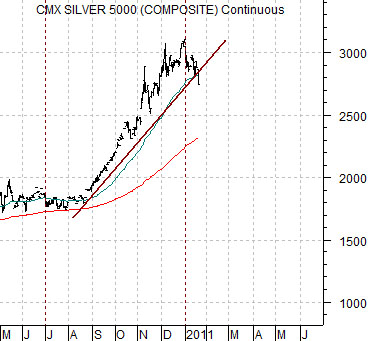
Next is featured a chart of silver futures from May of 2010 to the present day.
We have argued on quite a few occasions that in recent years the front half of the year has tended to feature a trend involving energy and base metals prices while the back half of the year has focused more on ‘everything else’. The first six months of the year have tended to include cyclical strength and upward pressure on yields while the final six months has leaned more towards falling yields and ‘catch up’ rallies by sectors left behind.
Now… it could be that all of this has now changed. It could be that the only reason energy and metals prices were stronger from January through June was that they were the dominant theme. It could be that this is simply a reflection of the seasonal trend that shows rising strength from November through May and slowing growth from June back into the autumn. Or not.
Our point is that we only have to look back to 2008 to see what can happen to a market once the quarter comes to an end. When we hit the month of July that year a rising trend for crude oil prices that so many experts told us was fundamentally justified disappeared in a puff of smoke. Poof. Gone. Up, up, up turned into down, down, down. And then down some more.
To us the chart for silver futures appears similar. After enjoying the ‘everything else’ rally through the final six months of 2010 the trend seems to be in the process of shifting paradigms without the benefit of a clutch.
Equity/Bond Markets
Jan. 20 (Bloomberg) — Treasuries dropped, pushing 30-year bond yields to an eight-month high, as initial jobless claims fell and existing-home sales rose more than forecast, bolstering speculation the economic recovery is building steam.
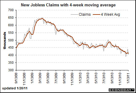
Below is a chart from Econoday.com. We have been showing the trend for U.S. weekly jobless claims on occasion for much of the past year. Our view has been that the markets have been driving off of this statistic.
There have been two ‘peaks’ for claims- March 2009 and roughly August of 2010.
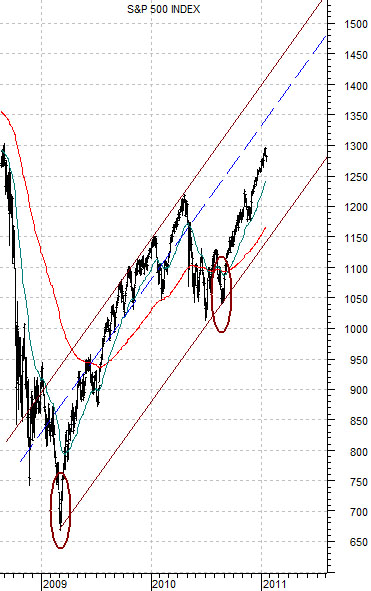
Below is a chart of the S&P 500 Index. There have been two ‘bottoms’ for the equity markets- March of 2009 and August of 2010.
The point is that after weeks of pushing higher the equity market appears to be at risk but… when viewed from the perspective of the trend for weekly jobless claims we can make the case that SPX 1350, 1400, and even 1450 are within the realm of the possible on an intermediate-term basis.
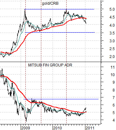
Last is a comparison between the ratio of gold to the CRB Index and the share price of Japanese bank Mitsubishi UFJ (MTU).
MTU is one of the ‘laggard banks’. The argument has been that it is trending in a mirror image of the gold/CRB Index ratio. When this ratio broke down through its 200-day e.m.a. line during the final quarter of 2010 the share price of MTU swung to the upside. The point is that through trading yesterday… nothing much had changed. Gold was still weak on a relative basis and we continue to hold a positive view on the laggard banks.