We were looking for a price peak for gold and a relative strength peak for crude oil (crude oil/CRB Index) around the end of April. Following these events the next issue to deal with is whether the U.S. equity markets can hold or rise in the face of downward pressure on commodity prices.
The quick answer is… all things are possible. The S&P 500 Index should outperform most foreign markets and within the SPX we expect to see relative strength in the pharma and biotech sectors along with the energy ‘users’ and the ‘deep value’ tech names (Intel, Microsoft, Cisco, etc.) The initial response to weaker commodity prices will be a decline in long-term yields although our expectation is that yields will swing higher later this month. First stop for crude oil is around 92 with the correction anticipated to run until crude returns close to 85. As for gold… 1100- 1150 in due course seems about right.
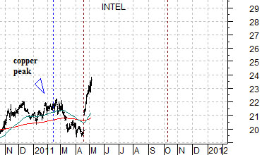
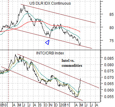
The chart below compares the U.S. Dollar Index (DXY) futures with the ratio between Intel (INTC) and the CRB Index. The argument here is that when the markets make the shift from commodities to ‘tech’ it often shows up in a rising trend for the dollar. The ratio rose through much of the month of April suggesting that ‘surprising’ dollar strength was just around the corner.
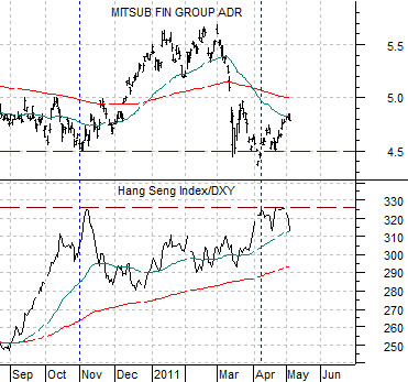
Next is a chart of Japanese bank Mitsubishi UFJ (MTU) and the ratio between the Hang Seng Index from Hong Kong and the U.S. Dollar Index futures.
The somewhat tentative argument made from this chart is that there is a general relationship between the trend for the laggard banks (MTU) and the action in the Hang Seng Index and dollar. In other words a peak for the Hang Seng Index/DXY ratio in early November of last year went with the upside pivot for MTU which, in turn, helped lead the stock prices of Bank of America and Citigroup upwards.
If the relationship is something more than pure coincidence then a second peak for the Hang Seng/DXY ratio should mark a second bottom for MTU. The chart suggests that this actually happened close to a month ago after MTU made a brief foray below the 4.50 level.
The point? The ratio between Intel and the CRB Index argues for dollar strength and dollar strength was an integral part of the rising trend for the laggard banks late last year. Hope, we suppose, springs eternal.
Equity/Bond Markets
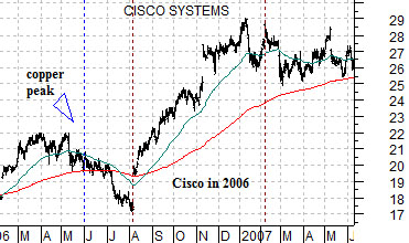
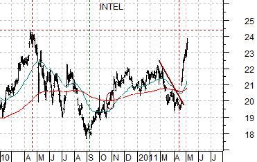
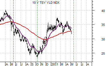
We are going to use the same two chart comparisons that we included in yesterday’s issue. Below is a chart of Intel from the current time frame and Cisco from 2006- 07. Next is a chart of Intel as well as 10-year Treasury yields. These two charts have been shifted or offset by one month to show the slight ‘lead’ between Intel and the trend for long-term yields.
The argument was that the upside ‘gap’ that Intel made in April was similar to the action in Cisco following earnings back in August of 2006. These kinds of surprising trend changes tend to run for at least a quarter of two which is why we have shown how Cisco trended upwards through the second half of 2006.
If Intel follows the same general path then the stock price should be higher into the autumn. This may or may not prove to be correct but… this is the thesis that we are working with.
The charts below suggest that Intel and yields trend fairly closely together and a case can be made that Intel actually ‘leads’ by a month or so. If this is true then the downward tilt for yields today is, in a sense, a reflection of the bearish trend for Intel into April. By the second half of this month yields should turn from lower back to higher.
So… consider what this would mean. The initial reaction to falling commodity prices is lower yields but the charts argue that in fairly short order the markets will come to realize one or both of two things. First, there is reasonable momentum in the tech sector. Second, if rising energy prices are economically negative then collapsing energy prices are economically stimulative and a positive cyclical trend shows up through rising yields.
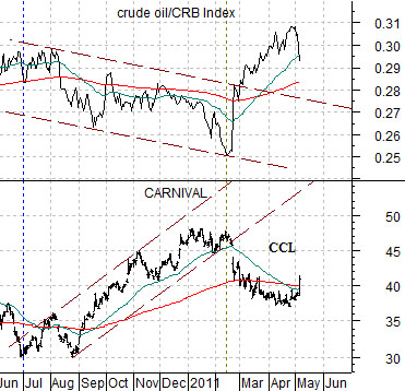
Quickly… we brought up the issue of ‘slack’ in yesterday’s issue. How far would oil prices have to decline and how long would oil prices have to weaken before the markets would start shifting money into the energy ‘users’. The reaction yesterday suggested that the answers suggested in trading yesterday were… quite far but not long. Below is a chart comparison between Carnival (CCL) and the crude oil/CRB Index ratio.