There are a number of hurdles facing the markets these days but two in particular come to mind. First, it is March and second, the decade-long positive trend for energy prices seems to be fading somewhat.
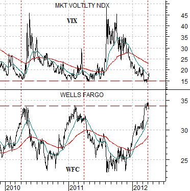
The chart below compares the share price of Wells Fargo (WFC) and the CBOE Volatility Index (VIX) from the start of 2010 to the present day.
We have made this argument once or twice in prior issues but the idea is that around in the end of the first quarter in both 2010 and 2011 the share price of Wells Fargo had risen up to the 34 level while the VIX had declined back down to around 15. From there the markets shifted from a positive trend back into a negative trend that ran for the next six or so months.
So… fast forward into 2012 and we can see that once again WFC has been flirting with resistance around 34 while the VIX was recently very close to 15. For the third year in a row cyclical optimism has elevated the share prices of the banks into the first quarter of the year while compressing risk and volatility.
The first hurdle for the markets to push over or stumble through involves Wells Fargo moving nicely above 34. Until such time as this happens one has to wonder whether the next good entry point will come with WFC back below 25 with the VIX north of 40.
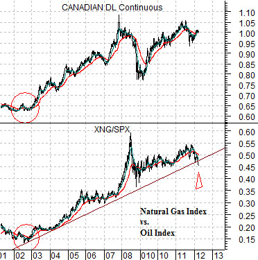
Next is a comparative view of the Canadian dollar (CAD) futures and the ratio between the Natural Gas Index (XNG) and the S&P 500 Index (SPX).
Essentially… the Cdn dollar turned higher in 2002 as the U.S. dollar began to weaken. U.S. dollar weakness went with the start of a broad commodity price uptrend that included strength in the natural gas sector. Fast forward a decade and gas producers are shutting in production, the drilling rig count is falling by the week, and the near-term concern is whether spot gas prices can hold much above zero as inventory capacity is stressed through the summer months.
The second hurdle for the markets to overcome is downward pressure on energy prices. Our view is that this will mark the end of the flow of capital towards gas producers and the start of some kind of positive flow towards sectors that can find new and innovative ways to shift industrial and consumer usage away from crude oil and gasoline over to natural gas.
Equity/Bond Markets
Now… we could be early in making this argument but we might as well get it out of the way now. There is a seasonal trend that favors gasoline prices through the Memorial Day long weekend (i.e. late in the month of May) but we are going to ‘assume’ that the energy trend is going to falter through the second quarter.
Last August the share price of Cisco ‘gapped’ to the upside. The intermarket ‘opposite’ of tech is gold. In other words gold does better with a strong bond market and weaker dollar while the large cap tech stocks prefer a weak bond market and stronger dollar.
If energy prices decline… what is the intermarket ‘opposite’? Our view is that it tends to be the defensive sectors including the drug stocks.
Stronger energy prices go with a weaker dollar and falling bond prices. The weak dollar supports commodity prices while falling bond prices suggest stronger cyclical growth. The intermarket ‘opposite’ to a weak dollar and bond market is, of course, a strong dollar and rising bond prices and this is the kind of trend that has traditionally favored the broad health care theme.
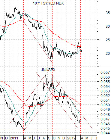
Below is a chart of 10-year Treasury yields and the ratio between Johnson and Johnson (JNJ) and the S&P 500 Index (SPX). In general when there is downward pressure on interest rates the share price of JNJ will tend to outperform the broad market.
A second outcome would involve a stronger dollar and a flat to rising dollar. Dollar strength puts pressure on energy prices while bond price weakness supports expanding economic growth.
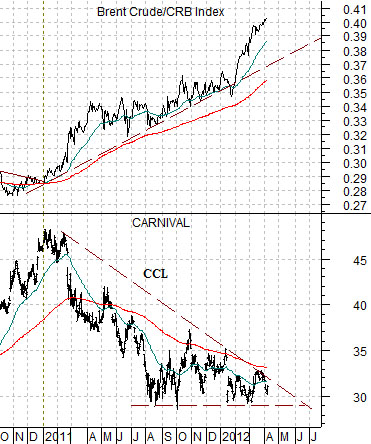
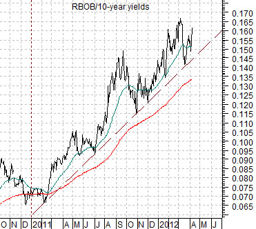
This outcome could potentially favor the theme that we tend to call ‘autos and airlines’- economically sensitive companies that do better when energy prices are under pressure. The share price of cruise ship operator Carnival (CCL) is an example of this theme. Below right we show CCL along with the ratio between Brent crude oil futures and the CRB Index. Another way to view this trend is through the ratio between gasoline (RBOB) futures and 10-year Treasury yields (chart below). If these trends falter and turn lower then look for the ‘autos and airlines’ to do better through the next quarter or two.