Our premise is that if nothing of significance has changed… then chances are that trends in motion will remain in motion.
That was a bit cryptic. Let’s try again using the comparison below for our explanation.
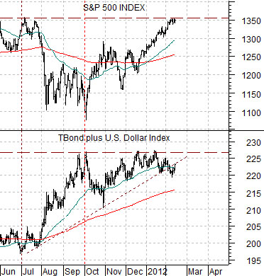
The chart shows the S&P 500 Index (SPX) and ratio between crude oil futures and the U.S. 30-year T-Bond futures from June of 1990 through April of 1991. This time period included Iraq’s invasion of Kuwait in August of 1990 and the first Gulf War that began in January of 1991.
Our argument is that the equity markets were held hostage to both bond and crude oil prices. From June of 1990 into October of that year oil prices rose while bond prices declined. This created a sharp increase in the ratio between crude oil and the TBond futures. When this ratio was tracking higher the equity markets declined.
In October of 1990 the crude oil/TBonds ratio peaked and turned lower and as it did the SPX swung upwards. The view is that if the SPX was rising in the face of a declining crude oil/TBonds ratio then regardless of the chart-based resistance at the 370 level (the mid-1990 highs) the index would remain positive as long as oil prices were weaker and bond prices were stronger.
Below is a chart comparison from the current time period. Each cycle has its own ‘drivers’; the relationships are blazingly obvious in hind sight and very difficult to discern in real time.
The idea here is that the SPX declined from July into October last year for two reasons. First, bond prices were rising. Second, the dollar was also rising.
Our argument has been that once the sum of the TBond futures and U.S. Dollar Index (DXY) futures stopped rising the equity markets began to recover. So far a stronger equity market had not required bond price or dollar weakness- just an end to last year’s strength.
So… if nothing of significance has changed (i.e. the sum of the TBonds and Dollar is not making new highs) then chances are that trends in motion (in this case a rising path for the SPX) will remain in motion.

Equity/Bond Markets
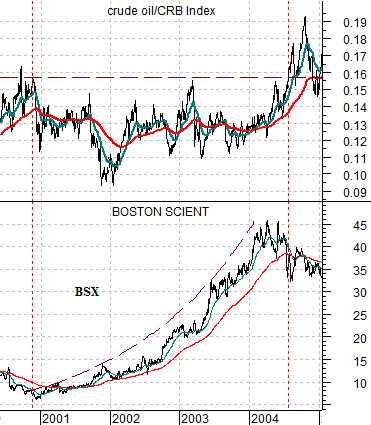
Just below is a chart comparison between the ratio of crude oil futures to the CRB Index and the share price of Boston Scientific (BSX) from 2000 through 2004.
This is a tricky comparison because it is only meant to represent what ‘did happen’ and is not intended to argue what ‘will happen’. One lesson that we keep having to learn over and over again is that the markets repeat trends but from different directions and using different sectors. The point is that if the markets are under a certain type of pressure in one cycle you might find offsetting strength in a variety of sectors but when the same or a similar kind of pressure shows up in the next cycle the offsets may be completely different.
On the other hand… the markets aren’t completely random. Cyclical pressure creates an uptrend for bond prices. When bond prices are strong and rising the defensive sectors tend to do better. This includes the usual suspects- pipelines, utilities, high dividend payers, etc. as long as their business is ‘not the reason that bond prices are rising’.
In any event… we have wandered off topic. In late 2000 the ratio of crude oil to the CRB Index peaked and turned lower. The downward pressure created by a prolonged period of time ‘without stress from rising energy prices’ created a window that allowed the markets to focus on other themes. Between the peak for the crude oil/CRB Index ratio at the end of 2000 and the eventual break to new highs by the ratio in 2004 the share price of BSX rose from just above 6 to just over 45. Nice.
So… what exactly is our point(s)?
First, any time energy prices stop pushing one should expect to find offsetting strength in apparently unrelated sectors. With the benefit of hindsight this isn’t much of a problem. In real time… not so much.
Second, these kinds of ‘energy offset’ trends can run for quarters or even years. We have become used to the idea that crude oil prices will strengthen for almost any reason (Egypt, Libya, Iran, Eurozone crisis, Eurozone crisis resolution, improved U.S. employment, almost anything out of China, weaker U.S. dollar, etc.) but the chart at top right suggests that once the offsets start rising (i.e. Boston Scientific) the trend can run for quite some time.
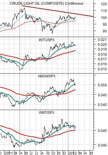
At bottom is a comparison between crude oil futures and the ratios between Intel (INTC), Amgen (AMGN), and Wal Mart (WMT) compared to the S&P 500 Index (SPX).
The argument is that the energy price trend peaked at the end of the first quarter of 2011. Even though crude oil futures are still flirting with triple digit prices the reality is that prices were higher a year ago.
The offset to the negative energy price trend is strength in an assortment of non-energy sectors including tech (Intel), biotech (AMGN), and even stodgy old Wal Mart.
So… almost a year into a ‘weaker energy price trend’ our sense is that not more than one in a hundred involved in the markets would realize that something has changed. The offset to this is, as usual, strength in non-energy sectors so as long as the ratios shown at right keep rising we will continue to believe that the trends in motion are going to remain in motion.