We are not sure whether there is ever a true rhyme or reason with regard to the topics that we cover on a daily basis in these pages. Usually we show perspectives on issues that we are thinking about which can lead to a bit of a scattered approach. Today, we suspect, is a good example of this.
We were pondering the impact on the markets of China starting to raise interest rates last October and wondering whether the initial reaction might be similar to the way the equity markets reacted to the first of a long series of Fed rate hikes around the end of June back in 2004. In other words… our focus was on the U.S. equity market and rising yields in 2004 and the Chinese stock market and rising yields through the end of 2010 and into 2011.
We do not have data on Chinese short-term yields so we decided to use U.S. yields instead given the fact that as China raised interest rates U.S. yields turned higher last October. Whether this is ‘fair’ or not is open to debate.
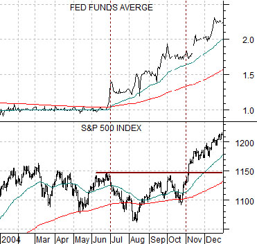
Below is a chart of the Fed funds target rate and the S&P 500 Index from 2004.
Notice that as the funds rate began to rise around the end of June that year the initial response for the SPX was bearish as prices sold off down through the 200-day e.m.a. line. It took roughly four months for the SPX to settle out and push to new highs even as the Fed funds rate continued to move upwards.
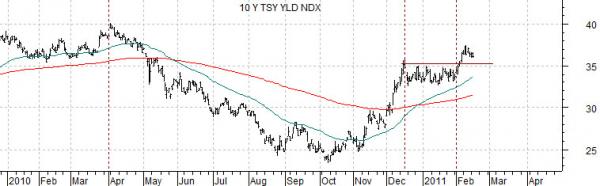
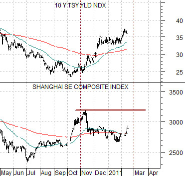
Compare this chart to the one below of 10-year Treasury yields and the Shanghai Composite Index from May of last year through to the present time period.
The chart shows that the first reaction by the Shanghai Comp. to rising yields was bearish with the index falling back below the 200-day e.m.a. line. If history were to repeat exactly- always a questionable assumption- the Shanghai Comp. would be set to move up through 3200 some time in early March. A bullish resolution would help confirm the rising trend for yields and help support our contention that yields will continue to push higher through into the autumn of 2012.
Equity/Bond Markets
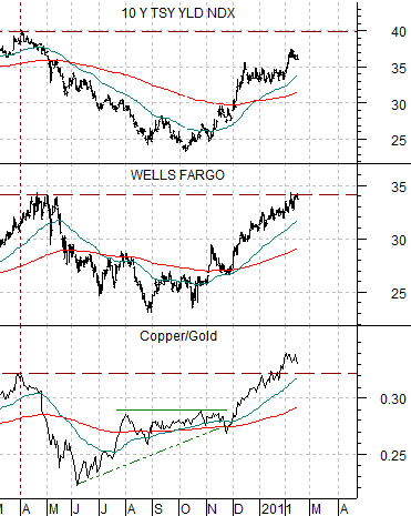
Below is a comparative view of 10-year Treasury yields, the share price of Wells Fargo (WFC), and the ratio between copper and gold futures.
The argument is that when yields are rising the copper/gold ratio should rise as well. If copper is ‘strong’ then gold prices can lag simply be rising at a slower pace. Our view has been that yields will rise AND gold prices will decline which suggests that this would work best if copper prices were to flatten out or even move into a period of consolidation.
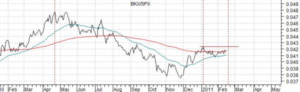
Below is a chart comparison that we find rather intriguing. Our favorite relationships are based on some kind of ‘lead’ because they help us get a handle on what might happen in the days to come.
We have included a chart of 10-year Treasury yields and the ratio between the Bank Index (BKX) and S&P 500 Index (SPX).
The charts have been shifted or offset by roughly 3 weeks.
The idea here is that there is a slight ‘lead’ between the trend for yields and the relative strength of the major banks compared to the broad market. In other words yields peaked at the start of April in 2010 while the BKX/SPX ratio did not top out until the second half of the month. As well yields bottomed in October while the BKX/SPX ratio bottomed in November and… the first peak for yields was made in December while the ratio reached a top early in January.
The point? If the chart has any predictive value look for the BKX/SPX ratio to make new highs later this month.