We argued earlier this week that the ‘Decade Theme’ suggested that the cyclical low for one or more sectors wouldn’t be made until some time closer to September. The idea was that the dominant theme from the previous decade- in this case some combination of small cap, foreign, commodity, and energy- tends to wash out around the end of the third quarter.
We showed yesterday that the recent trend has featured downward pressure on long-term yields through the second and third quarters of the year.
Another argument has been that energy prices tend to bottom at the low point for yields.
By combining these views we end up with the conclusion that energy prices and long-term yields will remain under pressure through the summer.
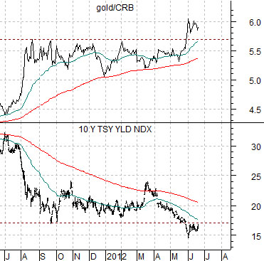
Below is a comparison between 10-year Treasury yields and the ratio between gold futures and the CRB Index.
The chart suggests that the gold/CRB Index ratio is acting as the mirror image of the trend for yields and that as 10-year yields moved below 1.7% in late May the relative strength of gold moved to new highs. Chances are we will see a return to gold price weakness once 10-year yields swing back up above the 1.7% level.
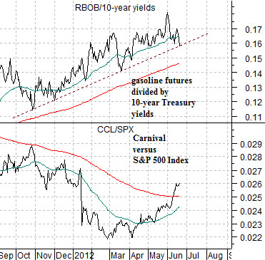
Below is a chart of two ratios as we compare the price of gasoline futures divided by 10-year yields to the ratio between the share price of Carnival Cruise Lines (CCL) to the S&P 500 Index (SPX).
The gasoline (RBOB)/10-year yields ratio represents the head wind face by the energy ‘users’. The combination of stronger fuel prices and falling yields (denoting economic weakness) puts pressure on the auto and airline stocks.
What we have noticed, however, is the start of a rising trend for Carnival that has the look and feel of something important changing. One of these days we would like to see the RBOB/yields ratio break cleanly to the down side to confirm the bullish pivot for the energy ‘user’ sector.
Equity/Bond Markets
We touched on something in yesterday’s issue that bears further explanation. The argument was that falling interest rates are bullish for equities at certain points in time and bearish at others. This is, by the way, not a completely random relationship.
By this we mean that there is a reason why falling yields move stock prices higher one year and then go with the collapse of asset prices in another year.
The point is that there are (at least) two reasons why yields decline. The first is that the intermarket factors forcing yields upwards have abated. This is the kind of event that the equity markets respond bullishly to.
The second reason for lower yields has to do with actual economic weakness. Instead of a pause or end to upward pressure on yields there is serious downward pressure on interest rates- the kind that goes with recessions and equity bear markets.
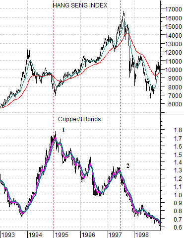
Below is a chart of Hong Kong’s Hang Seng Index and the ratio between copper futures and the U.S. 30-year T-Bond futures.
To explain… copper prices go with yields. This means that when copper prices are strong and rising we tend to find bond prices moving lower. The combination of rising copper prices and falling bond prices pushes the ratio steadily higher.
When copper prices stop pushing the bond market tends to lift in price. Flat to weaker copper prices combined with rising bond prices pushes the ratio lower. A rising ratio represents upward pressure on yields while a falling ratio represents downward pressure.
Through 1994 the copper/TBond ratio moved higher as stronger copper prices created upward pressure on interest rates. When this pressure came to an end in the final weeks of 1994 the stock markets turned upwards. The bullish trend continued until the ratio had risen to a second lower peak in 1997. As the ratio turned back to the down side in the summer of 1997 the Hang Seng Index ‘crashed’. By 1998 the bearish trend had gained enough momentum to create the Asian crisis.
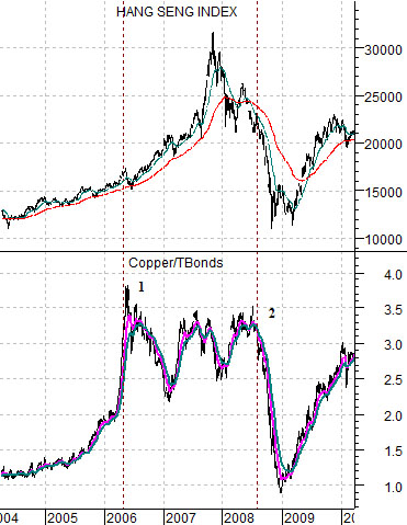
Yesterday we noted that the S&P 500 Index pushed upwards in mid-2006 when yields started to decline and then collapsed in mid-2008 when yields once again moved lower. What was the difference between 2006 and 2008?
The chart at bottom shows the Hang Seng Index and copper/TBond ratio from 2004 into 2010.
The difference was that in 2006 the copper/TBond ratio was making its first peak- similar in some ways to the end of 1994. The final peak was not made until the summer of 2008.
So… the point here is that the first peak for this ratio tends to lead into a bullish equity markets trend while the second or final peak tends to point to a bearish outcome. The first peak represents the end of upward pressure on interest rates while the second or final peak represents the start of the kind of economic weakness that tends to precede recessions and crises.