
One the basic reasons that we began to explore, create, and develop intermarket analysis stemmed from the fact that very few people ever took the time to consider how the trend in one market might impact the trends in other markets. For example, while it might seem obvious that the trend for the stock price of an oil company would be related to the trend for crude oil prices, arguing that a company can make X dollars per share and should trade at a multiple of Y to earnings misses a few keys points. Points like… why are oil prices rising or falling? Are oil prices stronger or weaker than general commodity prices? Given that there is a relationship between interest rates and valuation levels… are yields falling or rising? Is money moving towards defensive or growth sectors? If currencies are the gateways representing the flow of capital across borders… which currencies are rising to reflect positive capital flows?
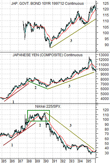
We thought we would start off today by taking a look at the Japanese yen and the ratio between the Nikkei 225 Index and S&P 500 Index and the Japanese 10-year bond futures as the Japanese stock market rose to a bubble peak in 1990 before turning lower into the early stages of what has proven to be a multi-decade deflationary trend.
From 1985 into 1988 the Japanese stock market clearly outperformed the U.S. stock market as the Nikkei/SPX ratio doubled in value. This went with an equally clear rising trend for the yen as capital moved towards Japan.
In general… cyclical or growth-oriented markets will tend to be strong and positive when capital is pouring in that direction. In other words the kind of trend that goes with significant outperformance but also includes the potential for a price ‘bubble’ feeds off of the flow of motivated money.
The trend shifted in 1988 as the yen began to weaken even as the Nikkei held near its relative strength highs. We will show on the following page how this impacted the Japanese stock market.
The trend shifted once again in 1990. At this juncture the yen continued to rise even as the Nikkei/SPX ratio turned lower. Instead of money chasing growth- as was the case from 1985 into 1988- the yen was stronger because investors were starting to appreciate the impact of collapsing asset prices on Japan’s inflation rate and bond market.
Equity/Bond Markets
In the narrative above we attempted to show that the Japanese stock market was strong and rising along with the yen from 1985 into 1988. At that juncture the trend changed somewhat as the yen began to weaken even as the Nikkei remained relatively strong compared to the S&P 500 Index.
The chart below compares the Nikkei 225 Index with the share prices of Hitachi (HIT), Toyota (TSM), and Panasonic (PC) from 1988 into 1990.
Notice that the final drive to bubble-dom for the Nikkei occurred as the yen started to weaken while the share prices of major Japanese exporters began to trend lower. In other words the Nikkei rose from around 28,000 to 39,000 on smaller cap speculative issues even as the stock prices of large cap names such as Toyota, Hitachi, and Panasonic weakened.
The point? Late in a speculative cycle the trend will tend to shift as the previous leaders begin to turn lower as the direction of capital flows (yen) changes. This might show up in one cycle as relative strength of silver or copper to gold, in another cycle as a concentrated focus on the internet stocks, and in a third cycle as gold or rare earth miners to the base metals. From an intermarket point of view when the nature of capital flows or a trend begins to morph it is time to start thinking about heading for the exits.
Quickly… below is a chart of Mitsubishi UFJ (MTU) and the ratio between Coca Cola (KO) and the S&P 500 Index (SPX). The argument is that a trend that favors Coke has a tendency to be negative for MTU while a weaker KO/SPX ratio has recently gone with a rising trend for the laggard banks.
Quickly once again… below right is a chart of 10-year Treasury yields and the ratio between commodity prices (CRB Index) and the Japanese stock market (Nikkei). This is a rather strange chart in that for the past decade when yields were rising the Nikkei was stronger than the CRB Index while through periods of falling yields the CRB Index did better. The point is that if 10-year yields continue to rise towards 4.5% we could see the CRB/Nikkei ratio fall by close to 50% either through downward pressure on commodity prices or upward pressure on the Nikkei.


