Let’s slow things down just a bit and return to what we view as ‘the basics’. Something like an introductory perspective on intermarket relationships.
On any given day, week, month, quarter, year, or even decade money is on the move. The direction of the flow of money determines winners and losers within the markets. Given that investors in general are perceived as rational (although we all know a few who aren’t) it makes sense to accept what the markets are doing instead of arguing against it.
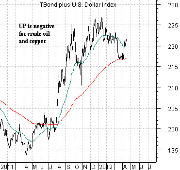
Below are two charts of the U.S. 30-year T-Bond futures and U.S. Dollar Index (DXY) futures. The charts are so similar in trend that at first glance they would appear to be almost the same but… they aren’t. In fact they are actually quite different.
The first chart shows the sum of the TBond and DXY. The sum rises when the bond market and/or dollar is moving higher and declines when bond and the dollar are weaker.
The intermarket argument is that a rising TBond plus dollar ‘sum’ reflects the kind of trend that favors defensive themes as well as the U.S. large cap sector. Money is moving into the U.S. dollar as well as into the U.S. bond market which means that money is moving away from most of the smaller currencies and those sectors or themes that are perceived as ‘risky’.
When the TBond and dollar are falling the trend tends to favor themes such as Asian/Latin/emerging markets as well as energy and metals prices. A weaker dollar and rising interest rates tends to go with stronger crude oil and copper prices.
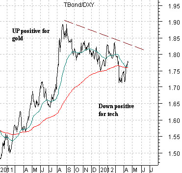
Below is the ratio between the two as we divide the price of the TBond by the U.S. Dollar Index. A rising ratio tends to be positive for gold prices (rising bond prices and falling dollar) while a declining ratio tends to favor sectors like ‘tech’. Keep in mind that this ratio reached a top last August at the high point for gold prices and has since chopped lower in response to a much stronger trend for many of the large cap Nasdaq names.
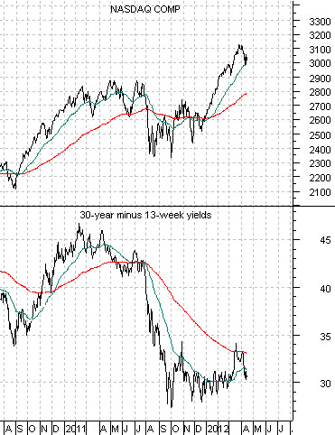
Equity/Bond Markets
Next is a chart of the Nasdaq Composite Index and the yield spread or difference between 30-year Treasuries and 3-month TBills.
Goodness… this chart probably deserves a couple of pages of explanation but we will have to blaze through as best we can.
There are two forces acting on the markets. On the one hand the Fed has stated that it will hold the funds rate near 0% through 2014. On the other hand… the Fed doesn’t have any control over when it will next raise the funds rate.
As long as growth remains somewhat tepid or, perhaps, growth does not expand to the point where the previous recession’s output gap is worked through a Fed funds rate near 0% will pull long-term yields lower. This is why bond prices soared following the last monthly employment report; the bond market realized that growth was still weak enough to allow the music to keep playing. And, as a certain banker once stated, as long as the music is playing you have to keep dancing.
The downward pull on long-term yields is a reflection of weakness and a cause of strength. The Nasdaq, for example, is soaring because it is not the cause of weakness. Put another way… does the Fed need to hold interest rates at current levels to support Apple’s business? Probably not. As long as monetary policy remains expansive in an effort to prop up the weakest sectors the strongest will thrive.
So… what are the weakest sectors? Aside from most things related to the Eurozone one answer would be the ‘laggard banks’.
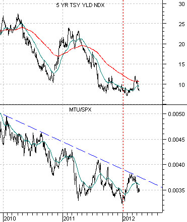
Below is a chart of 5-year U.S. Treasury yields and the ratio between Japanese bank Mitsubishi UFJ (MTU) and the S&P 500 Index. The argument is that until the MTU/SPX ratio stops declining there will be downward pressure on long-term yields. We argued that the trend actually changed at the start of this year (i.e. the low point for the ratio) but until it stops making ‘lower highs and lower lows’ the issue will remain in doubt.
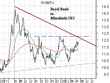
Below is a chart of the ratio between Canada’s Royal Bank (a leader) and MTU (a lagger). Strangely enough the ratio turned lower along with the Canadian dollar and crude oil prices at the end of last year’s first quarter.