Over the past while economists have argued that the economy will go through a ‘V’, ‘W’, or even ‘L’ shaped recovery. Our thought based on the way the currency and bond markets have been behaving through the last two weeks is that apparently it is going to look somewhat like a J’.
At top right we show a comparison between copper futures and the yield index for 5-year U.S. Treasuries.
The argument has been that copper futures prices have been trading quite close to 5-year yields through the recent cycle. When yields were 3.5% copper prices ranged around 3.50. When yields fell to 1.2% copper futures bottomed at 1.20 and when yields rebounded up close to 2.2% at the end of February copper futures continued to push upwards until resistance was met at 2.20.
The point is that last week’s Treasury market price meltdown sent 5-year yields up through 2.5%. If the bond market is ‘right’ then copper prices are headed to at least 2.50 or- if one takes the word of the forex markets (using comparisons based on the Cdn and Australian dollars) back above 3.00.
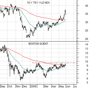
Below right we compare 10-year Treasury yields (TNX) with the share price of Boston Scientific (BSX).
BSX is obviously not a commodity producer but it was hit by the stock market melt down last autumn that went with tumbling long-term Treasury yields.
The argument is that if the bond market is ‘right’ then not only are commodity prices going higher but equity prices are set to surge upwards as well. If 10-year yields are ‘right’ north of 3.5% then Boston Scientific would be better priced closer to 12. The Cdn dollar has already risen to levels (chart on page 4) equivalent to something close to 1150 for the S&P 500 Index. In other words… the 200-day e.m.a. line near 950 may slow the stock market’s ascent for awhile but the rampaging bulls driving the bond and forex markets are suggesting that the recovery is going to be very fast.
As a final point… if this scenario actually proves to be correct… imagine how difficult the next few Fed meetings will be and imagine how far behind the curve the Fed will be once they finally gather up the nerve to start raising interest rates once again.
Equity/Bond Markets
Our thesis was that we would have a 2-month stock market rally from March into May followed by a 3-month correction into early August. Obviously our page 1 argument puts our thesis at risk although there still is a way where it could work.
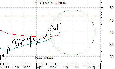
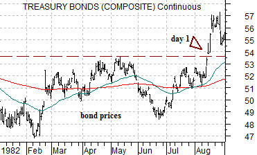
At right we show 30-year Treasury YIELDS from 2009 and 30-year Treasury futures PRICES from 1982.
In 1982 the stock market responded positively to rising bond prices while in 2009 it is rising along with yields.
The argument is that when bond PRICES peaked in May of 1982 the stock market’s rally faltered. The first day of the new bull market actually occurred in August when Treasury futures prices pushed up through the May highs.
For our thesis to work two things have to happen. First, long-term Treasury yields have to continue to decline. Second, they have to hold below last month’s peak into August. If we get falling yields similar to May and June of 1982 for bond prices followed by renewed upward pressure later this summer then our thesis still has a chance of working out.
Returning to the page 1 argument this would mean that 5-year yields would have to decline back below 2.20% to cool the rising price strength for copper. We would also expect that the U.S. dollar would have to show some amount of strength over the next few months.
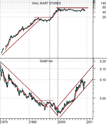
Below right we show the kind of chart that both fascinates us and gets us into trouble. The problem with long-term chart comparisons and a daily publishing schedule is that they often clash. There is a difference between what is happening and what could eventually happen if, as, or when the trend changes.
The chart compares the share price of Wal Mart (WMT) with the ratio between gold prices and the Japanese yen.
The argument is that for close to 20 years- between 1980 and 2000- the trend favored WMT as gold prices declined from the perspective of a Japanese investor. The only pause in the trend took place during the mid-1990’s when the gold/yen ratio showed strength through 1996 while WMT worked through a consolidation.
One of two outcomes seems likely here. The commodity bulls will argue that the past 10 years of rising gold prices is simply the start of a grand super-cycle that favors the commodity markets. We grant that if the trend ran one way for 20 years perhaps it can also work back the other way for 20 years.
An alternate argument would be that WMT simply got too far ahead of its fundamentals into 2000 and that some time was required so that earnings and dividends could catch up with the stock price.
Either way the idea is that when WMT eventually does push to new highs above 70 it should mark the end of the rising trend for gold prices. The chart intrigues us because its message is both clear and straight forward while getting us into trouble simply because we could be months or even years early in showing it.