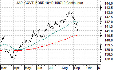
Below is a chart of the Japanese 10-year (JGB) bond futures. At present 10-year yields in Japan are in the vicinity of 1.15% and we have argued on occasion that anything below 2.0% represents a deflationary trend.
Asset prices in Japan have generally been declining for the past twenty years although along the way there have been some fairly healthy rallies for the Nikkei 225 Index. The key is that the trend for the Nikkei only turns positive when bond prices start to decline.
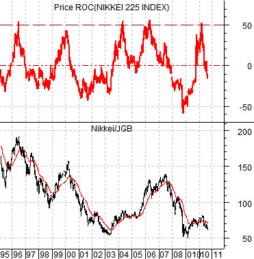
Below is a comparison between the ratio of the Nikkei 225 to the JGB futures (equities vs. bonds) and a year-over-year percentage change indicator for the Nikkei 225 Index.
The point? On five separate occasions since the mid-1990’s the Nikkei has made year-over-year gains of 50%… within the context of a 20 year bear market. Each occasion has been marked by a rising ratio between Japanese equities and bonds.
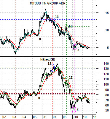
Below is a chart of Japanese bank Mitsubishi UFJ (MTU) and the Nikkei 225 Index/Japanese 10-year bond futures ratio. We have commented from time to time on the similarities between the two at key turning points. A ratio of, say, 80:1 has in the past gone with a price for MTU of around 8 while the rise into 2006 to 130:1 pushed MTU above 13.
In any event… Japanese bond prices have been weaker since last August and this is helping to lift the Nikkei. Whether the rally will extend until the year-over-year gain reaches 50% for a sixth time has yet to be determined but this is a number that we need to keep an eye on over the coming months.
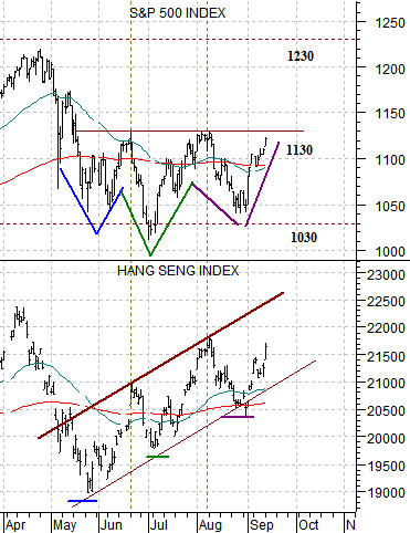
The chart below compares the S&P 500 Index with Hong Kong’s Hang Seng Index.
The argument has been that Asian growth is leading the recovery. In other words the Hang Seng Index should bottom and turn higher ahead of the S&P 500 Index. Since this index has been on the rise since late May… the situation today is encouraging.
The next test will likely come once the Hang Seng Index returns to the April highs or tests the rising trend line. Either way something close to 22,500 appears important. The SPX hit 1130 in both June and August when the Hang Seng Index pushed into resistance although chart-wise the SPX has made a ‘head and shoulders’ bottom with a neck line around 1130 counting up towards 1220- 1230.
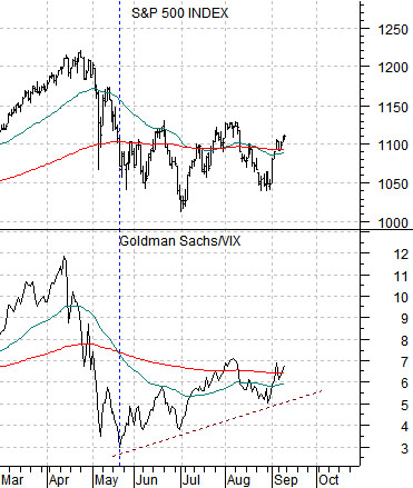
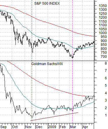
Below are two charts of the SPX along with the ratio between Goldman Sachs (GS) and the CBOE Volatility Index (VIX). The chart below is from 2008- 2009 while the chart directly below is from the current time period.
Goldman Sachs represents ‘the market’. A rising share price or a falling VIX is interpreted as being positive for the SPX.
The GS/VIX ratio bottomed in November of 2008 months ahead of the SPX. The time period between November of 2008 and March of 2009 represented the lag between Asian growth and the realization that conditions were improving in the U.S. Our thought is that this ratio bottomed in May of this year and after months of improvement we find the SPX approaching the upper edge of a ‘head and shoulders’ bottom formation which has the potential to point to higher prices ahead.
